Nick Jacobs as editor and publisher: some memories
Hyphen Press / 2024.04.11
My first encounter with Nick Jacobs happened in 1970. I had started to read New Left Review: in those days especially, the journal had an air of discovery about it, and I seemed to read most of every issue. That year, 1970, was when New Left Books was launched. NLR subscribers could buy these books by mail order, at a favourable price.
Hat Hut: some history and a new development
Hyphen Press / 2023.09.21
With Hat Hut, the musical content and the graphics, typographics and architecture of the packet, are fused more than most. Werner Uehlinger, who runs the label from Basel (before that, Therwil in the same Swiss canton) has a telling story of how it began in 1975.
Blank pages count
Hyphen Press / 2023.05.15
As often, it began with a remark by Anthony Froshaug. I had told him that some book had a certain number of pages – it was an odd number. He observed that this must be a strange book. To imagine a sheet of paper with just one side, or to imagine a folded sheet or a gathered number of folded sheets, with five or seven or nineteen or twenty-one sides is to enter the world of M.C. Escher.
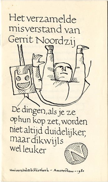
Remembering Gerrit Noordzij
Hyphen Press / 2022.05.06
Gerrit died a few weeks ago, aged 90. Even more than most human beings, he was complex. He was simple, sophisticated, dogmatic, open, authoritative, anti-authoritarian, inquiring, certain, proud, humble, unpretentious, masterly, amateur. I did not know him well, but did encounter and engage with him and his work over many years.
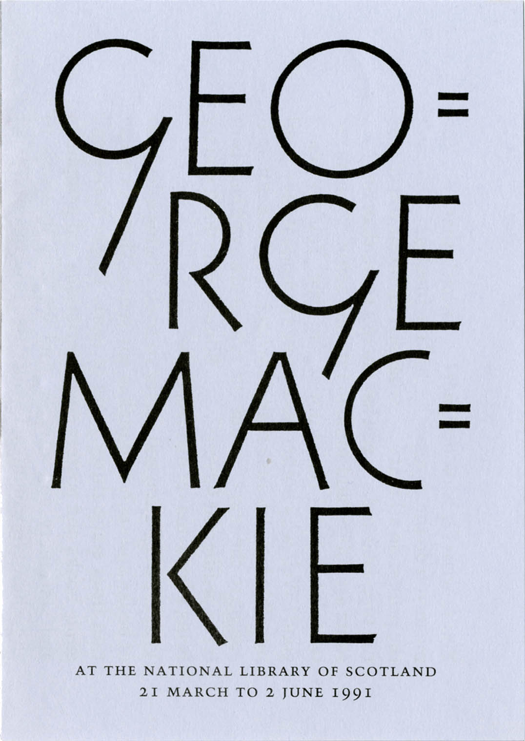
On George Mackie and his work
Hyphen Press / 2021.01.11
An appreciation of the work of the artist-designer George Mackie (1920–2020)
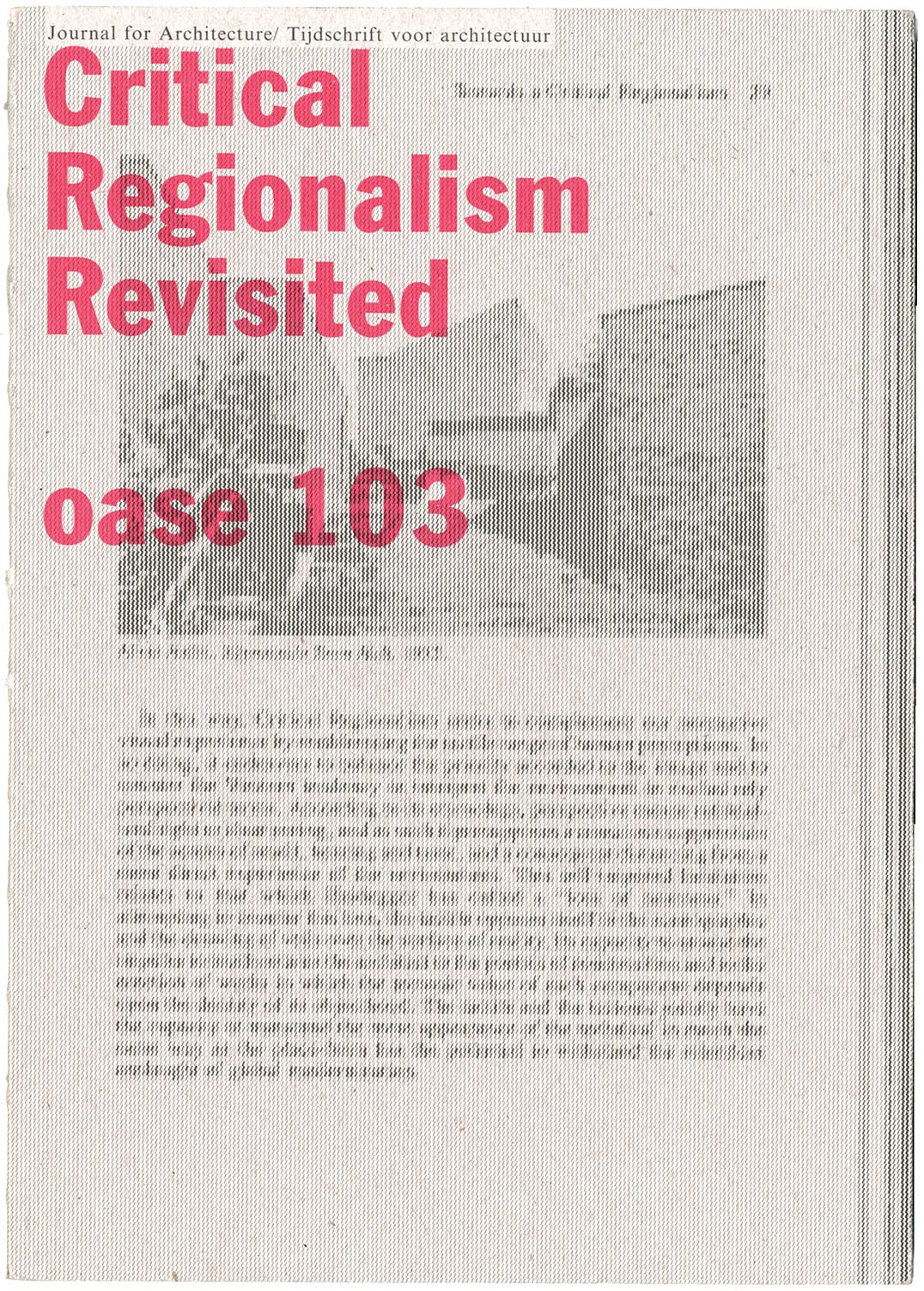
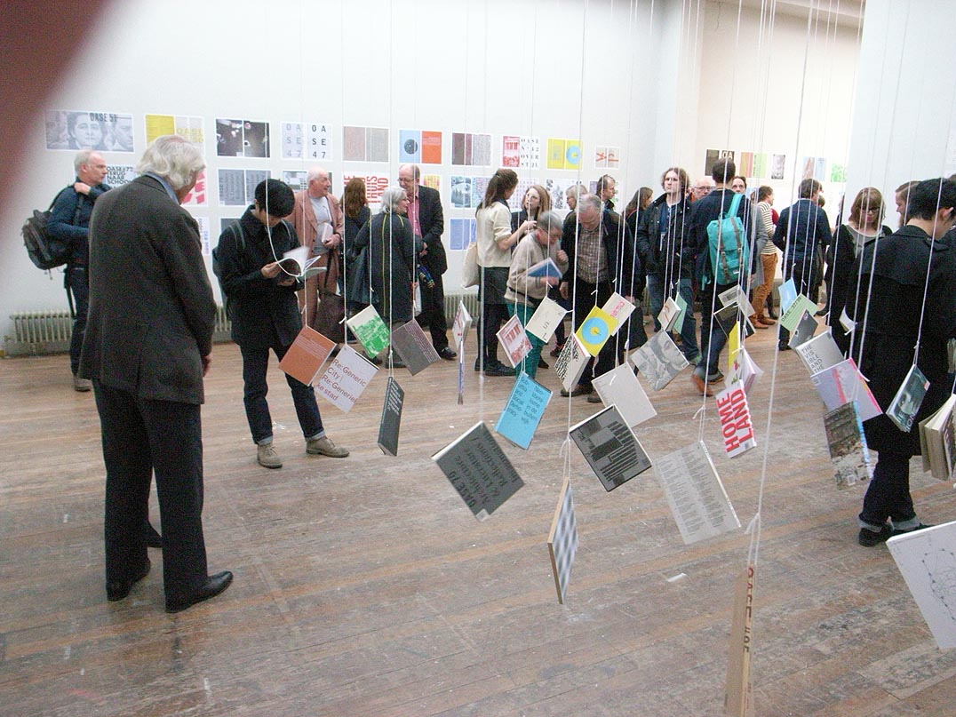
Frampton, Potter, Martens – and exemplification
Hyphen Press / 2019.06.25
The latest issue of Oase, the journal of architecture, is worth getting hold of. It is devoted to a discussion Kenneth Frampton’s theory of ‘critical regionalism’, which he published first in an essay of 1983. In this special issue of Oase, the original article is reprinted in facsimile, with Dutch translation added; there is a retrospective interview with Frampton, and discussions of the critical regionalism theory by other, younger practitioner-historian-critics: the combined role that Frampton has himself exemplified in his now long career.
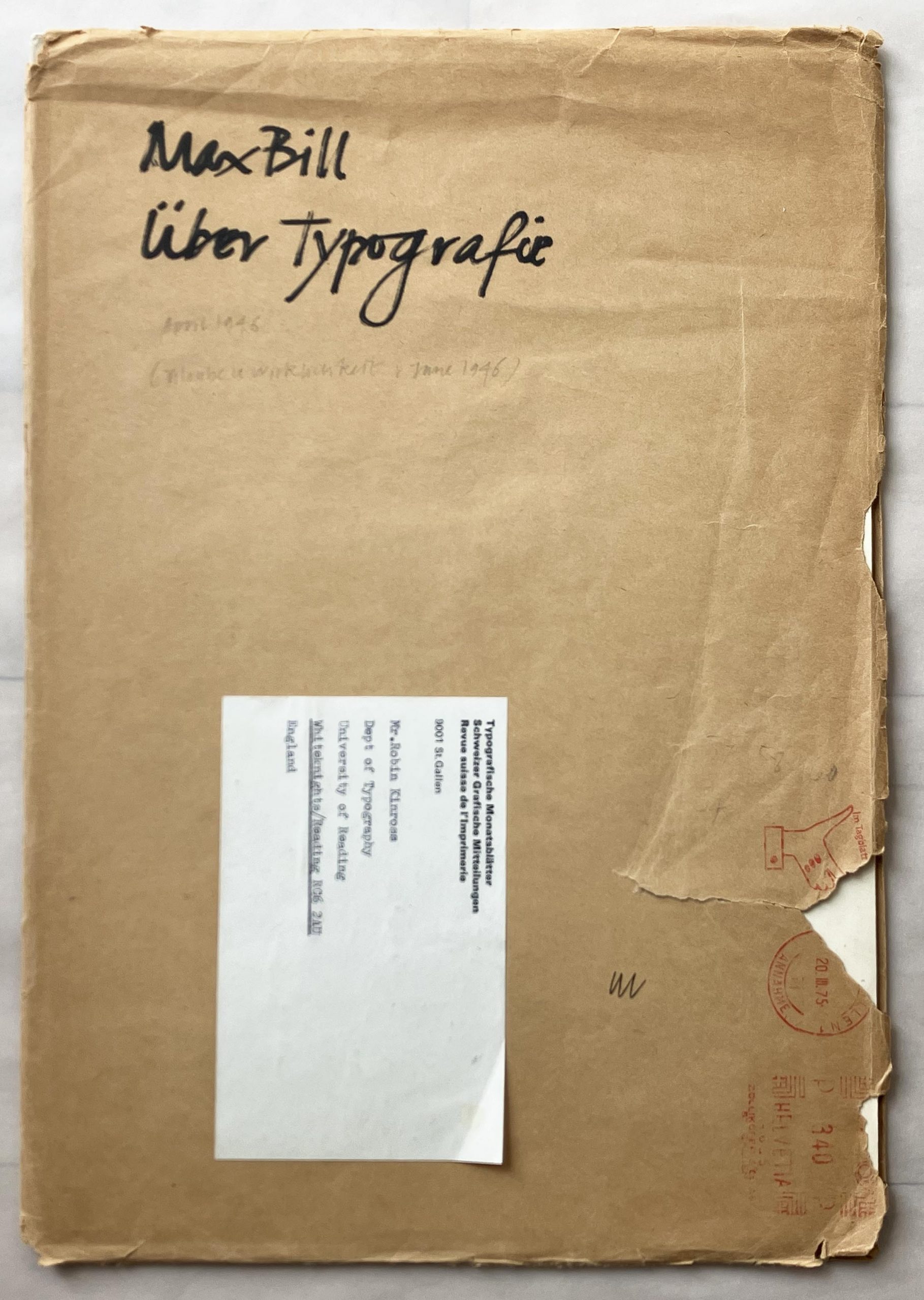
Punchcutting at ATypI, San Francisco, 1994
Hyphen Press / 2018.10.08
In the 1990s the annual meetings of ATypI (Association Typographique Internationale) were often fascinating events. The organization was in transition. Formed in 1957, as a grouping of type manufacturers, it represented the industry’s attempt to regulate itself, and especially to prevent – without recourse to the courts of law – one company from copying the designs of another.
For a typography of details
Hyphen Press / 2018.03.13
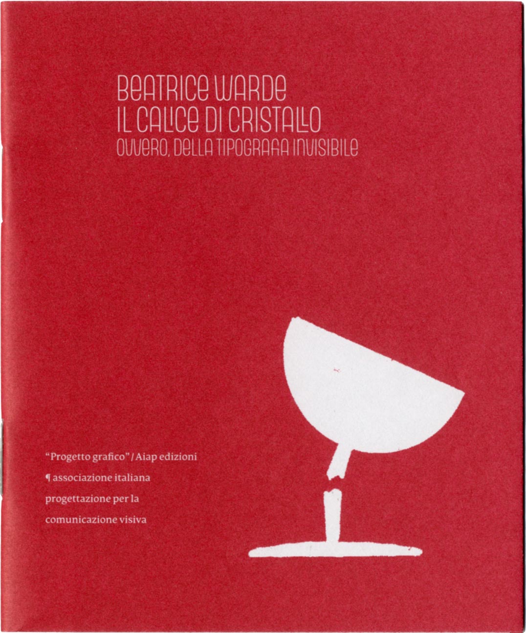
In 2006, invited by Giovanni Lussu and his colleagues on the editorial board of the journal ‘Progetto grafico’ (published by Aiap, the association of Italian graphic designers), I wrote a consideration of Beatrice Warde’s ‘Crystal goblet’ essay. This became part of a symposium on Warde’s view of typography, which was published in ‘Progetto grafico’, no. 8.
Copyright in Isotype work: the claim of the Arntz estate
Hyphen Press / 2017.11.09
This article follows on from the more general considerations on copyright in Isotype published here.
Copyright in Isotype work
Hyphen Press / 2017.08.14
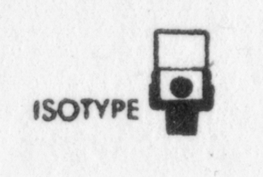
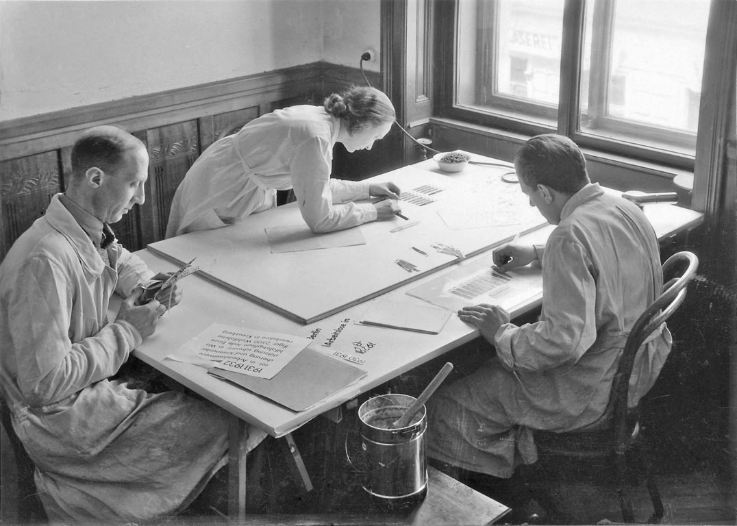
Isotype is now the generally used name for the work in visual communication carried out by groups under the direction of Otto Neurath and, after his death in 1945, by Marie (Reidemeister) Neurath. The institutions that produced this work were the Gesellschafts- und Wirtschaftsmuseum in Wien [GeWiMu] (1925–34), the International Foundation for Visual Education [IFVE] (1934–40), and the Isotype Institute (1942–71). We have published three books on Isotype: From hieroglyphics to Isotype, The transformer: principles of making Isotype charts, and Isotype: design and contexts, 1925–1971. The question of where copyright in the Isotype work lies has been a persistent one. The notes here provide an answer to it.
The right direction
Hyphen Press / 2017.05.08
A previous installment of this occasional series on book production concerned a novel by Julian Barnes, The noise of time. The book was published in 2016 in London by Jonathan Cape, an imprint of Vintage Publishing, and in turn part of Penguin Random House UK.
Risen spaces
Hyphen Press / 2016.07.04
Comments on the picture-sharing service Instagram have pointed to an interesting detail in Harry Carter’s book A view of early typography. Our edition of this work was a facsimile reprint of the book published by Oxford University Press in 1969, with added editorial matter.
Title casing
Hyphen Press / 2016.03.25
A detail of Hyphen Press style has sometimes caused puzzlement. We give the title of a book with initial capitalization only in the first word. Thus: The arrow of gold, rather than The Arrow of Gold. We have used this style in the text of most of the Hyphen books, and in their display typography too, in catalogues, and on this website.
The wrong direction
Hyphen Press / 2016.02.11
Julian Barnes’s latest novel was published in London a couple of weeks ago. This is mainly a note on its qualities as a physical object.
Net and book: an interview with Roland Reuß
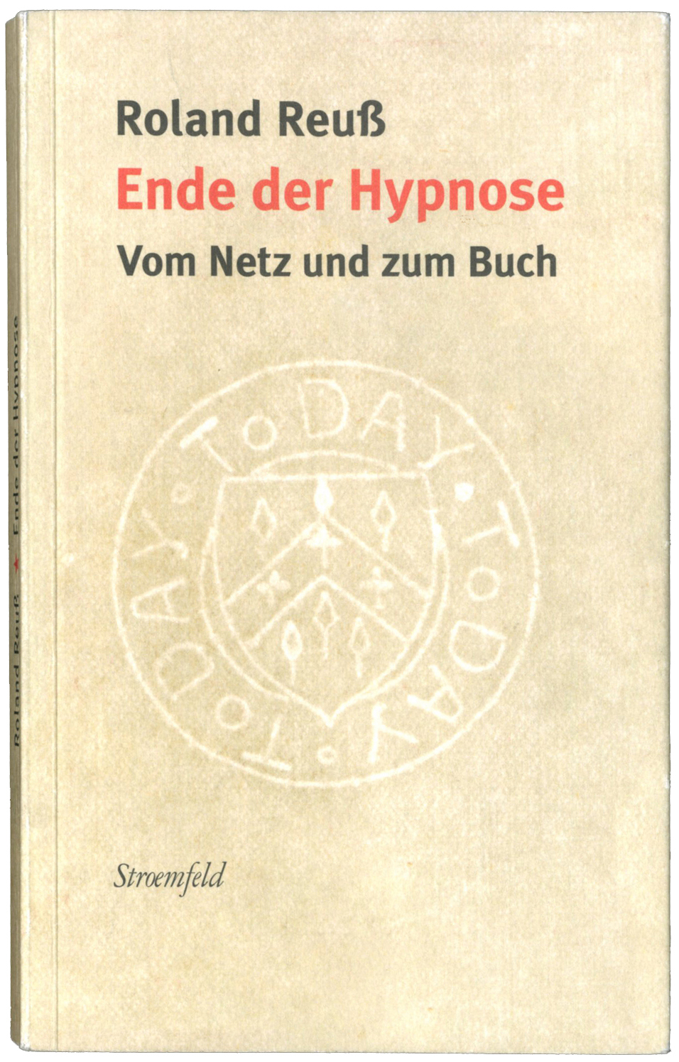
Hyphen Press / 2015.11.30
Roland Reuß teaches literature and text-editing at the University of Heidelberg, and co-directs the Institut für Textkritik there. As well as co-editing, with Peter Staengle, major historical-critical editions of Kleist and Kafka, he is a prolific writer on the subject of literature and editing. In addition, in the last few years he has published a stream of articles, especially in newspapers (notably the Frankfurter Allgemeine Zeitung and the Neue Zürcher Zeitung), on wider and more explicitly political themes: the rights of authors and publishers in the face of unlicensed copying of their work, the continuing virtues of the printed book as a means of embodying and duplicating texts and images, the role of independent publishers and booksellers in maintaining human culture.
Karel Martens at the KABK
Hyphen Press / 2015.03.12
The Gerrit Noordzij Prize, organized by the Type and Media postgraduate course at the Koninklijke Academie van Beeldende Kunsten (Royal Academy of Art) in The Hague, is awarded every three years. Last week it was presented to the type designer Cyrus Highsmith, and the previous winner, Karel Martens, was celebrated in a seminar, an exhibition, and a book.
Copyright in designed pages
Hyphen Press / 2014.05.25
When graphic design work is reproduced, what rights do the people who made this work have? This piece looks at some of the issues, and at what United Kingdom law has to say about them. Reproduction of works of art presents a connected set of issues, and these will be looked at in a following article.
Style guide
Hyphen Press / 2014.01.02
At work over the holidays on a writer’s first draft, the following notes seemed of possible wider interest.
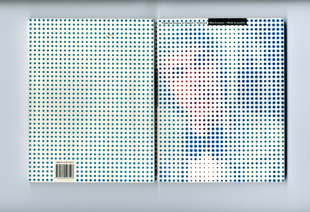
‘Wim Crouwel: mode en module’: a review
Hyphen Press / 2013.04.05
This review of the book Wim Crouwel: mode en module by Frederike Huygen and Hugues Boekrad, was written for and published in an issue Typography papers, now out of print. The Crouwel book, as it was often referred to, was issued only in a Dutch edition, which sold out quickly. Since then, Wim Crouwel’s renown has only increased.
Remembering Robin Fior
Hyphen Press / 2012.11.20
Robin Fior died on 29 September, in hospital at Mafra, outside Lisbon. This is not an obituary (his friend Richard Hollis has written a good one), but merely a set of memories of someone I knew, off and on, over twenty or so years. He was part of a certain network of designers in Britain, whose work has provided a main impetus for Hyphen Press.
The cover of ‘Fellow readers’
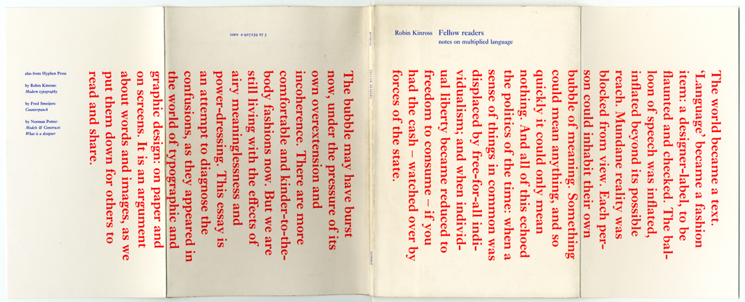
Hyphen Press / 2012.04.26
This is the cover of the pamphlet Fellow readers: notes on multiplied language, which Hyphen Press put out in 1994. The piece was prompted by the debates over typography that had been published in the pages of Emigre and Eye magazines, and elsewhere. A participant in this discussion, I saw the chance to make a more extended contribution when my book Modern typography was coming up for a reprint.
A note on the collages
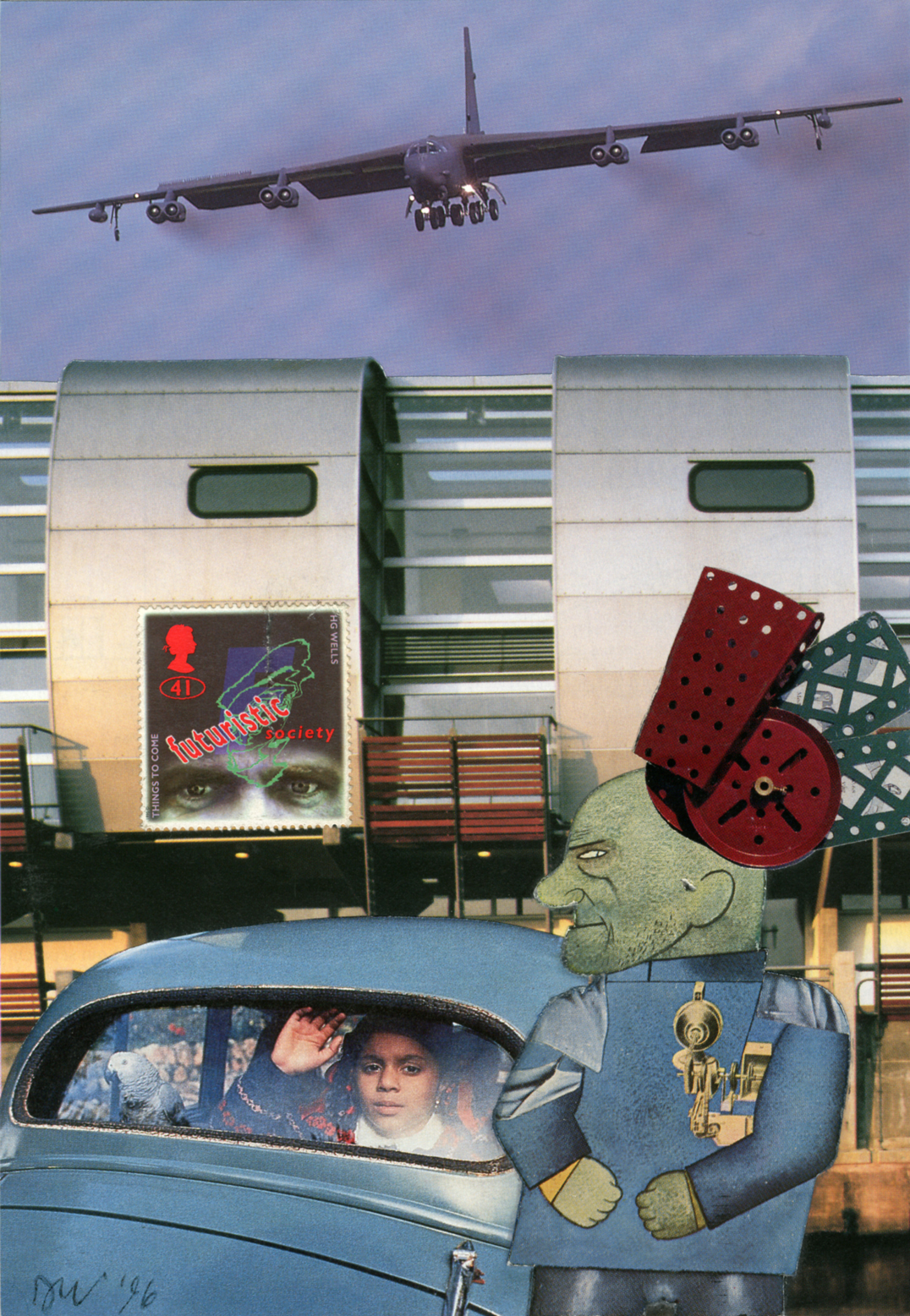
Hyphen Press / 2011.12.20
David Wild recently wrote a brief note on the history of the collages that he has been making over 35 years. We give it here, with the examples to which he refers.
The work of Matthew Carter
Hyphen Press / 2011.11.01
On 13 October in Antwerp Fred Smeijers spoke some words of introduction at the opening of the exhibition ‘The Most Widely Read Man in the World: Matthew Carter’, on show until the end of the year at the Catapult gallery.
About Peter Campbell’s writings
Hyphen Press / 2011.10.26
Peter Campbell died yesterday at his home, after being diagnosed last year with cancer. He was a special man, both in his nature and in the combination of his talents. We were very glad to publish his writings, and to add him to the list of Hyphen authors, who seem often to be people whom the world finds it hard to pin down.
On E.C. Large
Hyphen Press / 2011.07.06
Our re-issue of two novels by E.C. Large, Sugar in the air and Asleep in the afternoon, and publication of a companion work, God’s amateur, prompted this piece in Lodown (no. 74), the magazine of ‘Populärkultur und Bewegungskunst’, published from Berlin. The introduction and email interviews are by Renko Heu.
‘Gerd Arntz: graphic designer’
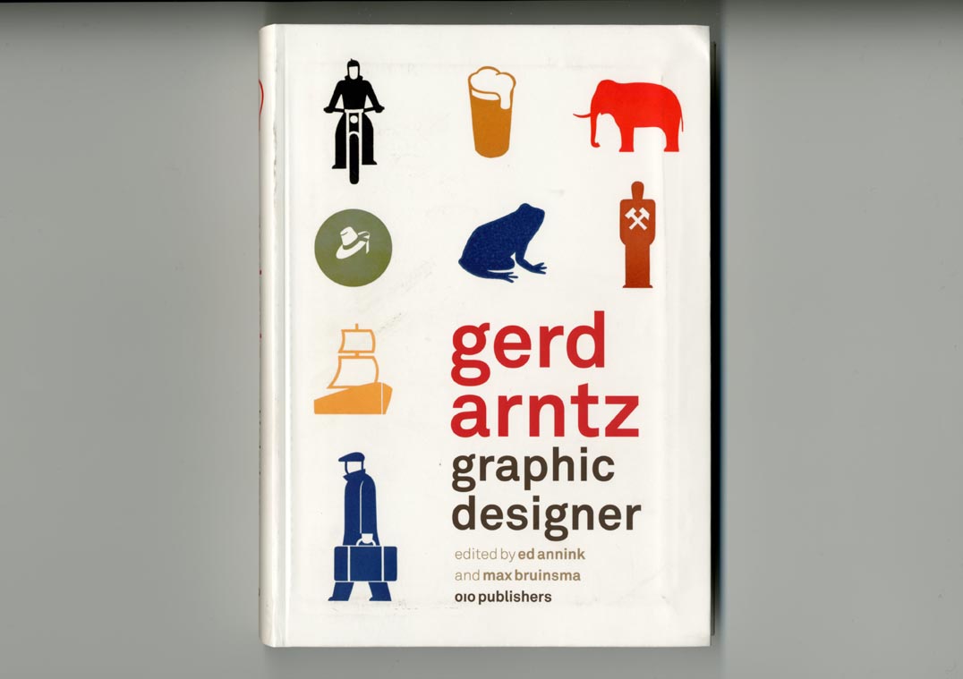
Hyphen Press / 2011.04.26
This book review was written for the Designgeschiedenis Nederland website. It is published here in slightly adapted form, as a follow-up to an earlier review of publications about Isotype.
Paul Stiff (1949–2011)
Hyphen Press / 2011.04.11
An obituary of Paul Stiff was published in ‘The Guardian’ on 7 April – see here. What follows below is an extended and re-edited version of that text
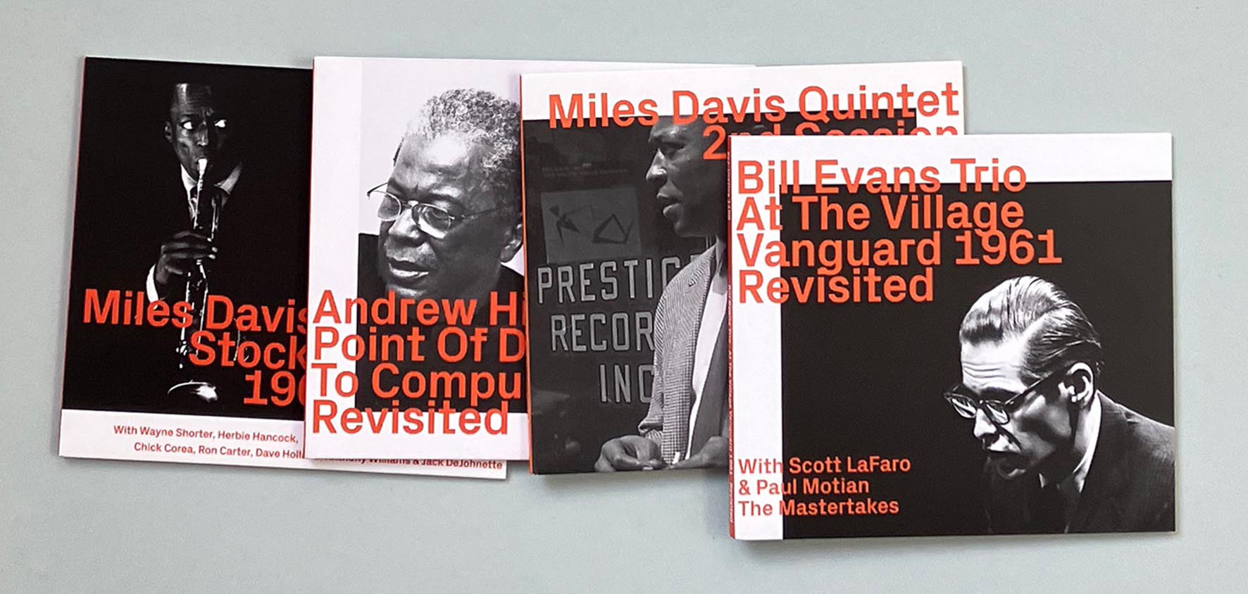
CD packs: the development of an idea
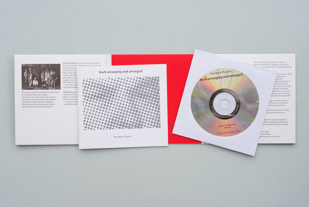
Hyphen Press / 2011.01.27
When we were planning to publish music CDs, I tried to keep in mind that (since all the decisions were in our hands) it was a chance to think freshly and not – or not necessarily – use the reigning model of a plastic jewel case with printed ‘inlay’ sheet and booklet.
Teus de Jong (1946–2010)
Hyphen Press / 2010.11.10
Teus de Jong died last week in hospital in Groningen, after a succession of serious illnesses. He was the typesetter of a number of our books, especially the paperbacks designed by Françoise Berserik.
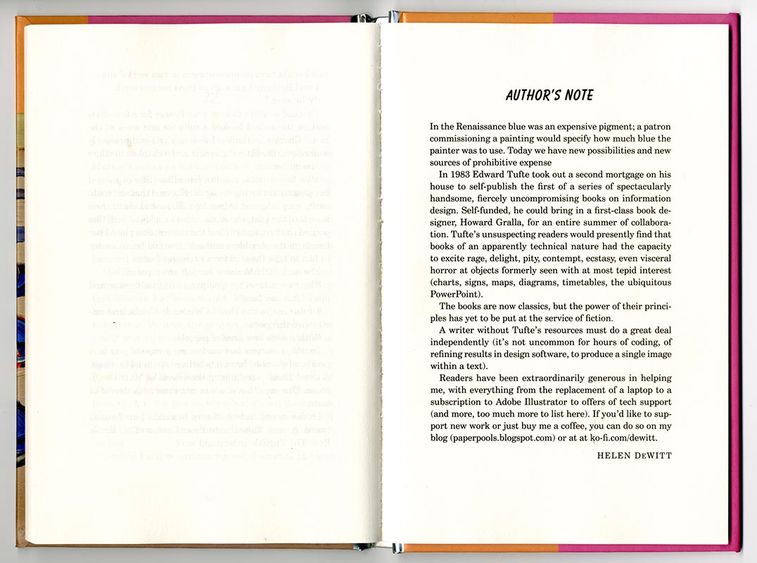
A book of conversation
Hyphen Press / 2010.08.09
It’s been suggested elsewhere in these web-pages that we can judge the quality of a book by looking at its production as an object for carrying meaning. The space between the lines will tell us something about the quality of thought in the editorial-design processes, and so – because editor and writer might work hand-in-hand – in the writing too; and the glue on the spine will tell us something about the thinking in the publishing house
‘Subterranean modernism’
Hyphen Press / 2010.07.01
Idea magazine is pleasantly print-fixed: none of the words it publishes are put online, so anyone wanting a taste of it simply has to go out and find a copy. The current issue, no. 341, has an article that refers to Hyphen Press and its efforts. This essay, ‘Subterranean modernism’ by Randy Nakamura and Ian Lynam, is perhaps the first published piece by unconnected observers to address ideas that we’ve been busy with for now 30 years.
On typography
Hyphen Press / 2009.10.19
Anthony Froshaug’s article ‘Typography is a grid’, which we posted here in August 2000, has proved to be the most popular page on this website, with numbers boosted recently by a link from a website about grids in typography.
Brecht and Benjamin in English
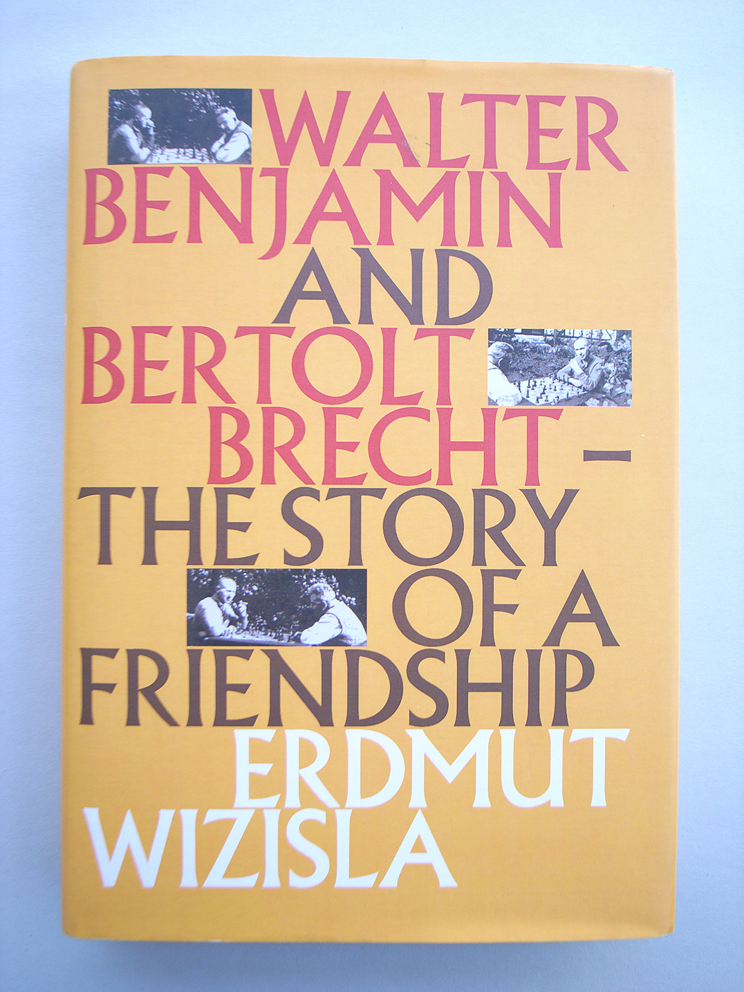
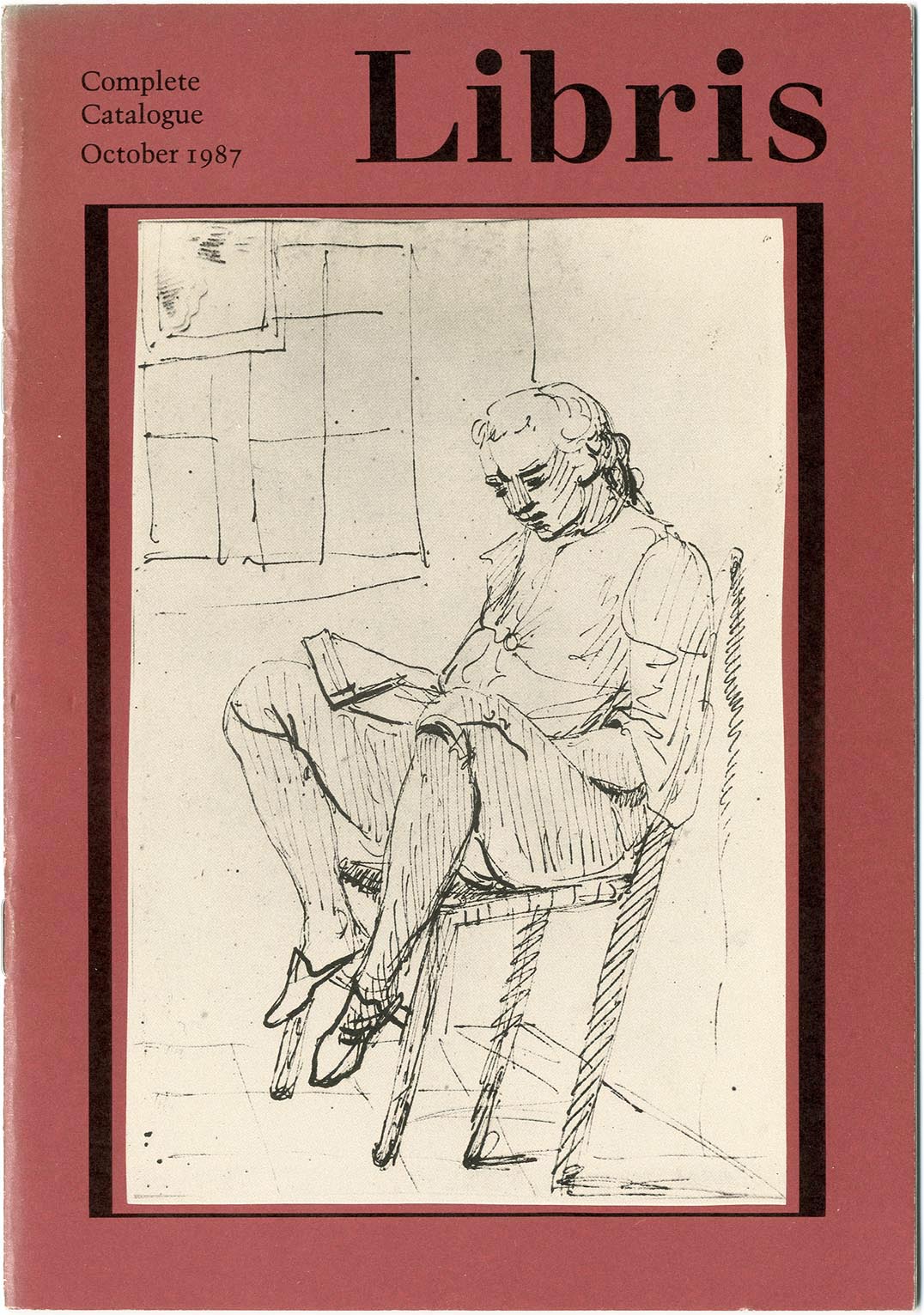
Hyphen Press / 2009.09.29
Last Thursday the London publisher Libris brought out Erdmut Wizisla’s Walter Benjamin and Bertolt Brecht: the story of a friendship. This is an English-language edition of the book published originally by Suhrkamp. Behind that edition was a first embodiment, as its author’s doctoral thesis.
Alexander Verberne
Hyphen Press / 2009.09.15
The typographer Alexander Verberne died on 27 May 2009. After a stroke in 1997, which was followed by further strokes, he had been seriously impaired and was living in a care-home in The Hague. He was born on 18 August 1924 in Den Helder.
Anthony Froshaug: material words / making the book
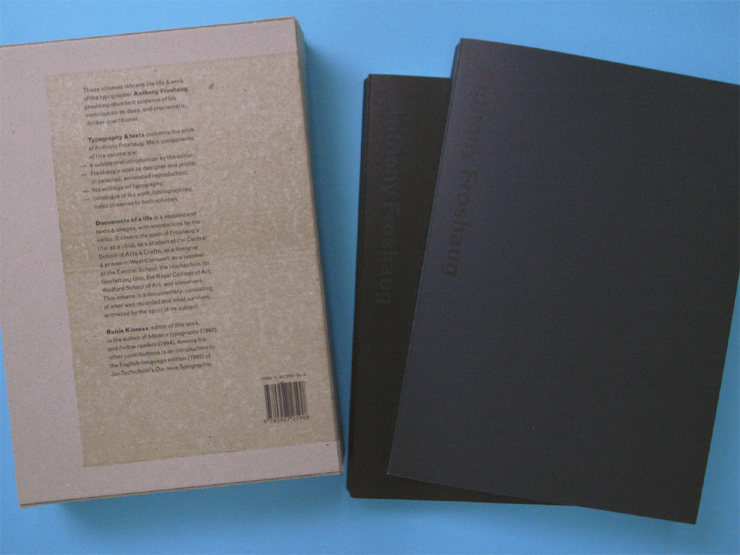
Hyphen Press / 2009.02.21
A recent tidying of the office turned up an offprint from the journal Matrix (no. 21, 2001), which published two pieces written on the occasion of the publication of our book ‘Anthony Froshaug’. Looking at them again, they seem worth reviving – to explain something of the process by which that book was made.
An interview with Nicolette Moonen
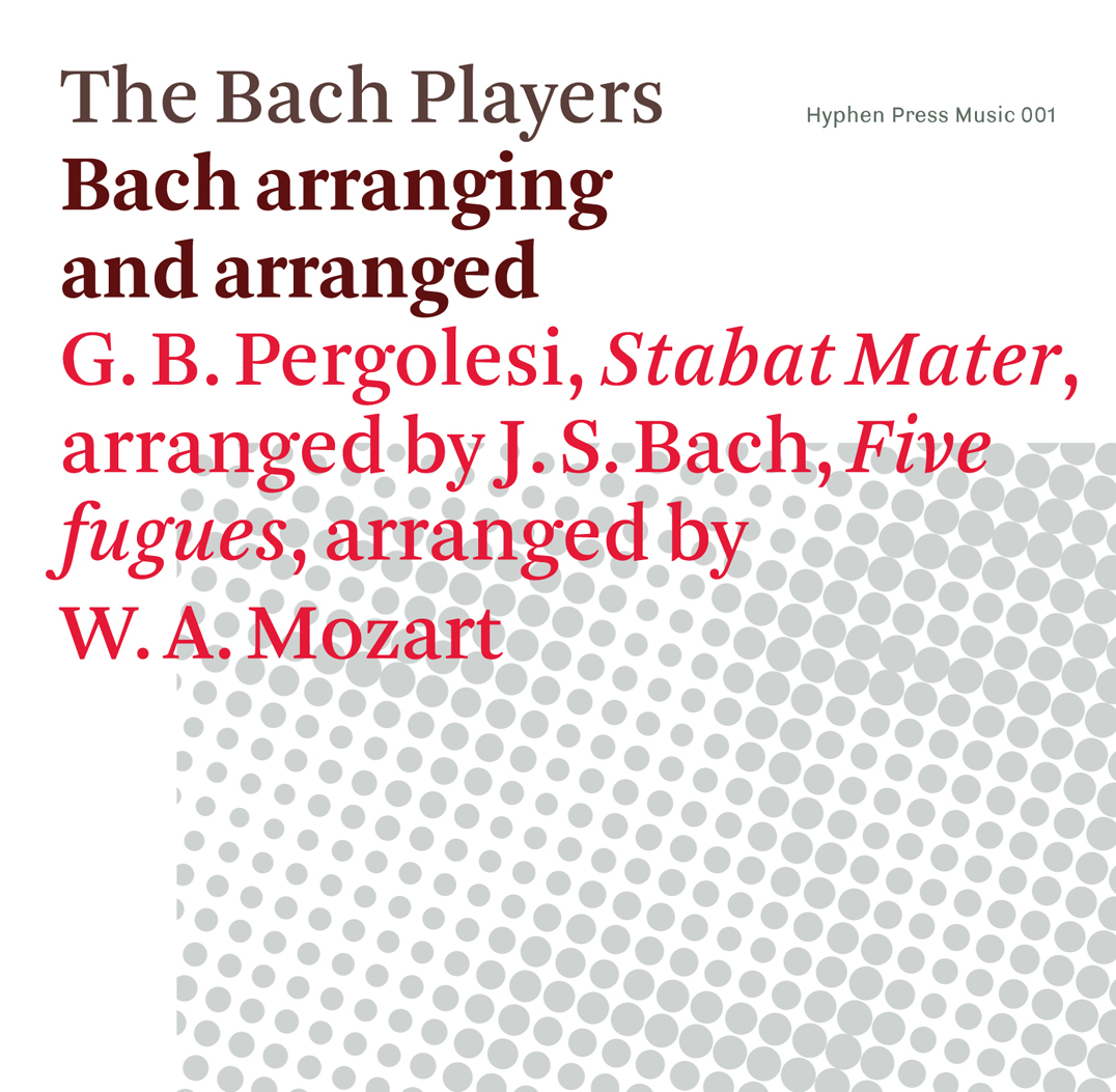
Hyphen Press / 2008.10.26
en Press Music is publishing its first CD: Bach arranging and arranged by The Bach Players.
Benjamins
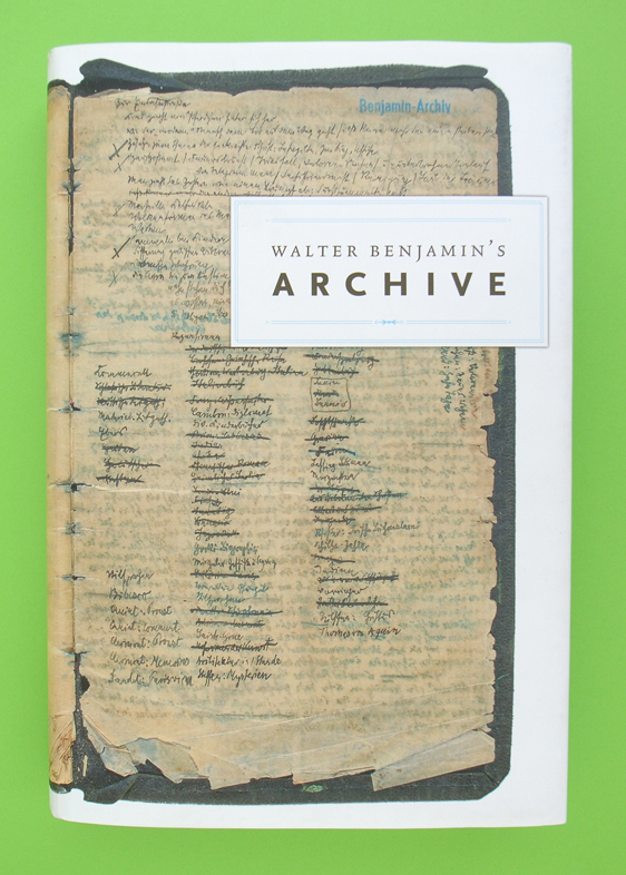
Hyphen Press / 2008.08.22
Now that every word that Walter Benjamin published in his lifetime has been collected and republished, and now that his many unfinished words have been similarly collected and printed, and now that to this set of ‘collected writings’ we can add letters and diaries that he cannot have thought of publishing, there only remains to be transcribed and multiplied the scraps, cards, sheets, that fill up the rest of his archive.
Isotype: recent publications
Hyphen Press / 2008.05.12
The recent flourish of interest in the visual work of Otto Neurath – let’s call it Isotype – may be seen as a second wave, coming after a first period of discovery, which included exhibitions of the work in Reading (1975) and Vienna (1982), and an exhibition of the work of the Neurath group’s main artist, Gerd Arntz, in The Hague (1976).
The political economy of book production
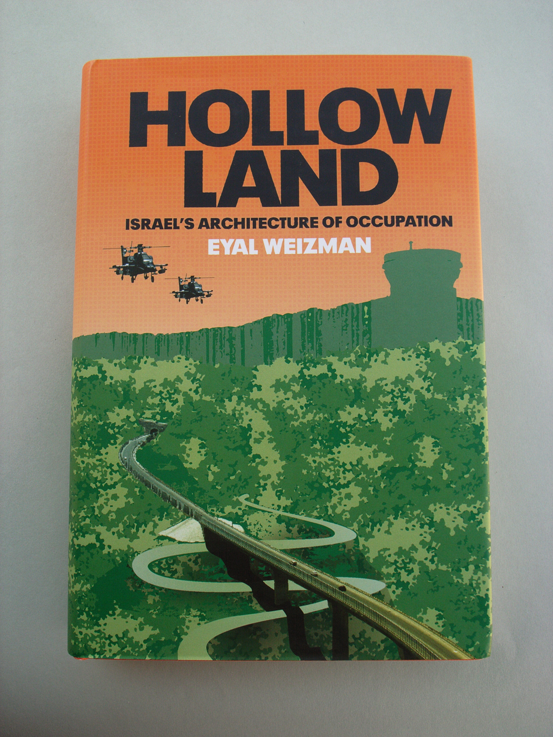
Hyphen Press / 2008.02.18
Compare and contrast these two good books published by Verso in London and New York.
Signs at the Royal Festival Hall
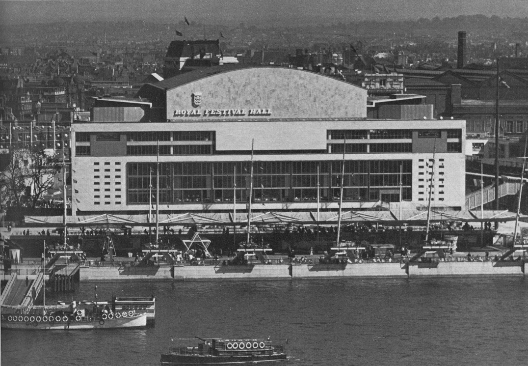
Hyphen Press / 2007.12.10
In summer of this year the Royal Festival Hall, on the South Bank of London’s river, was reopened after a major, two-year refurbishment. The auditorium itself was remade and restored, and the rest of the building was significantly remade/restored too. The spirit and the materials of the original building were respected, at the same time changes needed for the place’s new uses were made.
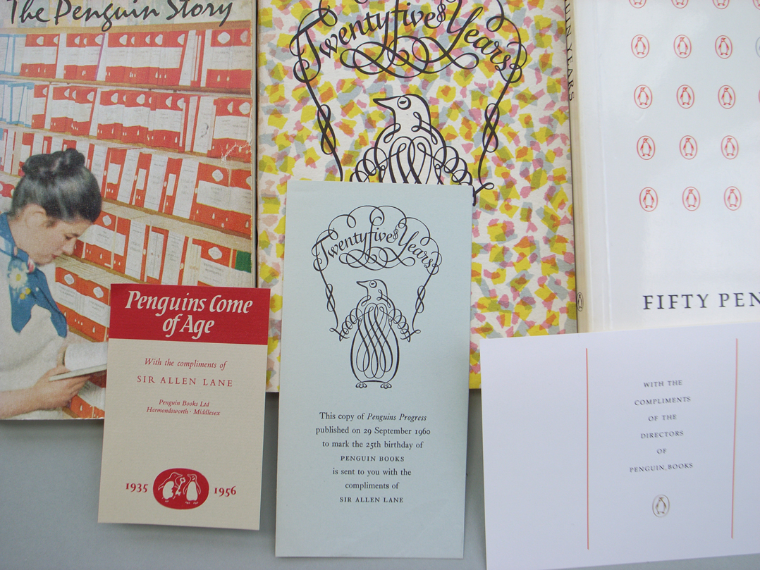
Penguins lose the plot
Hyphen Press / 2007.11.01
As any long-term reader and watcher of Penguin Books knows, the company has always cultivated its own history, seizing the chance of an anniversary to make an exhibition or put out a book celebrating its own story.
Rule or law
Hyphen Press / 2007.09.15
The re-publication here of this essay by Gerrit Noordzij is prompted by the issue of Christopher Burke’s Active literature. Our book was made in the belief that the best service to Tschichold is a critical placing of his works and his ideas in their real historical context: the fact that we want to do this in such detail must be evidence of the importance that we think his work has. Gerrit Noordzij’s short and sharply critical essay points to what may be the central issue in Tschichold’s writings, and it does more than that.
Biospeak
Hyphen Press / 2007.08.09
Two demon constituents of capsule English-language biographies (for book-flaps, catalogues, CVs, and so on) are ‘currently’ and ‘based in’. ‘Cormac Wrathbone is a freelance writer and critic, currently based in London.’ What’s wrong here? It’s not just the tiredness of the phrasing.
Best books 2006
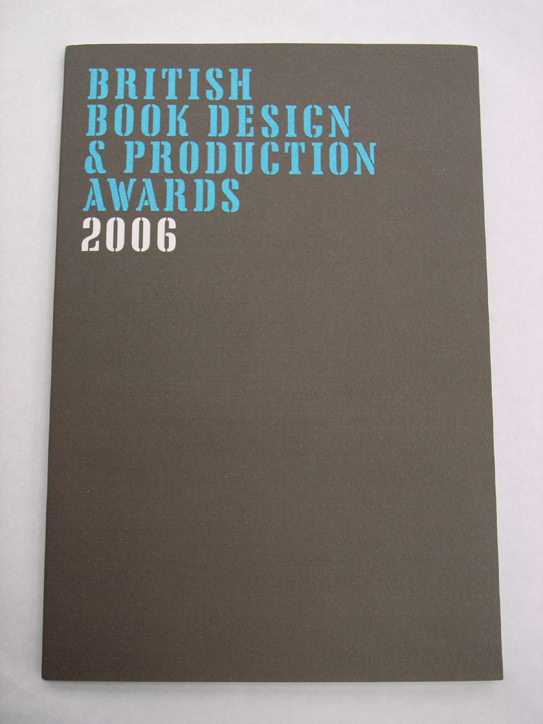
Hyphen Press / 2007.06.27
This year’s catalogues for the best-designed/-produced books have been appearing. The Swiss catalogue for books issued in 2006 is just published. The German catalogue for the same period came out some weeks ago. The British publication, also carrying the designation ‘2006’, was produced towards the end of last year. The Dutch best-books catalogue is on its way, and will cover books published in 2006. With the exception of the British publication, these catalogues describe and discuss books that are put on exhibition in their own countries, and which are also, in the autumn, added to a showing at the Frankfurt Book Fair of all the world’s best-books of that preceding year. A proper survey of the best-books exhibitions would take in all the countries represented at Frankfurt, including (as I recall) Finland, Denmark, the Czech Republic, the United States, Spain. These remarks are addressed to the countries with which I am most familiar.
Books that lie open
Hyphen Press / 2007.05.02
This is an introductory survey of a vexed issue of book-production: binding techniques. The intention of the piece is general enlightenment, and to support a process that is threatened with extinction. A version of this article was published here in May 2007. The text and images here are a new version of this article – thoroughly revised and reshaped in April 2018.
Two books on book typography
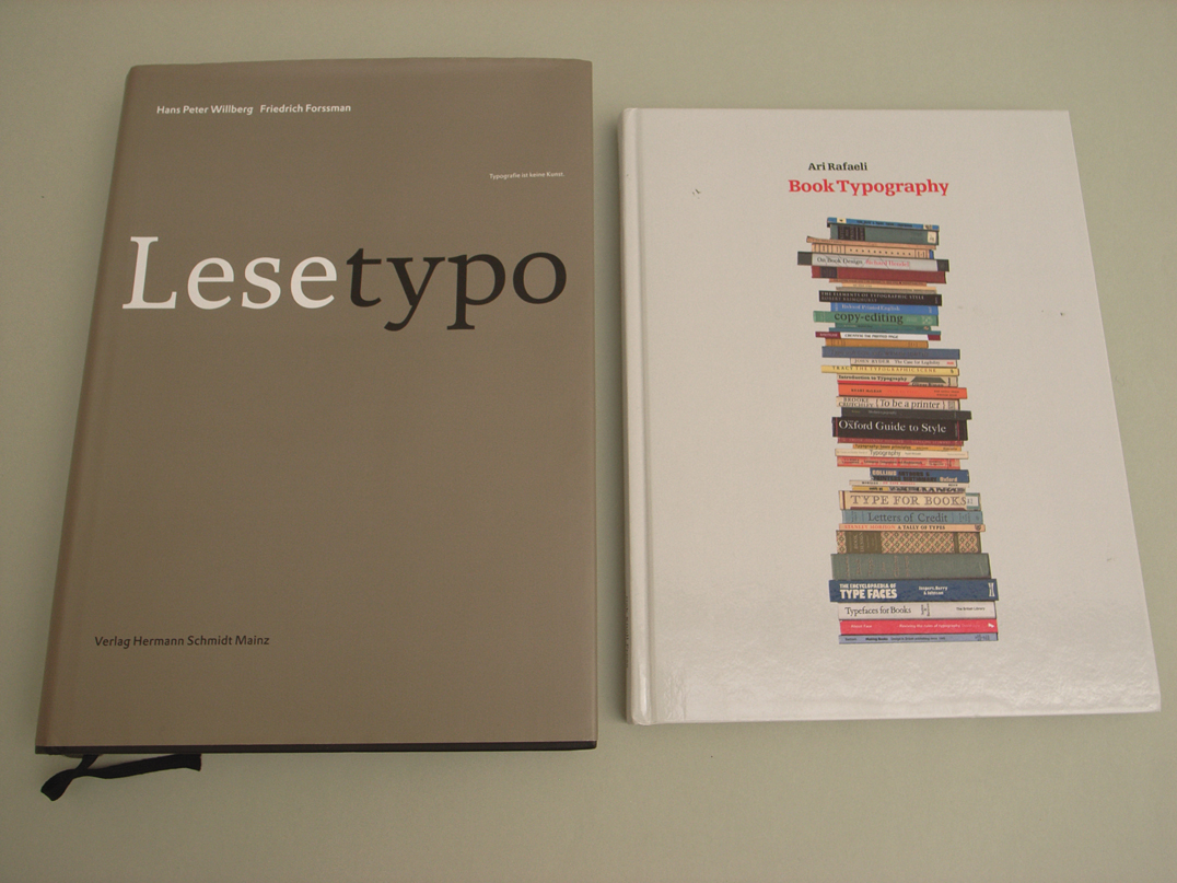
Hyphen Press / 2007.04.26
This review has just appeared in the new number (no. 11) of Text, within an issue on the theme of ‘Edition & Typographie’.
Remembering Peter Burnhill
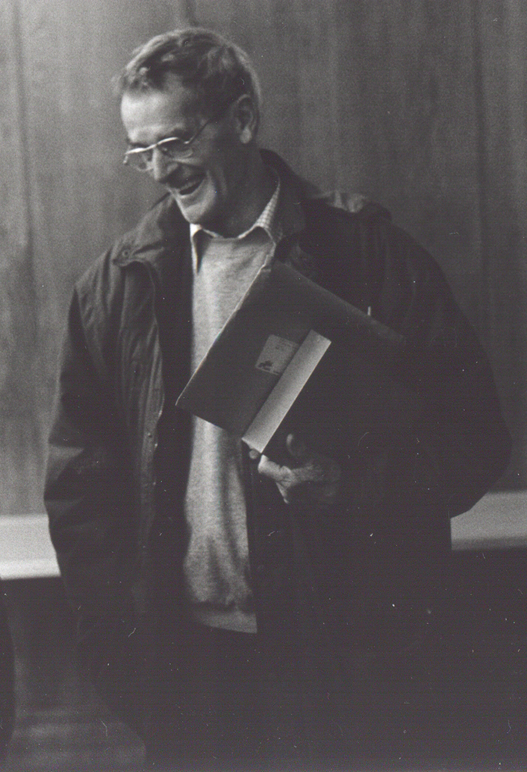
Hyphen Press / 2007.04.17
Peter was there in Stafford as a constant point of reference for me for about thirty years. I remember making what seemed like a pilgrimage from Reading to Stafford, in 1977, to meet him for the first time, and the others around him in the group that made and ran the typography course at the College of Art and Design.
Lazy links
Hyphen Press / 2007.01.22
When it launched its website in July 1995, the internet seller Amazon seemed a wondrous thing. Here was a bookstore stocked with almost every title, and one that would reach parts of the country (the United States of America) that were far from any bricks-and-mortar shop. It was indeed based in Seattle, and its employees, one imagined, were mainly grunge-kids in baggy jeans and t-shirts, fetching and packing the books for minimum wages. The company seemed endearing to those of us who like brave new ventures.
Domus reprinted
Hyphen Press / 2006.11.29
In a bravura act of publishing, Taschen Verlag has put out an extended selection, in facsimile, of the magazine Domus. This short review of the venture appears in the November issue of Architecture Today.
Is it possible to determine what typeface of the 1990s will become a classic in the future
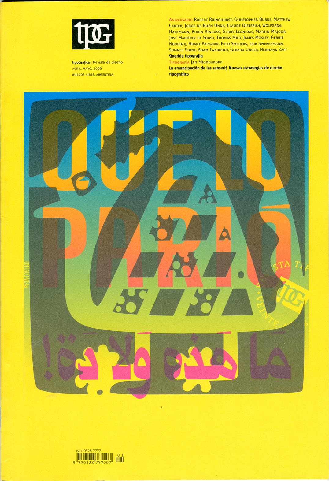
Hyphen Press / 2006.09.27
With its issue of April–May 2006 (no. 70), the magazine Tipográfica entered its twentieth year of publication. Published from Buenos Aires since its first issue of May 1987, the magazine is now established as one of the liveliest and most internationally minded design magazine.
Report from the SHARP conference 2006
Hyphen Press / 2006.08.06
Last month the Society for the History of Authorship, Reading & Publishing – SHARP – held its annual gathering over several days (11–15 July) in The Hague.
Kinneir, Reading, ‘Typography papers’
Hyphen Press / 2005.05.13
Designers, places, publications are woven together and put in historical perspective in this short text by Paul Stiff.
The architects of the book
Hyphen Press / 2002.05.22
Architectural and design publishing has seen remarkable changes in recent years. How does this sector of publishing work now? How did it come to have this structure? What part does the design of these books play?
Interview with Christopher Burke
Hyphen Press / 2002.05.17
We publish an interview with Christopher Burke, conducted and introduced by Andreu Balius and Juan J. Arrausi, graphic designers in Barcelona. This is the original English text of the interview published in Spanish in the magazine GRRR (no. 8, 2001).
Some considerations on biography
Hyphen Press / 2000.11.24
We are pleased to publish this address given by Tanya Harrod to the meeting on 10 October 2000 at the Conway Hall, London, to launch the book Anthony Froshaug.
Typography is a grid
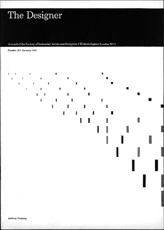
Hyphen Press / 2000.08.22
This article was first published in ‘The Designer’, no. 167, January 1967. It is one of the ‘texts’ published in our book ‘Anthony Froshaug: Typography & texts / Documents of a life’.
An interview with Robin Kinross
Hyphen Press / 2000.08.21
This interview was recorded in London on 28 May 1999, and published in Slovenian translation in the cultural magazine Emzin’.
‘Counterpunch’: how the book was made
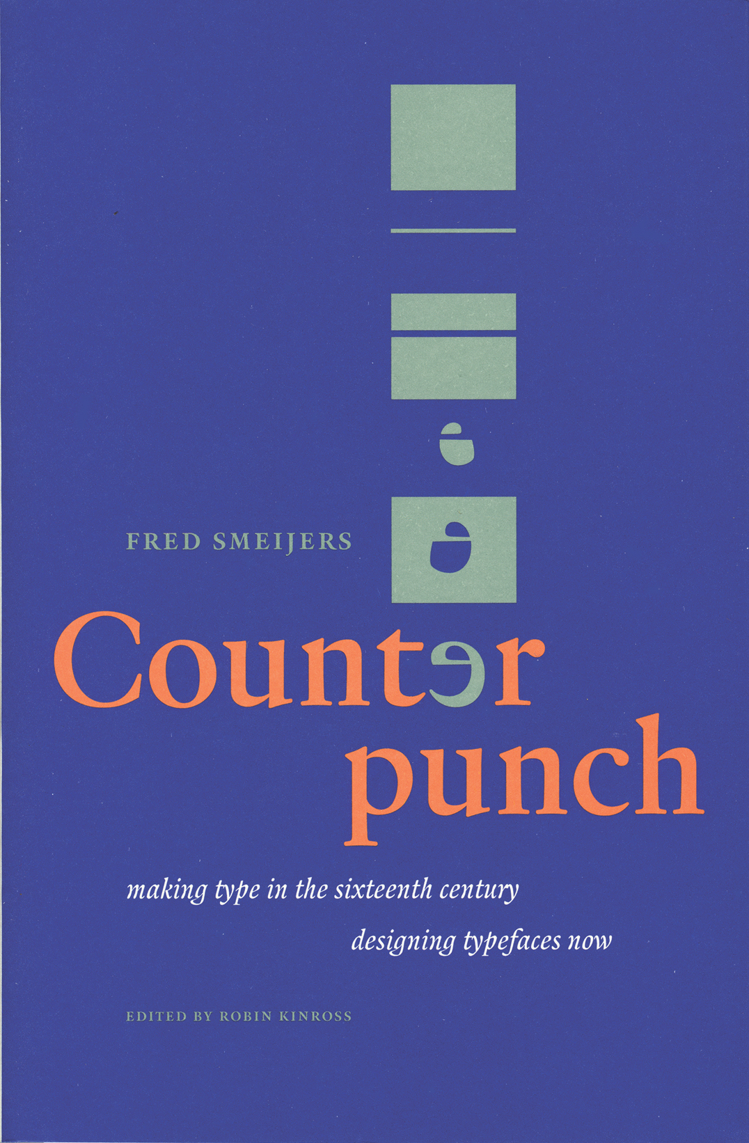
Hyphen Press / 1998.07.26
This article was written in October 1996 for the ‘Typelab Krant’. This was a laser-printed and stapled publication circulated at the ATypI meeting in The Hague in that year: it was published in the issue of 25 October 1996. We resurrect the piece now, because it gives some picture of the way in which Hyphen Press books come into existence.