Remembering James Mosley
robin / 2026.01.07
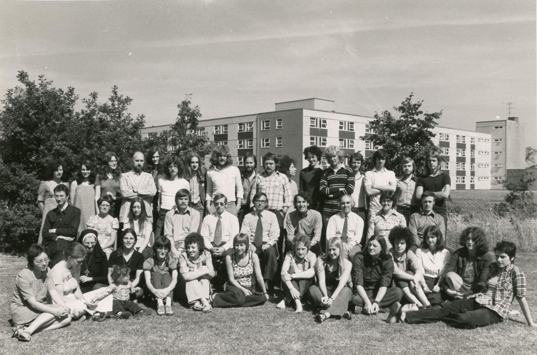
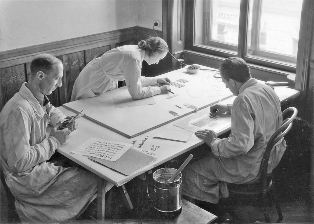
My first knowledge of James was at Reading in the 1970s, at his Saturday morning lectures on the history of type and letterforms. It was only later that I realized how exceptional he was as a lecturer. These were discourses, apparently improvised, using images – often his own high-quality photographs – as instances and stepping stones in a historical account.
Substack!
robin / 2025.09.24
A new series of occasional posts by Robin Kinross is now up on Substack: here. These look at particular books – mostly recently published – evaluating their content, their editing, and their material production.
Bill 5, Tschichold 6
robin / 2025.02.24
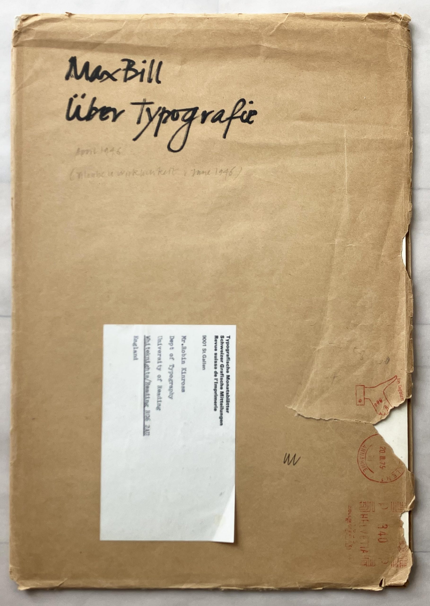
The exchanges in 1946 between Max Bill and Jan Tschichold never go away. They combined typography, aesthetics, morality, politics, at a level of seriousness that is rare in any such debate between designers. (In a one sentence summary: Bill accused Tschichold of now practising a reactionary typography, with dangerous political echoes; Tschichold considered Bill’s typography to be artistic in a bad sense, and with a false elevation of machine production.) Recently, revising a text that I had written in the 1990s about the conditions for design in Europe after 1945, I had to check its publishing details again.
‘Lettercarving for type designers’
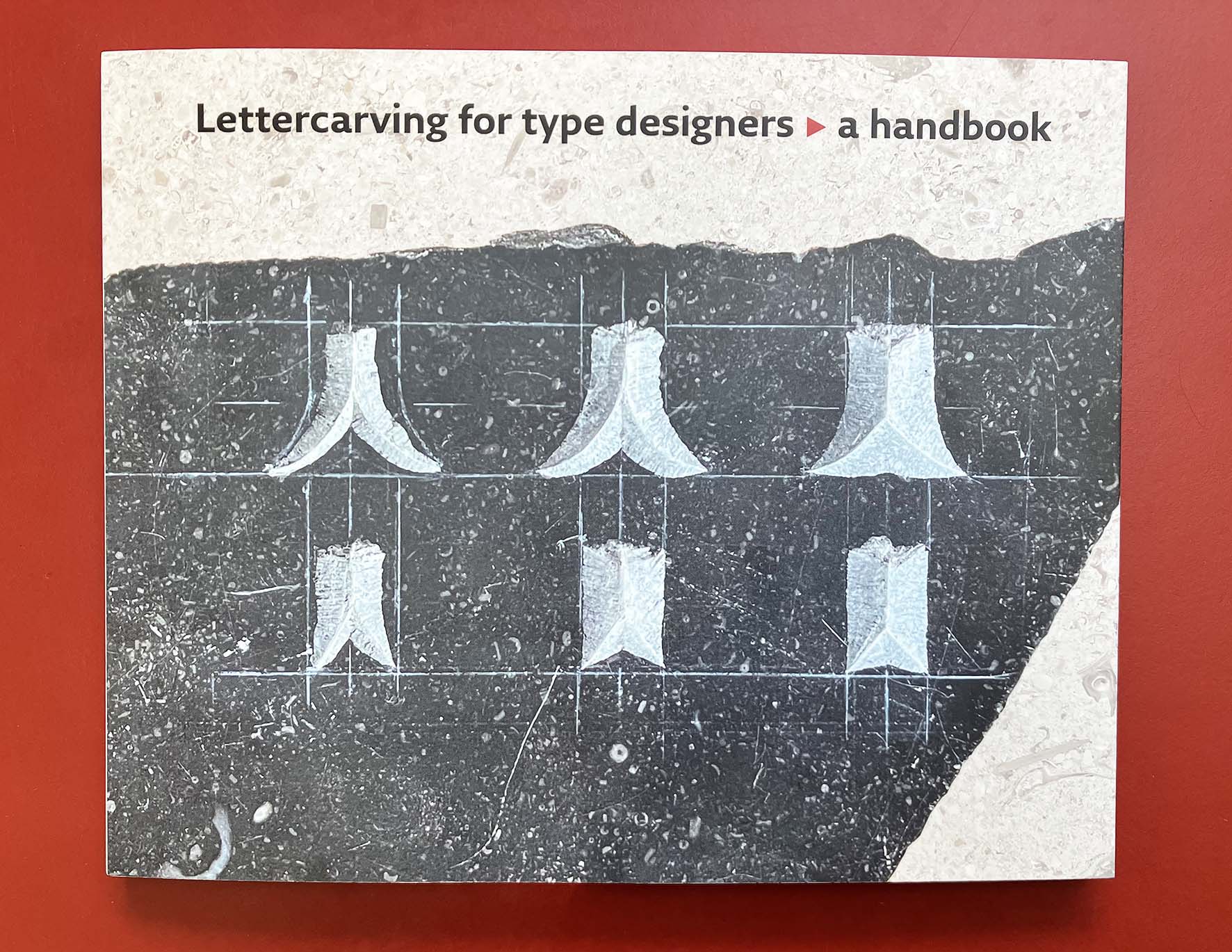
robin / 2024.12.07
Alongside designing books, Françoise Berserik has worked for many years as a lettercarver – making signs, memorials, gravestones to commission. She has also taught lettercarving to students on the Type and Media course at the Koninklijke Academie van Beeldende Kunsten in The Hague. They take it seriously there: this course is not an optional extra. Now, with the support of the Academy, she has written and published a handbook on this practice, written specifically for type design students and illustrated with their work.
Nick Jacobs as editor and publisher: some memories
robin / 2024.04.11
My first encounter with Nick Jacobs happened in 1970. I had started to read New Left Review: in those days especially, the journal had an air of discovery about it, and I seemed to read most of every issue. That year, 1970, was when New Left Books was launched. NLR subscribers could buy these books by mail order, at a favourable price.
Hat Hut: some history and a new development
robin / 2023.09.21
With Hat Hut, the musical content and the graphics, typographics and architecture of the packet, are fused more than most. Werner Uehlinger, who runs the label from Basel (before that, Therwil in the same Swiss canton) has a telling story of how it began in 1975.
Summer break 2023
robin / 2023.07.10
The office is now closed for two weeks. Orders for books or music CDs can be made, but will not be processed and sent off until Monday 24 July.
Winding down
robin / 2023.06.12
As part of the process of winding down Hyphen Press’s sales, we have now closed our agreement with our UK distributor. This means that any in-print book or CD must be bought directly from this website.
Blank pages count
robin / 2023.05.15
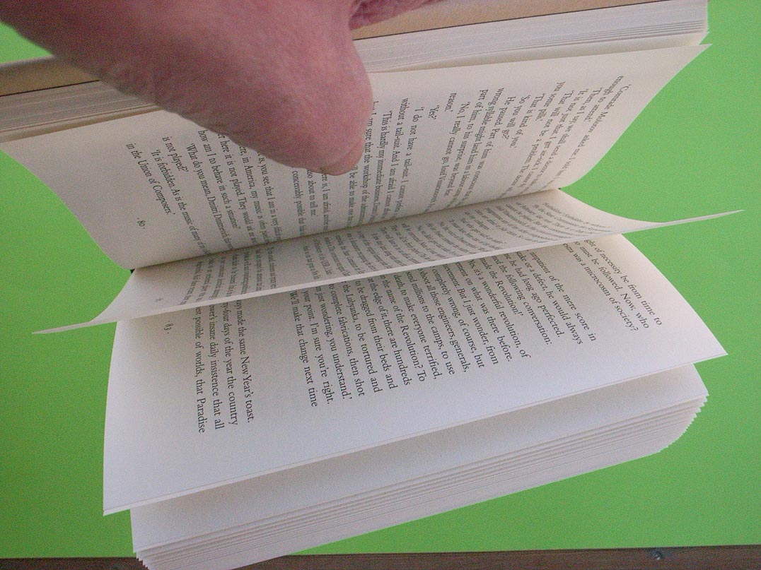
As often, it began with a remark by Anthony Froshaug. I had told him that some book had a certain number of pages – it was an odd number. He observed that this must be a strange book. To imagine a sheet of paper with just one side, or to imagine a folded sheet or a gathered number of folded sheets, with five or seven or nineteen or twenty-one sides is to enter the world of M.C. Escher.
An index to the journal
robin / 2023.01.14
Last year we moved this website to a new hosting company and into a new CMS (WordPress). The appearance of the website has changed only in some details. This has provided an opportunity to check through content, and especially to look at and try to mend the now many broken links. This is a large and still continuing project. It has also provided the occasion to update the occasional indexes to the journal that have been offered here. These are now consolidated as the present post.
Typography papers is being made available again
robin / 2022.12.15
We are glad to announce that articles from the Typography papers series are being made available as free-to-download pdf files on the University of Reading’s Typography & Graphic Communication website.
Remembering Gerrit Noordzij
robin / 2022.05.06
Gerrit died a few weeks ago, aged 90. Even more than most human beings, he was complex. He was simple, sophisticated, dogmatic, open, authoritative, anti-authoritarian, inquiring, certain, proud, humble, unpretentious, masterly, amateur. I did not know him well, but did encounter and engage with him and his work over many years.
‘This is one of the best books on graphic design ever’
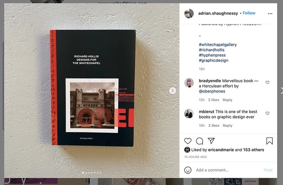
robin / 2021.03.02
We agree with Michael Bierut, a serious reader and judge of graphic design books. He made this comment yesterday on the Instagram feed of Adrian Shaughnessy (another serious reader and judge of graphic design books).
On George Mackie and his work
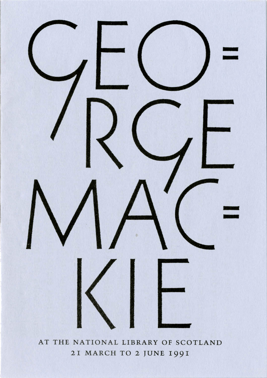
robin / 2021.01.11
An appreciation of the work of the artist-designer George Mackie (1920–2020)
Shipping orders to the USA
robin / 2020.08.21
Following the recent sharp increase in prices for sending packets by airmail from the UK to the USA, we will ship lower value packets to the USA with surface mail. For orders with a value of £80 and over, we will use a courier.
Sales from this website: new
robin / 2020.07.04
After a long break during the period of lockdown, we are now able to sell books and music CDs from this website.
Sales from this website
robin / 2020.03.20
At present, due to restrictions of movement during the outbreak of Covid-19, our office is closed and we cannot respond to orders from books from this website.
Winter holidays
robin / 2019.12.06
The office is closed for orders for books and CDs, from 6 to 16 December. Orders received during this period will be dispatched on 17 December.
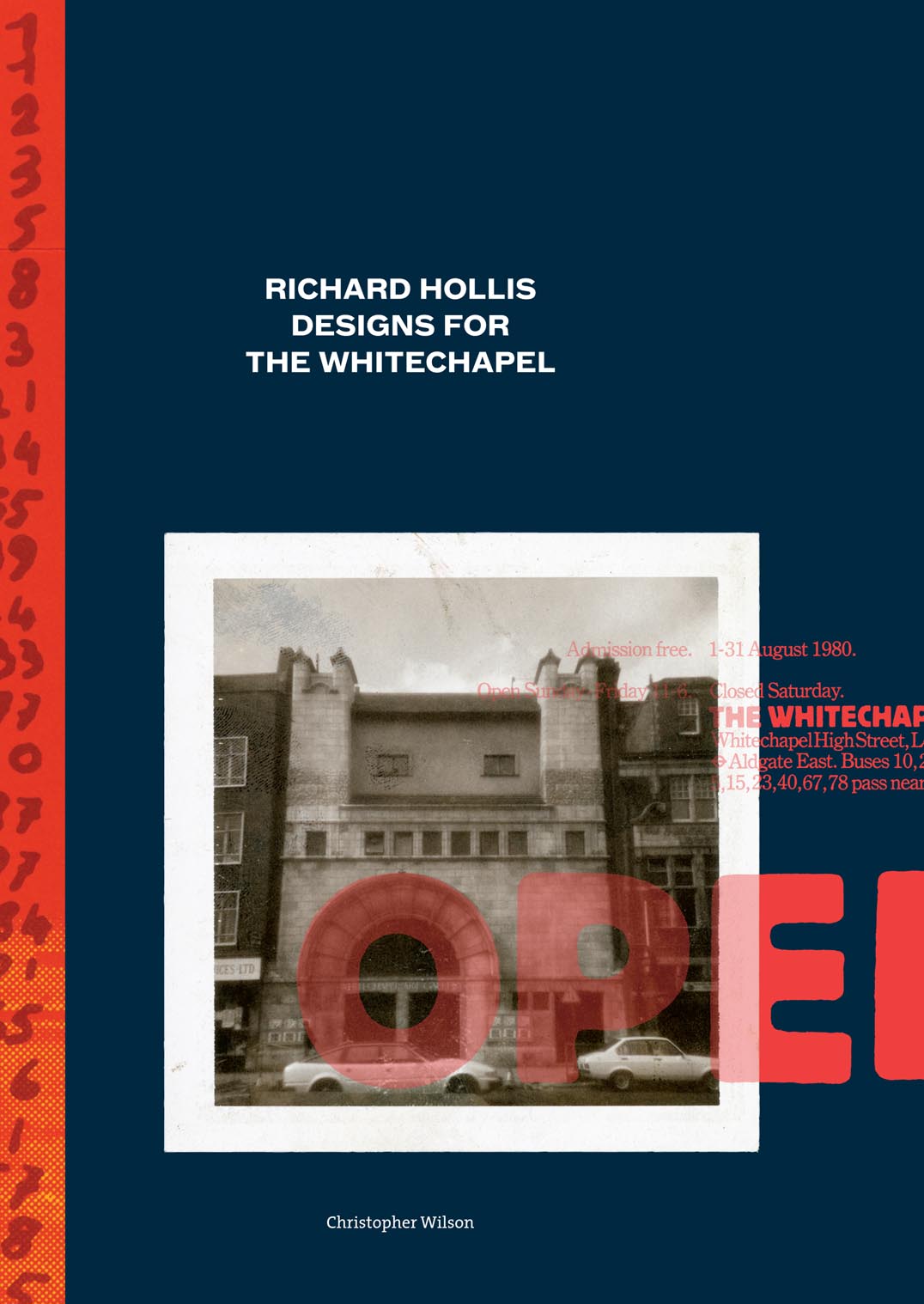
Price reduction
robin / 2019.09.26
Christopher Wilson’s Richard Hollis designs for the Whitechapel now sells for £15.
Our books with other publishers
robin / 2019.09.25
As Hyphen Press gradually winds down its activities, we are passing titles on to other, sympathetic publishers.
Summer holidays 2019
robin / 2019.07.09
The office is closed for orders for books and CDs, from 10 to 28 July. Orders received during this period will be dispatched on 29 July.
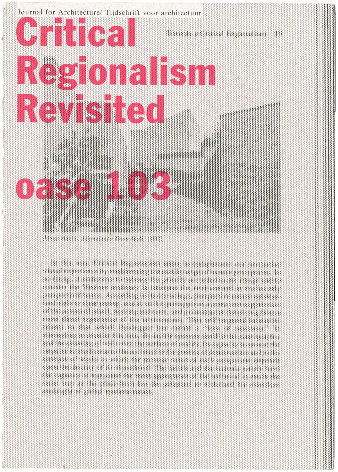
Frampton, Potter, Martens – and exemplification
robin / 2019.06.25
The latest issue of Oase, the journal of architecture, is worth getting hold of. It is devoted to a discussion Kenneth Frampton’s theory of ‘critical regionalism’, which he published first in an essay of 1983. In this special issue of Oase, the original article is reprinted in facsimile, with Dutch translation added; there is a retrospective interview with Frampton, and discussions of the critical regionalism theory by other, younger practitioner-historian-critics: the combined role that Frampton has himself exemplified in his now long career.
David Wild speaks
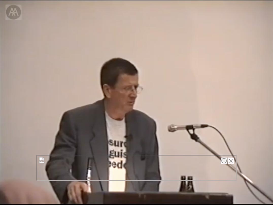
robin / 2019.06.13
This video of David Wild talking at the Architectural Association in London in 1998, to launch his book Fragments of utopia, has emerged on YouTube.
‘The stroke’ reissued
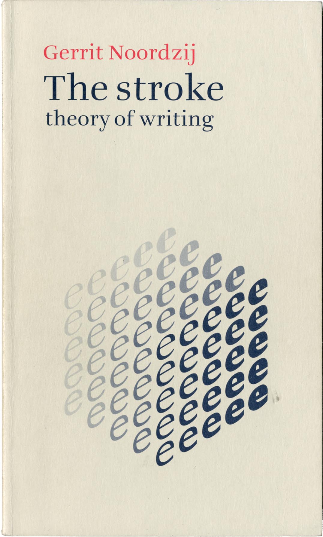
robin / 2019.03.18
Gerrit Noordzij’s The stroke, in the English-language translation that we published first in 2005, is being reissued this year by the Amsterdam printer and publisher De Buitenkant, in collaboration with the KABK (Royal Academy of Art), The Hague.
‘Type spaces’ download
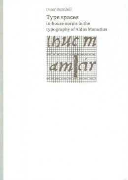
robin / 2019.03.11
Peter Burnhill’s book Type spaces, published in 2003, has been out of print for several years. The author died in 2007 and there is no question of revising the book – though one might write another one, extending its material and qualifying its ideas. As a service to readers, we are making the work available again as a free download
‘Typeform dialogues’, second edition

robin / 2019.01.08
Last month we uploaded a second, much extended, edition of the ‘Typeform dialogues’ document, first published here in 2012.
Punchcutting at ATypI, San Francisco, 1994
robin / 2018.10.08
In the 1990s the annual meetings of ATypI (Association Typographique Internationale) were often fascinating events. The organization was in transition. Formed in 1957, as a grouping of type manufacturers, it represented the industry’s attempt to regulate itself, and especially to prevent – without recourse to the courts of law – one company from copying the designs of another.
The memory lingers on
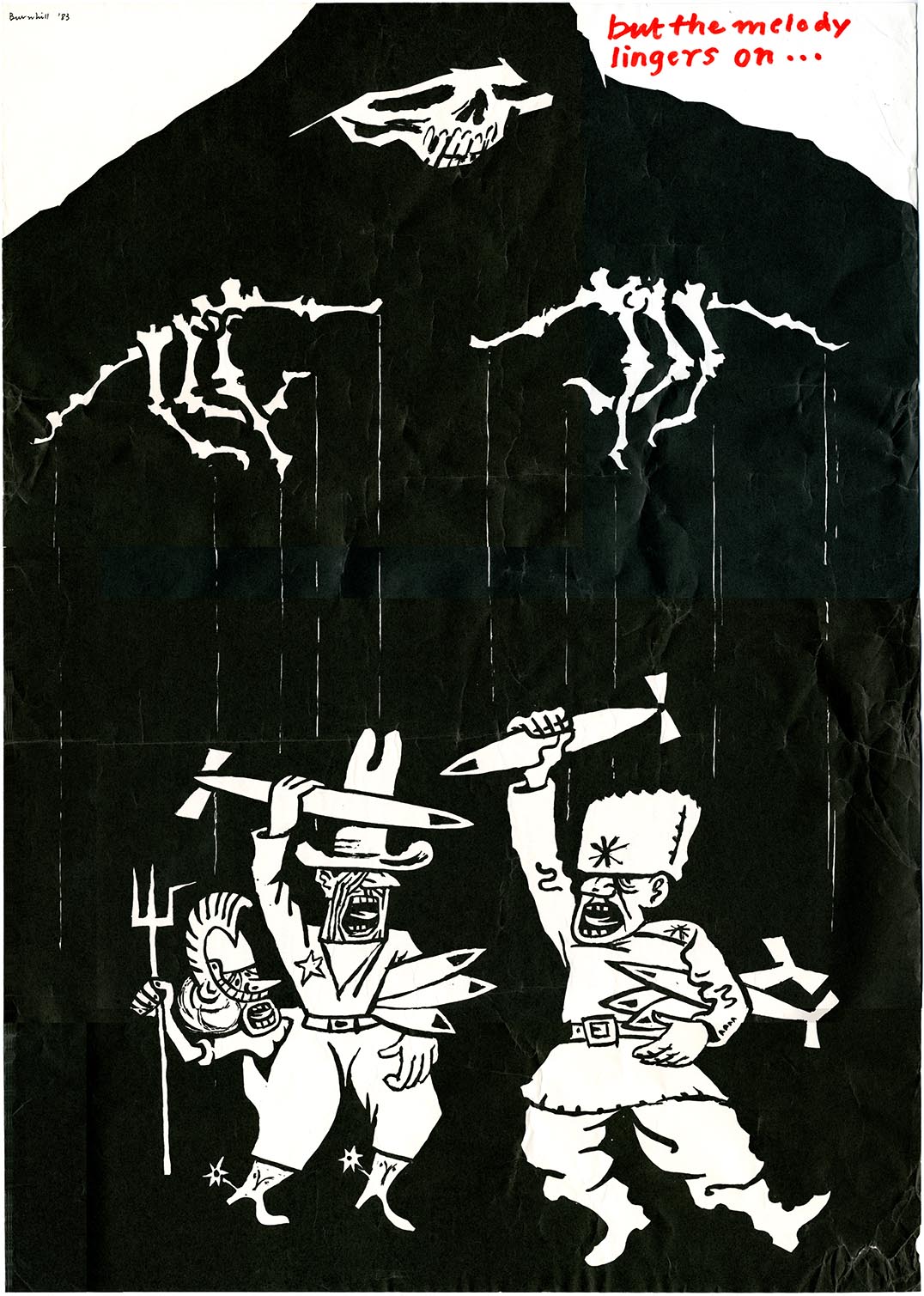
robin / 2018.08.20
This poster by Peter Burnhill has emerged from a tidy-up in the office. It’s a nice example of his talents as an artist, and of his activity as a political campaigner. Peter worked for his local, Stafford branch of the Campaign for Nuclear Disarmament, helping to run a weekly CND stall in the town. This was at the time of Cold War escalation, with the installation of US missiles in Europe.
Summer holidays 2018
robin / 2018.07.11
The office is closed for orders for books and CDs, from 12 to 28 July. Orders received during this period will be dispatched on 30 July.
For a typography of details
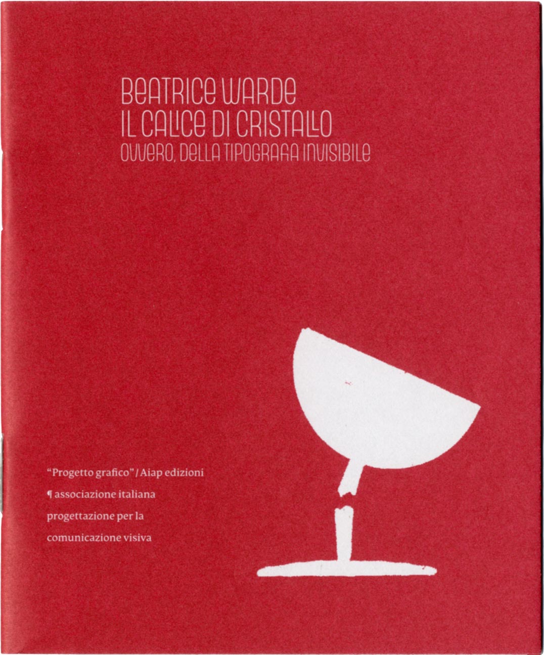
robin / 2018.03.13
In 2006, invited by Giovanni Lussu and his colleagues on the editorial board of the journal ‘Progetto grafico’ (published by Aiap, the association of Italian graphic designers), I wrote a consideration of Beatrice Warde’s ‘Crystal goblet’ essay. This became part of a symposium on Warde’s view of typography, which was published in ‘Progetto grafico’, no. 8.
Office closed for orders, 11–17 December
robin / 2017.12.10
The Hyphen Press office is closed this week.
Copyright in Isotype work: the claim of the Arntz estate
robin / 2017.11.09
This article follows on from the more general considerations on copyright in Isotype published here.
Copyright in Isotype work
robin / 2017.08.14
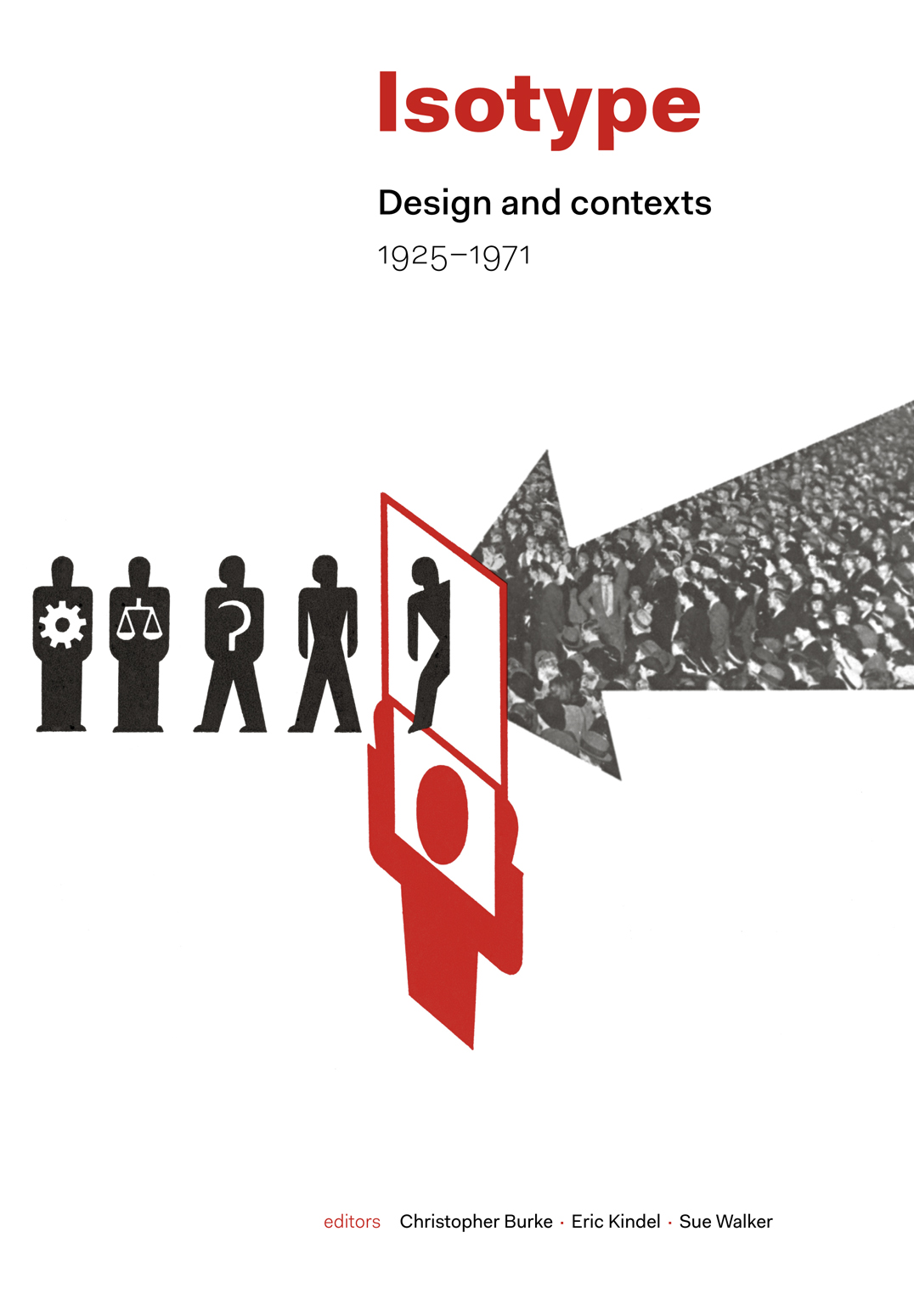
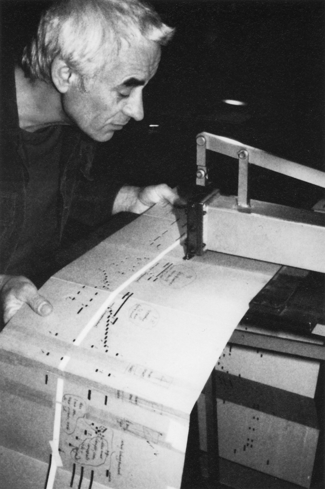
Isotype is now the generally used name for the work in visual communication carried out by groups under the direction of Otto Neurath and, after his death in 1945, by Marie (Reidemeister) Neurath. The institutions that produced this work were the Gesellschafts- und Wirtschaftsmuseum in Wien [GeWiMu] (1925–34), the International Foundation for Visual Education [IFVE] (1934–40), and the Isotype Institute (1942–71). We have published three books on Isotype: From hieroglyphics to Isotype, The transformer: principles of making Isotype charts, and Isotype: design and contexts, 1925–1971. The question of where copyright in the Isotype work lies has been a persistent one. The notes here provide an answer to it.
The right direction
robin / 2017.05.08
A previous installment of this occasional series on book production concerned a novel by Julian Barnes, The noise of time. The book was published in 2016 in London by Jonathan Cape, an imprint of Vintage Publishing, and in turn part of Penguin Random House UK.
‘Musical offering’ arrived

robin / 2017.05.05
We have been assembling the discs, booklets, and packs for our next Hyphen Press Music CD, ‘Musical offering’, to be released on 26 May (in the UK, and a week later in continental Europe).
‘Winter light’: a new book
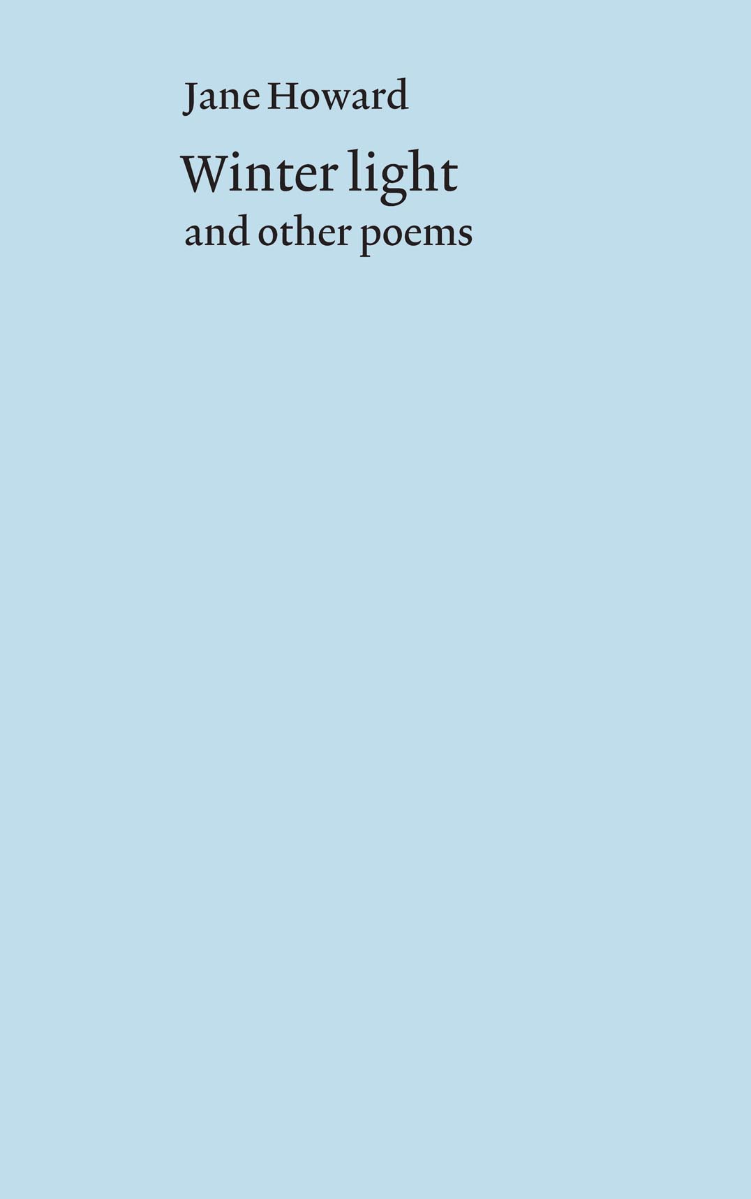
robin / 2017.02.16
A couple of months ago, just before Christmas, we published a new book: Winter light, and other poems by Jane Howard. This small book (a single section of 32 pages, stapled and with a jacket wrapped around) collects poems written over many years.
Website sales before Christmas
robin / 2016.12.16
The Hyphen Press office is closed now until 24 December. This means that during these days we cannot process and send out any orders made from this website for books and CDs. Any orders received now will be attended to promptly in the days immediately after Christmas.
‘Richard Holllis designs for the Whitechapel’: progress
robin / 2016.11.25
Our Richard Hollis designs for the Whitechapel is perhaps the most anticipated, most delayed work on which we have worked. Christopher Wilson’s book was first announced to the world in November 2012, as due for publication in spring 2013. Since then the work has grown and become elaborated.
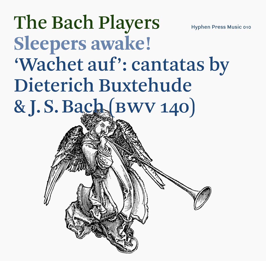
‘Sleepers awake!’ arrived
robin / 2016.10.05
The printed materials for the next Hyphen Press Music CD have arrived in the office – we assemble and shrink-wrap these CDs here. This is Sleepers awake!, in which The Bach Players perform two settings by Dieterich Buxtehude of the ‘Wachet auf’ text (‘wake up, the voice calls us’), and one by J.S. Bach – as well as some fascinating, connected extra works.
Risen spaces
robin / 2016.07.04
Comments on the picture-sharing service Instagram have pointed to an interesting detail in Harry Carter’s book A view of early typography. Our edition of this work was a facsimile reprint of the book published by Oxford University Press in 1969, with added editorial matter.
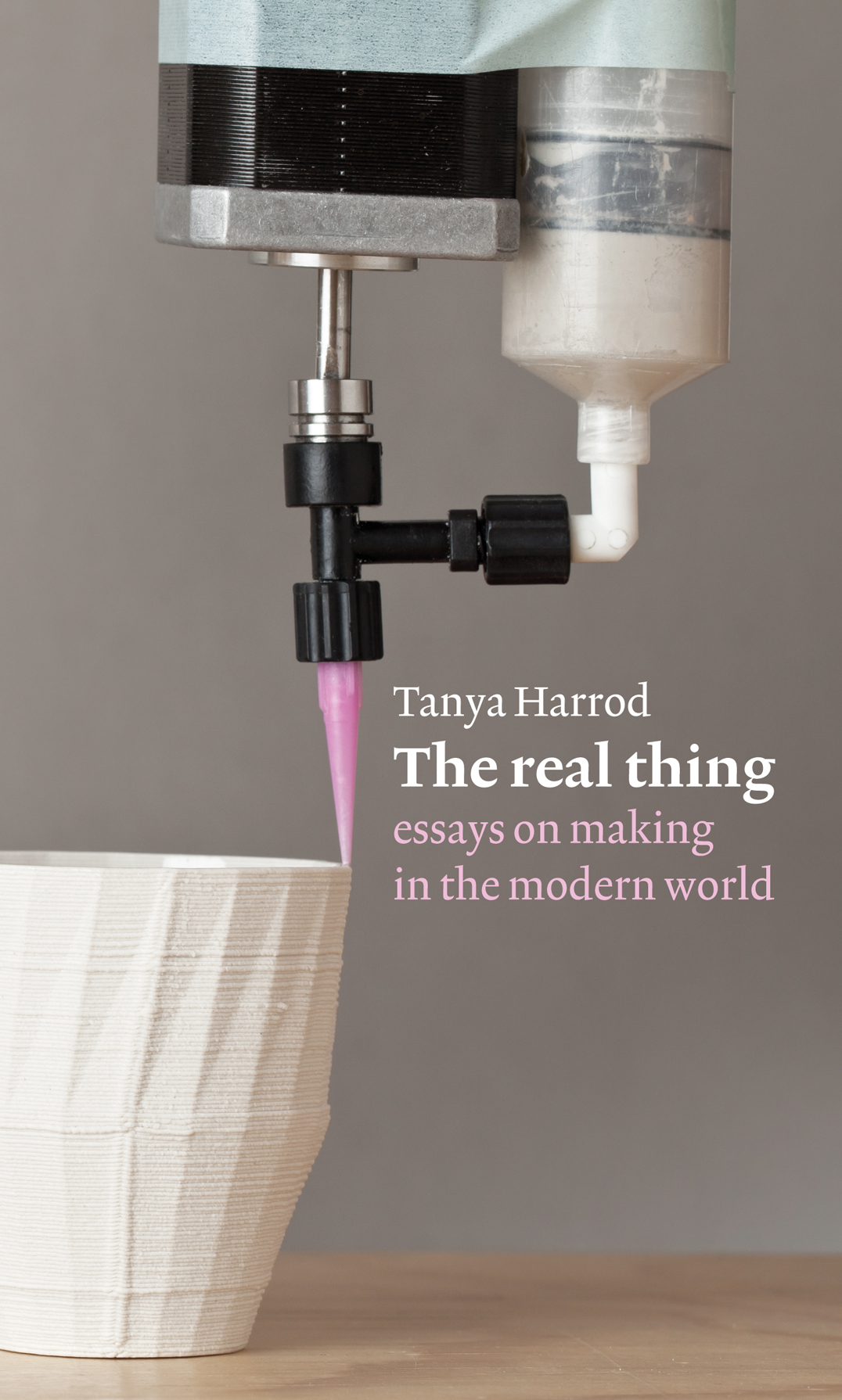
Tanya Harrod in conversation
robin / 2016.05.11
On 10 March at the Vitra showroom in London, Tanya Harrod spoke about her work as a writer, in conversation with Grant Gibson, editor of Crafts. This was one of the magazine’s series of Book Club events. For its illumination of her book The real thing and for its discussion of issues in the present art/craft scene, the conversation is well worth listening to.
Title casing
robin / 2016.03.25
A detail of Hyphen Press style has sometimes caused puzzlement. We give the title of a book with initial capitalization only in the first word. Thus: The arrow of gold, rather than The Arrow of Gold. We have used this style in the text of most of the Hyphen books, and in their display typography too, in catalogues, and on this website.
The wrong direction
robin / 2016.02.11
Julian Barnes’s latest novel was published in London a couple of weeks ago. This is mainly a note on its qualities as a physical object.
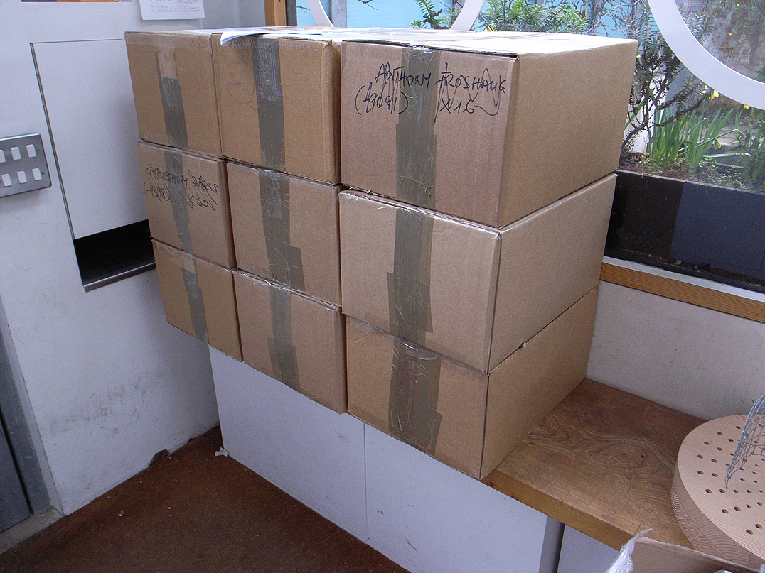
Books discovered in a cupboard
robin / 2016.02.03
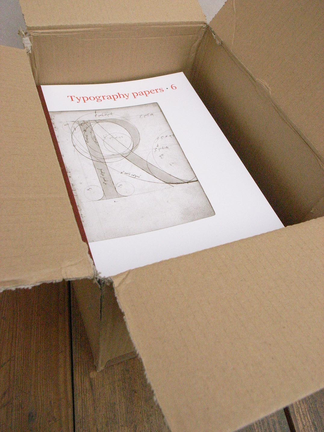
A familiar book-trade story: a book sells out, is declared out-of-print. A few years pass and a box of fresh copies of this item turns up in some clear-out or tidy-up in a distributor’s warehouse or a publishing office. This has just happened with Typography papers 6, which we published in 2005. We have 30-odd copies for sale.
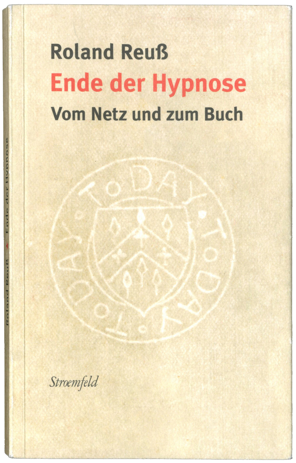
Net and book: an interview with Roland Reuß
robin / 2015.11.30
Roland Reuß teaches literature and text-editing at the University of Heidelberg, and co-directs the Institut für Textkritik there. As well as co-editing, with Peter Staengle, major historical-critical editions of Kleist and Kafka, he is a prolific writer on the subject of literature and editing. In addition, in the last few years he has published a stream of articles, especially in newspapers (notably the Frankfurter Allgemeine Zeitung and the Neue Zürcher Zeitung), on wider and more explicitly political themes: the rights of authors and publishers in the face of unlicensed copying of their work, the continuing virtues of the printed book as a means of embodying and duplicating texts and images, the role of independent publishers and booksellers in maintaining human culture.
‘Detail in typography’ available again
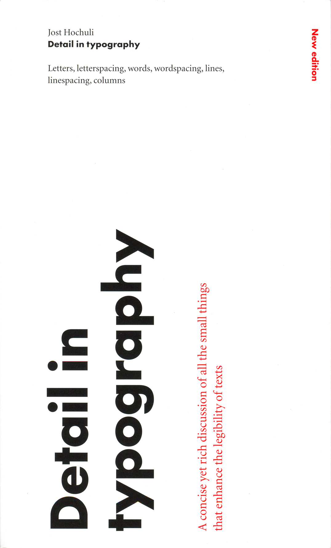
robin / 2015.10.23
Our edition of Jost Hochuli’s Detail in typography has been out of print for some time. The book is now back in print with Éditions B42, along with the original German-language and French-language editions of the work. We are happy to recommend this book to readers.
Anarchy on Nottingham
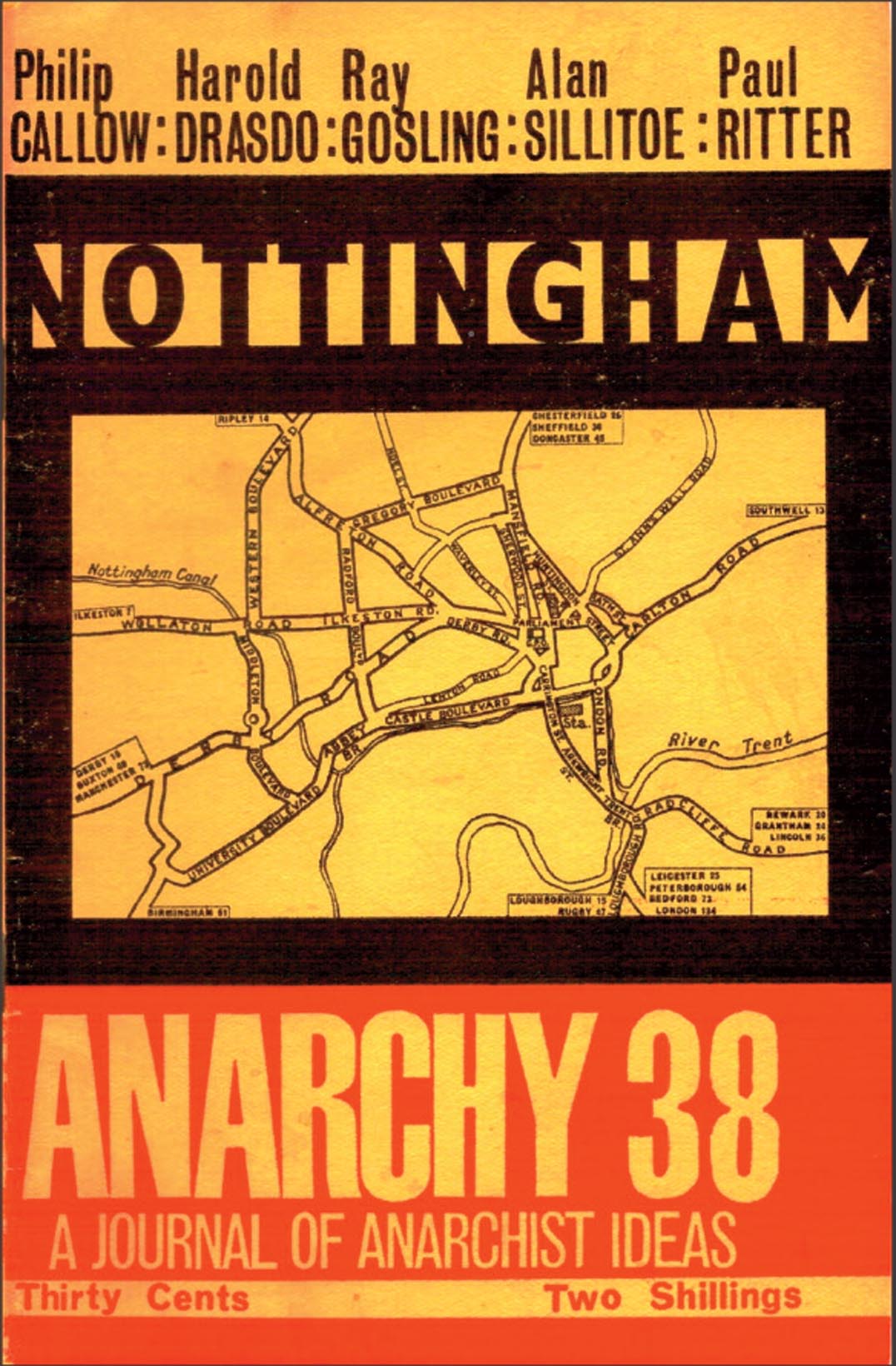
robin / 2015.09.22
Copies of the journal Anarchy, which is the subject of our book Autonomy, are certainly now items for collectors. But Anarchy no. 38, devoted to the city of Nottingham, is back in print from Five Leaves, the publisher – and also bookseller – with its home in that city.
Karel Martens at the KABK
robin / 2015.03.12
The Gerrit Noordzij Prize, organized by the Type and Media postgraduate course at the Koninklijke Academie van Beeldende Kunsten (Royal Academy of Art) in The Hague, is awarded every three years. Last week it was presented to the type designer Cyrus Highsmith, and the previous winner, Karel Martens, was celebrated in a seminar, an exhibition, and a book.
New book, new CD
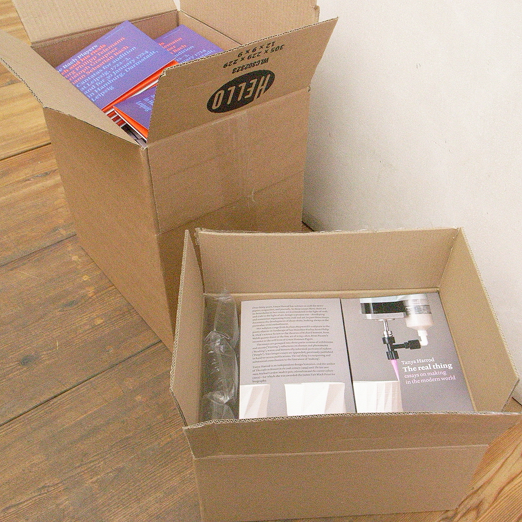
robin / 2015.02.18
Copies of our new book, Tanya Harrod’s The real thing, arrived before Christmas. We published it formally on 22 January, launching it that evening at a reception at the Art Workers’ Guild in London.
CD packages
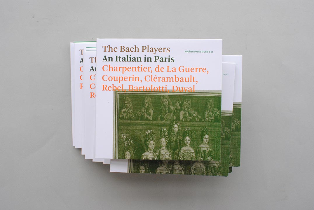
robin / 2014.11.28
The CD An Italian in Paris that we published earlier this year has just received a very nice review in the magazine Early Music Today. The reviewer is Nicholas Anderson, whom a few of us will remember as a warm and knowledgeable voice on BBC Radio 3 in the 1970s – in the days when standards of music broadcasting at Radio 3 were high.
Copyright in designed pages
robin / 2014.05.25
When graphic design work is reproduced, what rights do the people who made this work have? This piece looks at some of the issues, and at what United Kingdom law has to say about them. Reproduction of works of art presents a connected set of issues, and these will be looked at in a following article.
Style guide
robin / 2014.01.02
At work over the holidays on a writer’s first draft, the following notes seemed of possible wider interest.
‘Typography papers 9’, and ‘Isotype’
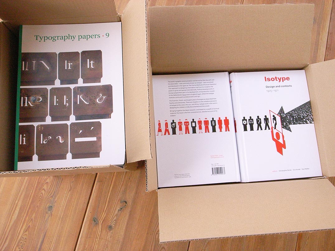
robin / 2013.12.10
Copies of our two new titles arrived in the office recently, and we are releasing them for sale today. These are Typography papers 9, edited by Eric Kindel and Paul Luna, and Isotype: design and contexts, 1925–1971, edited by Christopher Burke, Eric Kindel, and Sue Walker.
In translation
robin / 2013.10.18
One of the most gratifying and interesting moments in book-publishing is seeing a book of ours issued by another publisher in a translated edition.
‘Detail in typography’ out of print
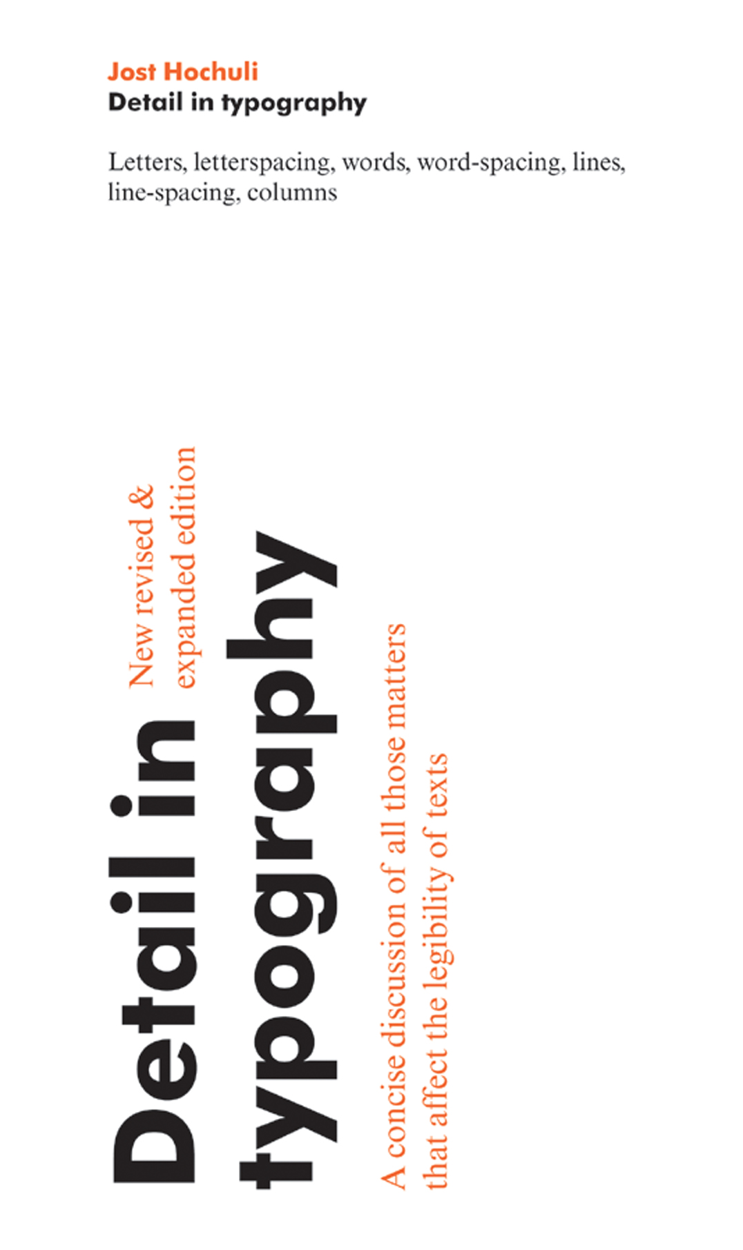
robin / 2013.05.08
We have sold the last copies of Jost Hochuli’s Detail in typography (2008, reprinted in 2009). Demand for this book continues, but we have decided not to make a reprint.
‘Wim Crouwel: mode en module’: a review
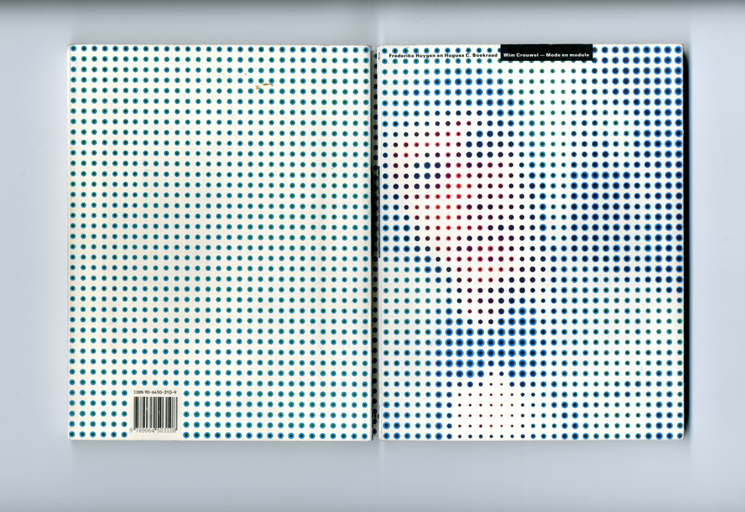
robin / 2013.04.05
This review of the book Wim Crouwel: mode en module by Frederike Huygen and Hugues Boekrad, was written for and published in an issue Typography papers, now out of print. The Crouwel book, as it was often referred to, was issued only in a Dutch edition, which sold out quickly. Since then, Wim Crouwel’s renown has only increased.
CDs in boxes
robin / 2013.03.24
Last week we sent off 1550 Bach Players CDs, all assembled in the office, to the warehouse of our new distributor Codaex, in Belgium.
New distributor for our CDs
robin / 2013.03.19
From next month our CDs will be distributed by Codaex. Through the various Codaex partners we will for the first time be able to reach shops in Belgium, France, Germany, Italy, the Netherlands, Norway, as well as the UK.
Bread and Roses Award 2013 shortlist
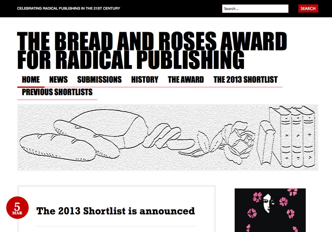
robin / 2013.03.06
We are delighted that Autonomy, edited by Daniel Poyner, is among the books shortlisted for this year’s Bread and Roses Award. The book finally chosen for the award, by a panel of three, will be announced on 11 May at the London Radical Bookfair in the good old Conway Hall.
‘Autonomy’ at Housmans
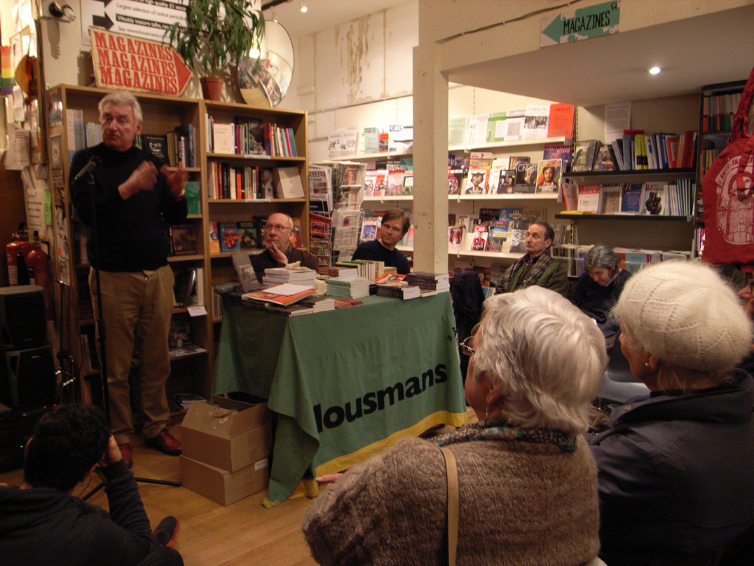
robin / 2013.02.10
We were part of a successful and good-spirited event at Housmans bookshop in London last night. The occasion was the publication of our book Autonomy, and the posthumous collection of Colin Ward’s writings on ecological themes: Talking green.
Talking about Colin Ward and ‘Anarchy’
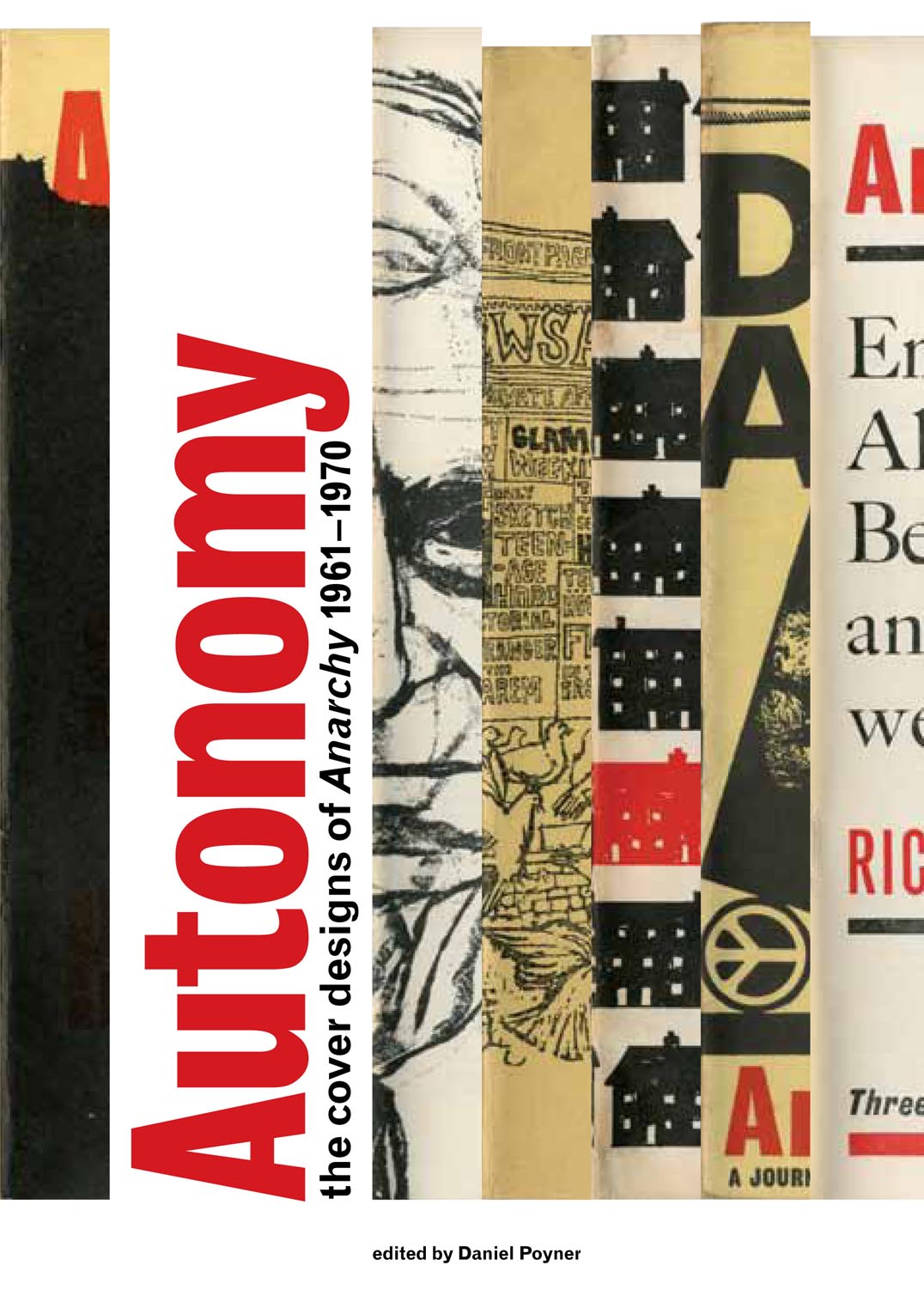
robin / 2013.01.07
On Saturday 9 February (6.30 pm), our book Autonomy is the subject of an event at Housmans Bookshop in London.
‘Typeform dialogues’
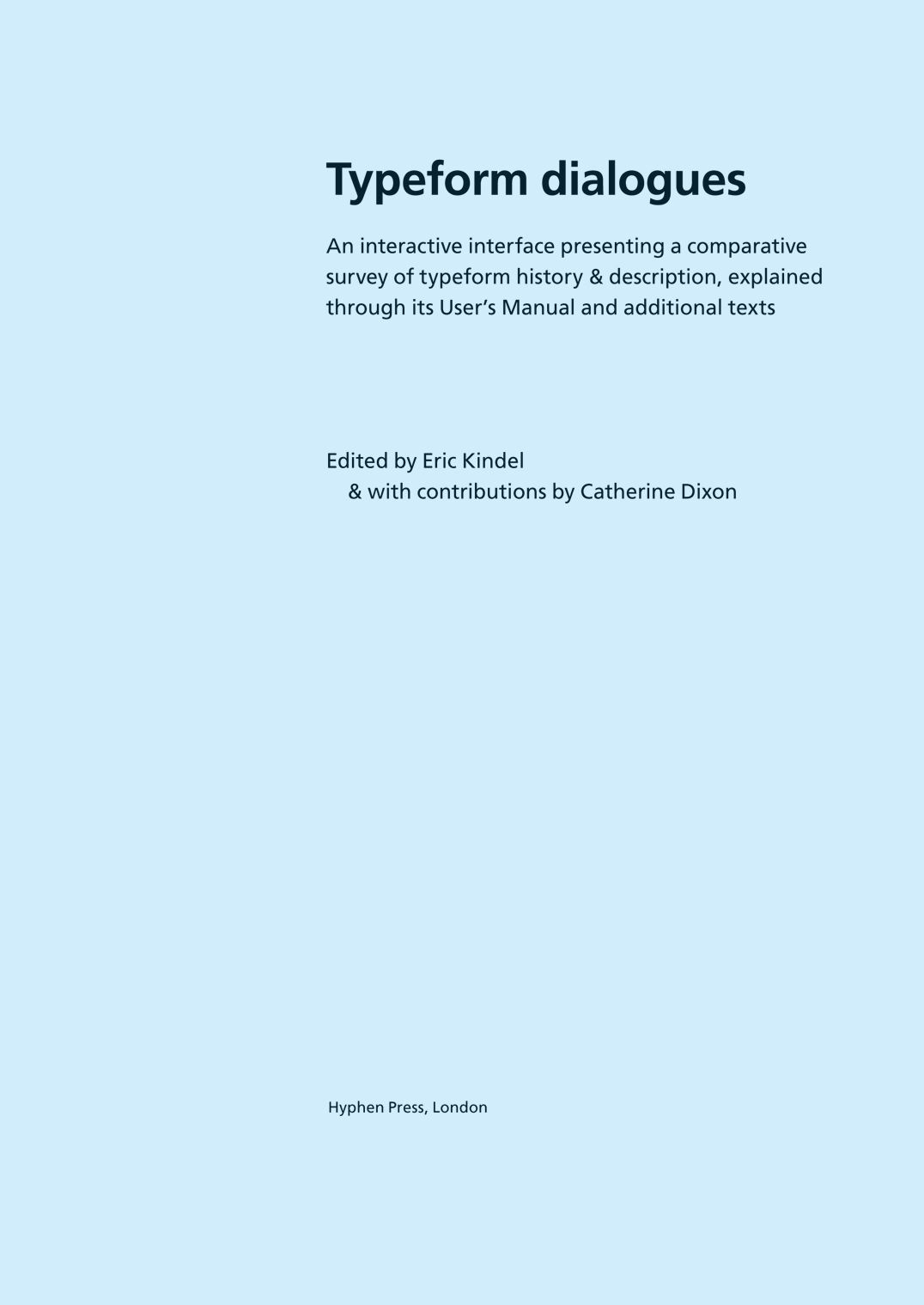
robin / 2012.11.26
We have today posted – free to download – a document that gathers materials from the Typeform dialogues project, carried out by Eric Kindel, Catherine Dixon, and others at Central Saint Martins, London, in 1994–8 and afterwards.
Remembering Robin Fior
robin / 2012.11.20
Robin Fior died on 29 September, in hospital at Mafra, outside Lisbon. This is not an obituary (his friend Richard Hollis has written a good one), but merely a set of memories of someone I knew, off and on, over twenty or so years. He was part of a certain network of designers in Britain, whose work has provided a main impetus for Hyphen Press.
‘Autonomy’ arrived
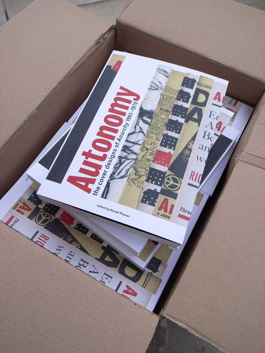
robin / 2012.10.26
Some finished copies of our next book, Autonomy: the cover designs of ‘Anarchy’ 1961–1970 were delivered to the office this morning.
Book and zine fair, Spike Island
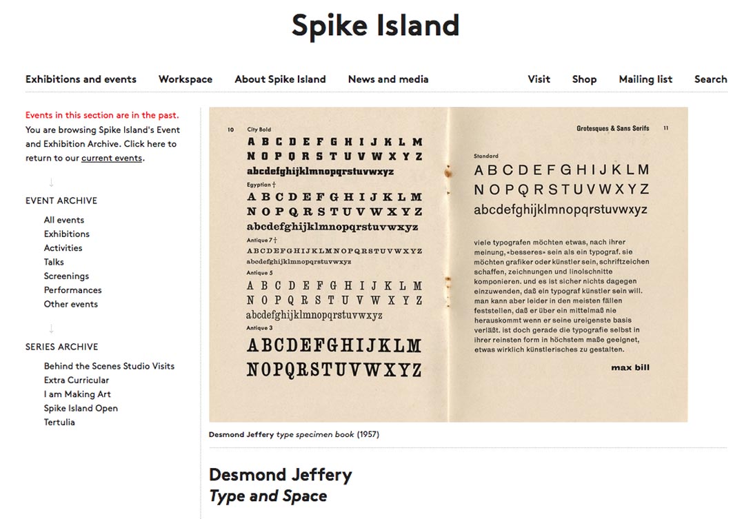
robin / 2012.10.15
This Saturday 20 October we are taking part in the book and zine fair at Spike Island, Bristol – not because we publish experimental literature (we don’t), but because of some Bristol connections (starting with Norman Potter) and because of an exhibition there of pieces designed and printed Desmond Jeffery.
Frankfurt 2012
robin / 2012.10.05
Our books and catalogues are at the Buchmesse, on the stand of Coen Sligting Bookimport: Halle 4.1, K547.
Reading in public
robin / 2012.09.12
What happens to books when they leave home and are taken out into the public realm? We posted on this here and here. Now see this wonderful blog on the theme: the Underground New York Public Library.
In Vienna
robin / 2012.06.07
Next week in Vienna, two events hosted by the Typographische Gesellschaft Austria take place: a workshop with Jost Hochuli (Monday 11 to Friday 15) and a talk by Robin Kinross on ‘Design for meaning’ (Wednesday 13).
They order these things better in France
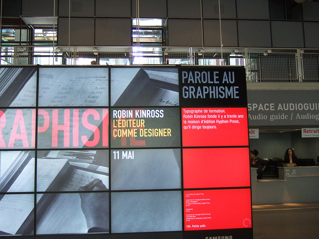
robin / 2012.05.16
The photograph below records the entrance space at the Centre Pompidou in Paris, last week, where Robin Kinross gave a ‘conférence’ on the occasion of the publication of the French edition of Modern typography.
Editing as design, in France
robin / 2012.05.04
On the occasion of the publication of the French edition of Modern typography, Robin Kinross is speaking on the theme of ‘editing as design’ at ÉSAD Valence next Thursday, and at the Centre Pompidou on Friday.
Shipping costs within the UK
robin / 2012.04.28
Until now we have had a policy of not charging UK customers for the carriage of books and CDs bought from this website. But, on Monday, the Royal Mail is raising its charges markedly. Postage costs will represent an even larger proportion of a purchase – and we have decided now to introduce charges to cover our costs.
The cover of ‘Fellow readers’
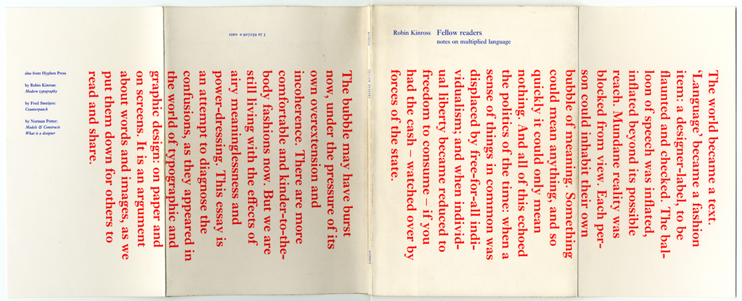
robin / 2012.04.26
This is the cover of the pamphlet Fellow readers: notes on multiplied language, which Hyphen Press put out in 1994. The piece was prompted by the debates over typography that had been published in the pages of Emigre and Eye magazines, and elsewhere. A participant in this discussion, I saw the chance to make a more extended contribution when my book Modern typography was coming up for a reprint.
Twitter fascination
robin / 2012.04.16
Postings in this journal column have been light over the last few months. This is partly just because we’ve been busy. But it is partly due to having opened a Twitter account (@hyphenpress).
Our fifth CD
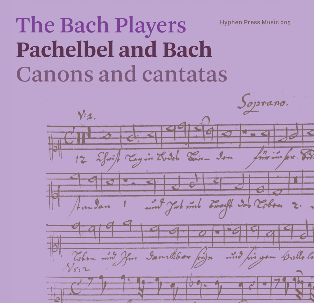
robin / 2012.03.14
Copies of our fifth CD arrived in the office last week. This is a double CD, offering an extensive selection of pieces by the two composers, Johann Pachelbel and J.S. Bach.
Returning
robin / 2012.01.22
Many apologies to anyone who has been trying to find this website in the last few days. Our provider had put it on a new server – with essential elements missing, and nothing showed. But now we’re back.
A pause, and greetings
robin / 2011.12.23
Our office is now closed for the Christmas and New Year holidays. Any orders made on the website will be gratefully received during this period – but the books and CDs cannot be posted to you until the first week of January. Greetings of the season!
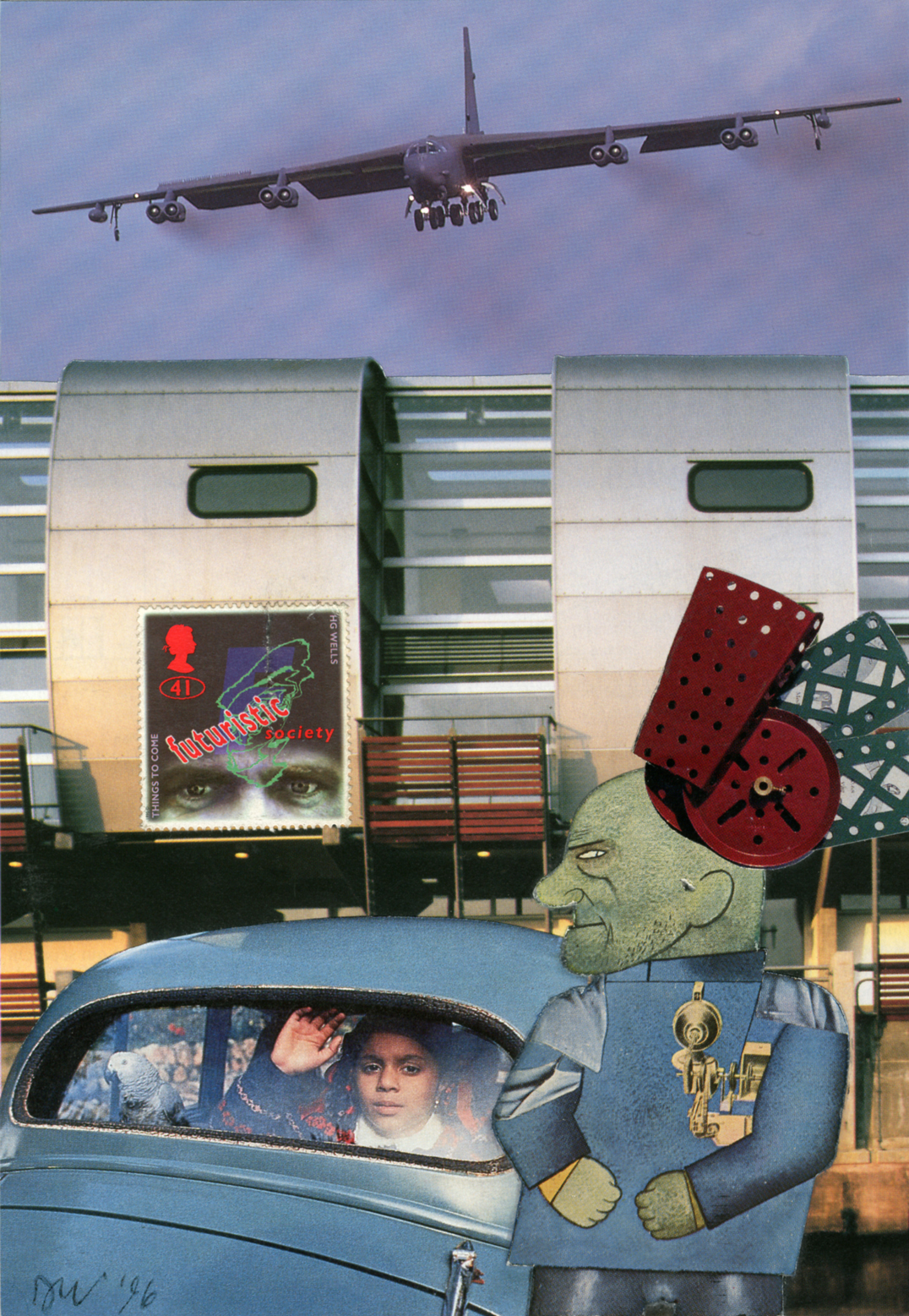
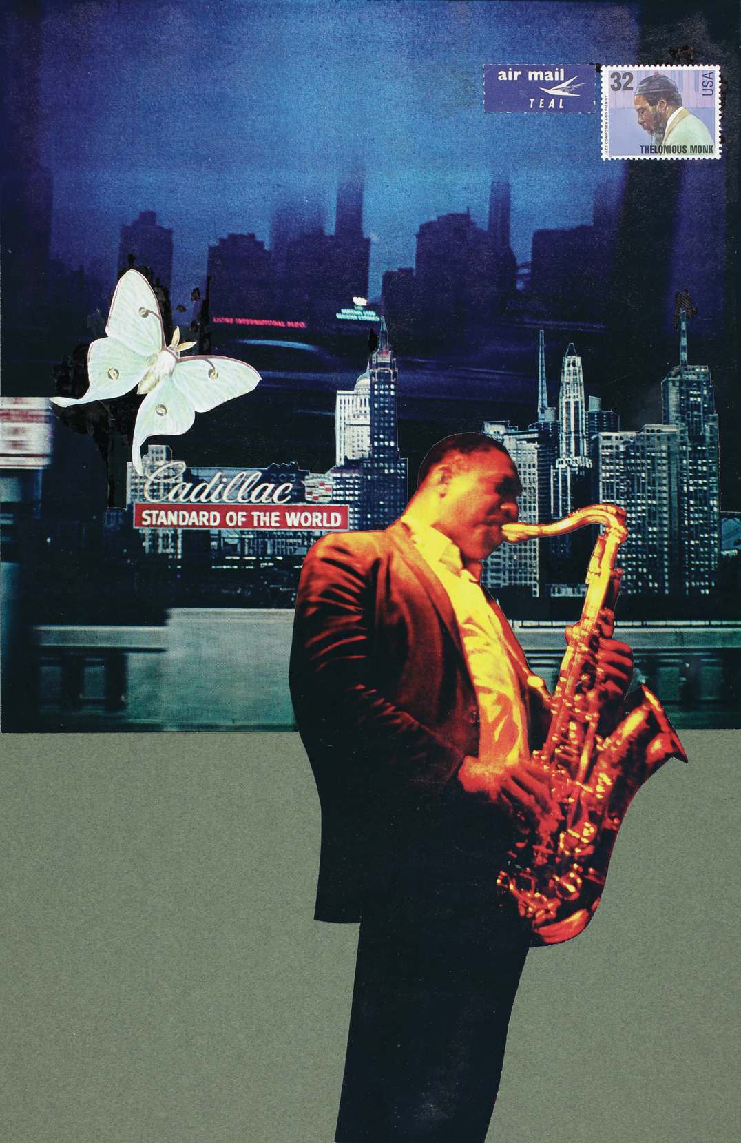
A note on the collages
robin / 2011.12.20
David Wild recently wrote a brief note on the history of the collages that he has been making over 35 years. We give it here, with the examples to which he refers.
‘Type spaces’ sold out in Europe
robin / 2011.11.20
We have sold the last copy of Peter Burnhill’s book Type spaces. Our North American distributor, Princeton Architectural Press, still has some copies left.
Asleep in the East Village
robin / 2011.11.17
Any book seems to have its appropriate, though inevitably temporary, resting place. Here we see a copy of E.C. Large’s Asleep in the afternoon in the Mast second-hand bookshop in Manhattan’s East Village.
Martens on TV
robin / 2011.11.09
A 30-minute film about Karel Martens and his work is being shown on Canvas, the Belgian TV channel, on Sunday 13 November at 20:15.
Typically Swiss?
robin / 2011.11.08
Is there still a ‘Swiss typography’. That is the broad theme of the first Tÿpo St.Gallen conference, running from 18 to 20 November.
‘Jazzpaths’ exhibition
robin / 2011.11.07
An exhibition of photographs and photomontages by David Wild opens this week at the Beardsmore Gallery in Kentish Town, London, and runs until 10 December.
The work of Matthew Carter
robin / 2011.11.01
On 13 October in Antwerp Fred Smeijers spoke some words of introduction at the opening of the exhibition ‘The Most Widely Read Man in the World: Matthew Carter’, on show until the end of the year at the Catapult gallery.
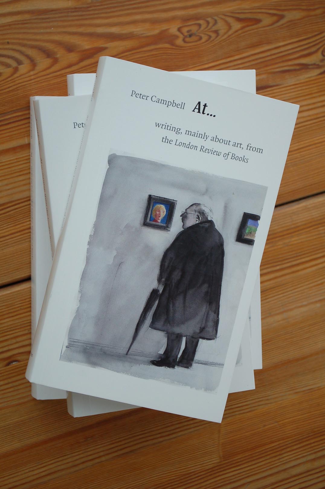
About Peter Campbell’s writings
robin / 2011.10.26
Peter Campbell died yesterday at his home, after being diagnosed last year with cancer. He was a special man, both in his nature and in the combination of his talents. We were very glad to publish his writings, and to add him to the list of Hyphen authors, who seem often to be people whom the world finds it hard to pin down.
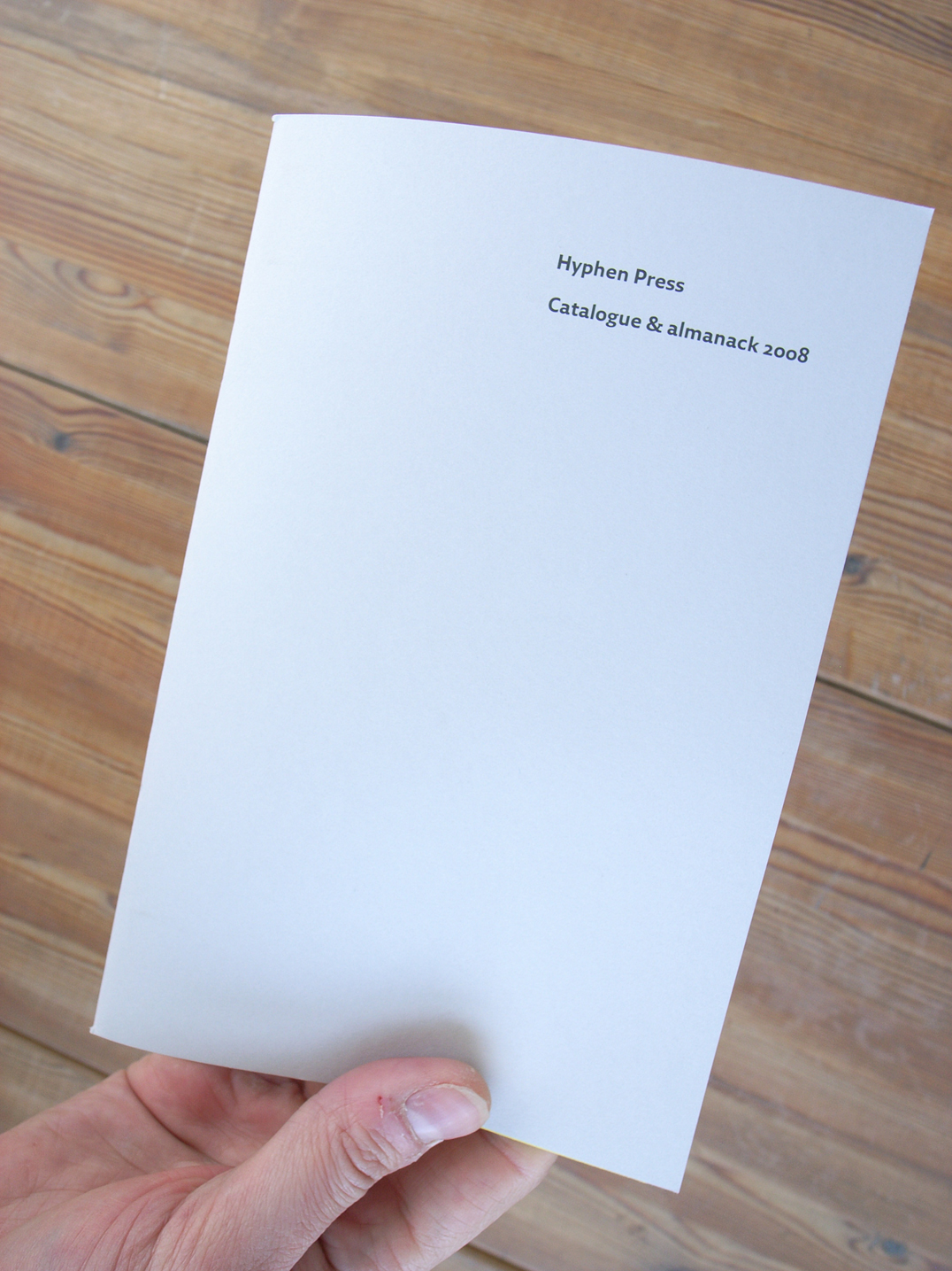
Catalogue & almanack 2011–2012
robin / 2011.10.21
We have produced a new catalogue and almanack (for 2011–2012) and will be distributing copies primarily at book fairs, conferences, lectures, and other public events, and will send a copy to anyone who buys books from our website.
At Frankfurt 2011
robin / 2011.10.12
This week at the Frankfurt Book Fair our books will be at the stand of our Dutch distributor, Coen Sligting: Halle 4.1, N547.
Amazon and tax
robin / 2011.09.07
Richard Fletcher in The Daily Telegraph: “… the likes of Amazon, Google and eBay are no longer the loss-making start-ups they once were, but are now among some of the largest companies in the world”.
‘Counterpunch’: second edition at the printer
robin / 2011.09.06
The long-delayed and much-anticipated second edition of this book is now in the last stages of production: it was printed yesterday and now goes to the binder. We expect that copies will go on sale in Europe at the end of this month.
Isotype: a new book
robin / 2011.08.01
We are working on a book, with the title Isotype, which will provide an extensive and detailed history of the work in graphic communication produced under the direction of Otto Neurath. This is a collection of freshly written and fully illustrated essays, supplemented by documents published for the first time in English translation or in transcription.
Price reductions
robin / 2011.07.23
We have reduced the prices of these books: Models & Constructs, Anthony Froshaug, and A view of early typography.
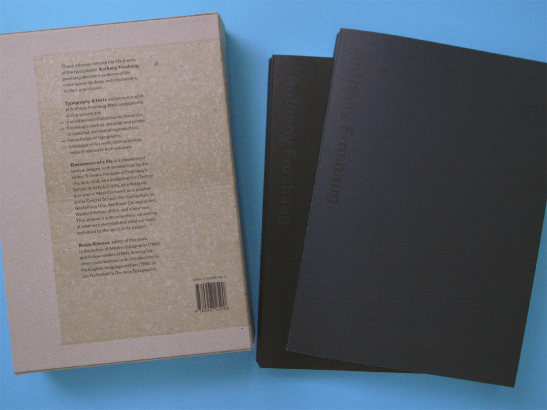
On Anthony Froshaug
robin / 2011.07.19
Lucy Sisman’s recollections and estimation of Anthony Froshaug.
On E.C. Large
robin / 2011.07.06
Our re-issue of two novels by E.C. Large, Sugar in the air and Asleep in the afternoon, and publication of a companion work, God’s amateur, prompted this piece in Lodown (no. 74), the magazine of ‘Populärkultur und Bewegungskunst’, published from Berlin. The introduction and email interviews are by Renko Heu.
A waking dream
robin / 2011.06.09
Every publisher or author’s dream is to see someone reading their book on the bus or underground train. This really happened to us with Jost Hochuli’s Detail in typography.
Smeijers interviewed
robin / 2011.06.07
Fred Smeijers interviewed, as OurType makes a deal with WebInk.
‘Designing books’: out of print
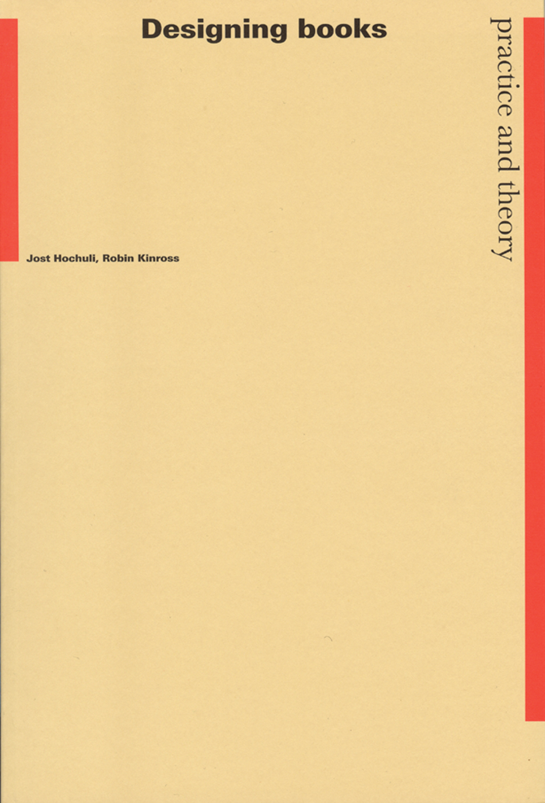
robin / 2011.05.27
The original hardback edition (1996) and the subsequent paperback edition (2003, reprinted 2007) of this book have now sold out. Despite its popularity, we have decided to let the book stay out of print now.
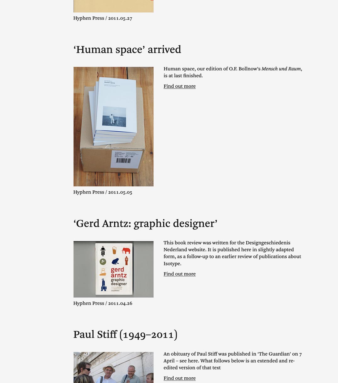
‘Human space’ arrived
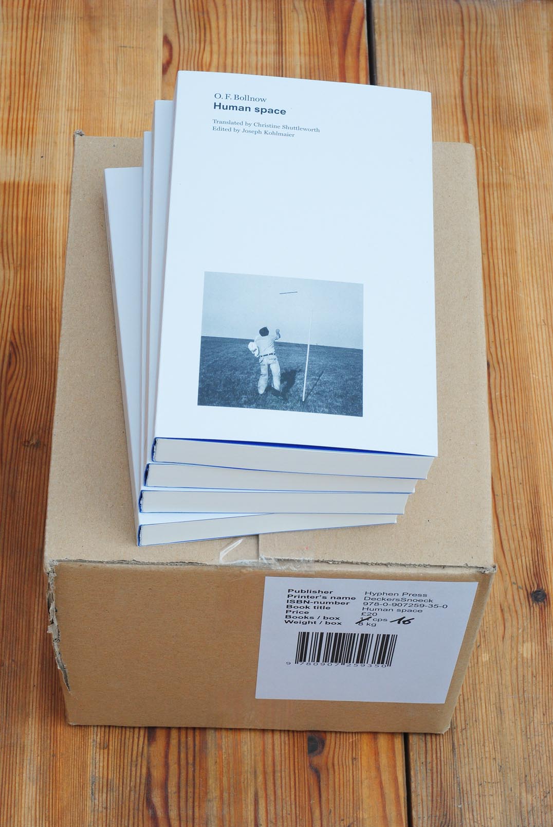
robin / 2011.05.05
Human space, our edition of O.F. Bollnow’s Mensch und Raum, is at last finished.
‘Gerd Arntz: graphic designer’
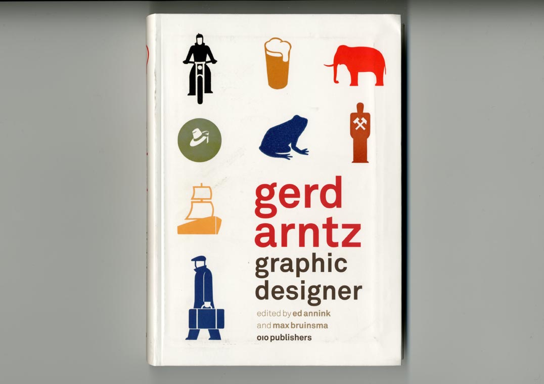
robin / 2011.04.26
This book review was written for the Designgeschiedenis Nederland website. It is published here in slightly adapted form, as a follow-up to an earlier review of publications about Isotype.
Paul Stiff (1949–2011)
robin / 2011.04.11
An obituary of Paul Stiff was published in ‘The Guardian’ on 7 April – see here. What follows below is an extended and re-edited version of that text
Martens at Monash
robin / 2011.04.05
This month Karel Martens is at Monash University, near Melbourne, for a talk, workshops, and an exhibition of his work on Oase.
‘Printed matter’: the three editions
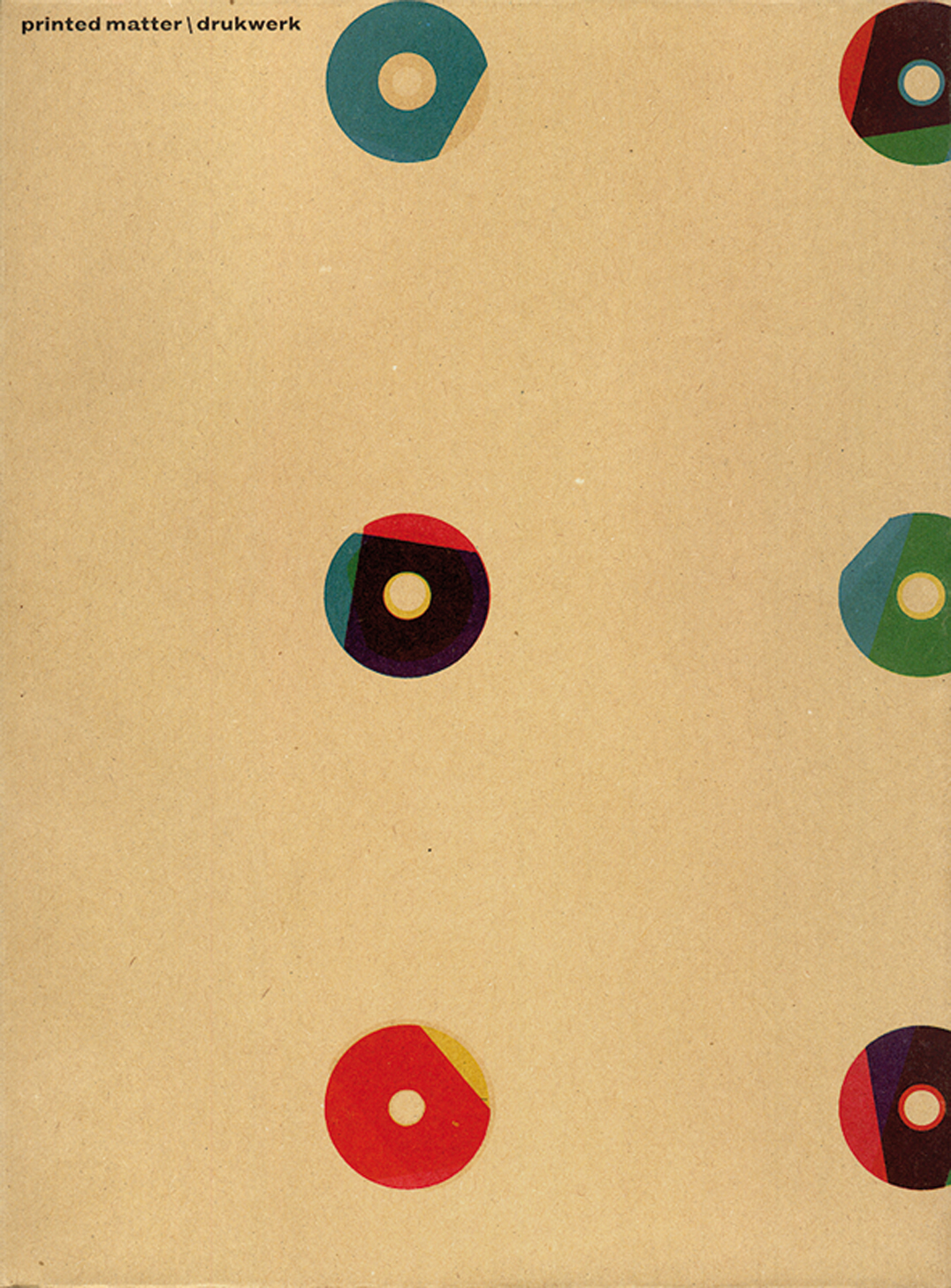
robin / 2011.02.23
Clear proof that you need to get the third edition, even if you already have the second and the first.
Paul Stiff
robin / 2011.02.15
Paul Stiff died in Reading last Saturday. He was a great friend, over 35 years, and shared in much of what has issued from Hyphen Press – especially, of course, Typography papers.
Our fourth CD
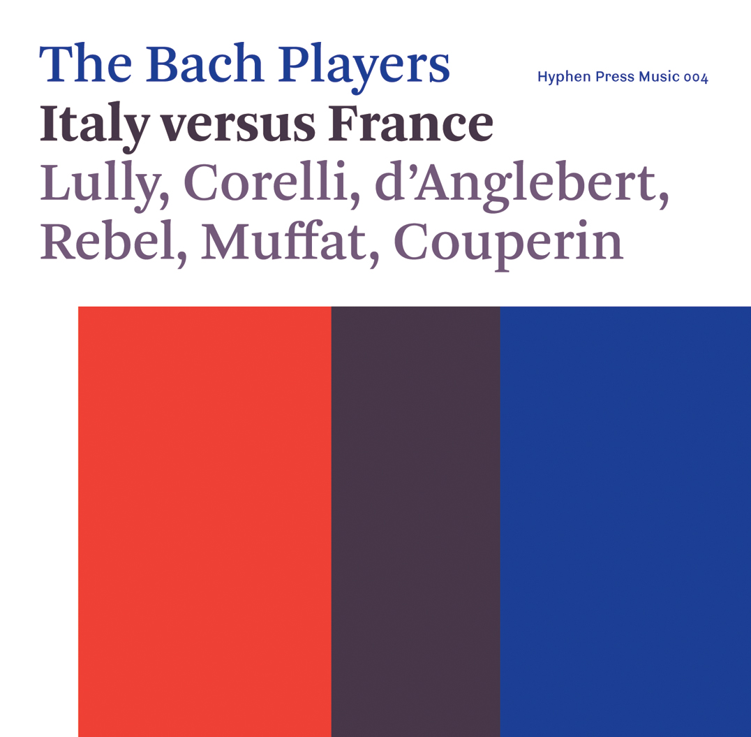
robin / 2011.02.02
Copies of our fourth CD, Italy versus France by The Bach Players, arrived in the office this week. It will be released to the trade in the UK on 28 March.
CD packs: the development of an idea
robin / 2011.01.27
When we were planning to publish music CDs, I tried to keep in mind that (since all the decisions were in our hands) it was a chance to think freshly and not – or not necessarily – use the reigning model of a plastic jewel case with printed ‘inlay’ sheet and booklet.
‘From hieroglyphics to Isotype’: book launch (report)
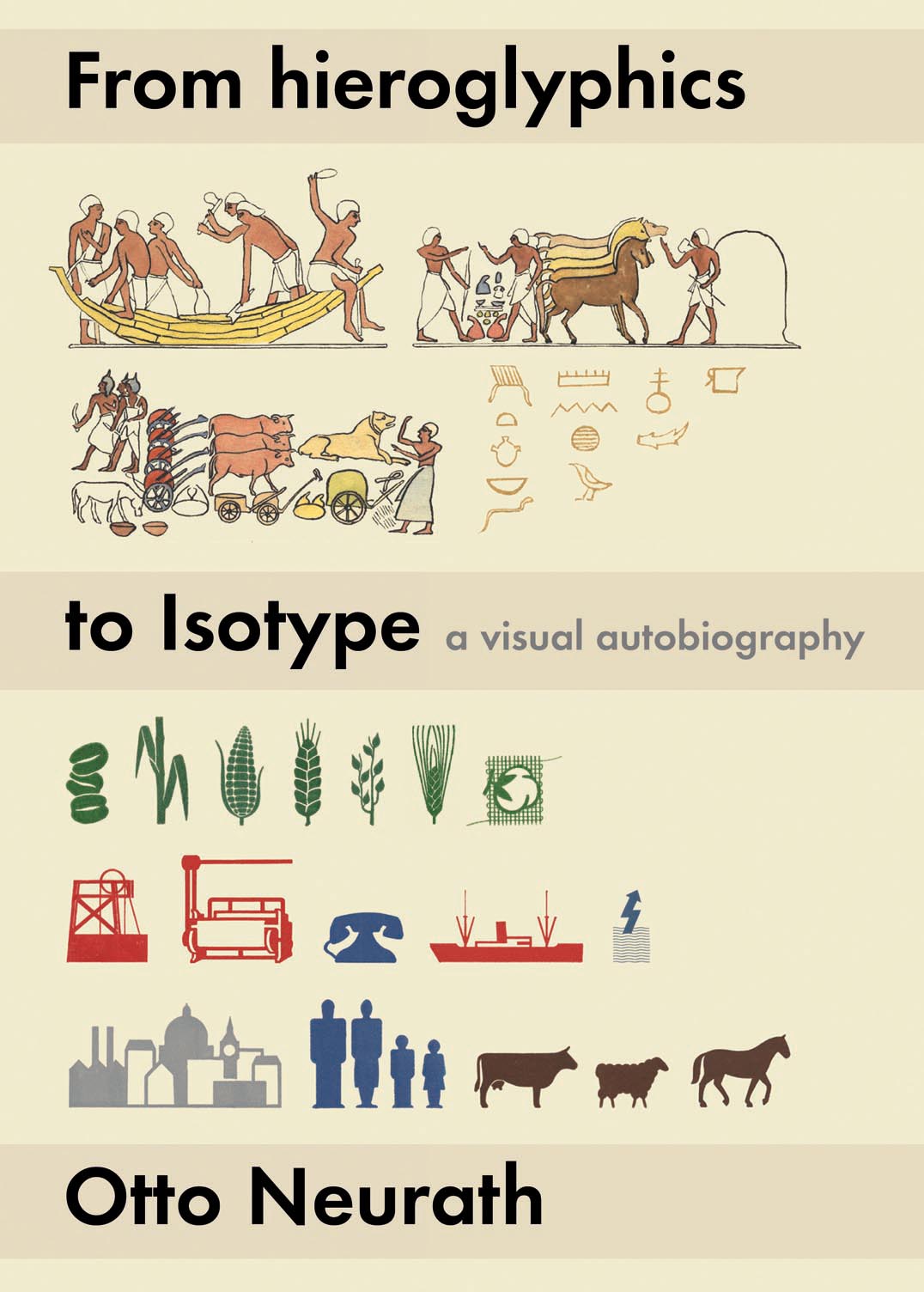
robin / 2011.01.26
A short report, with the introductory remarks by Robin Kinross and Eric Kindel, and Christopher Burke’s more substantial exposition of the making of our edition, can now be found on the ‘Isotype revisited’ website.
‘Typography papers’: a list of contents
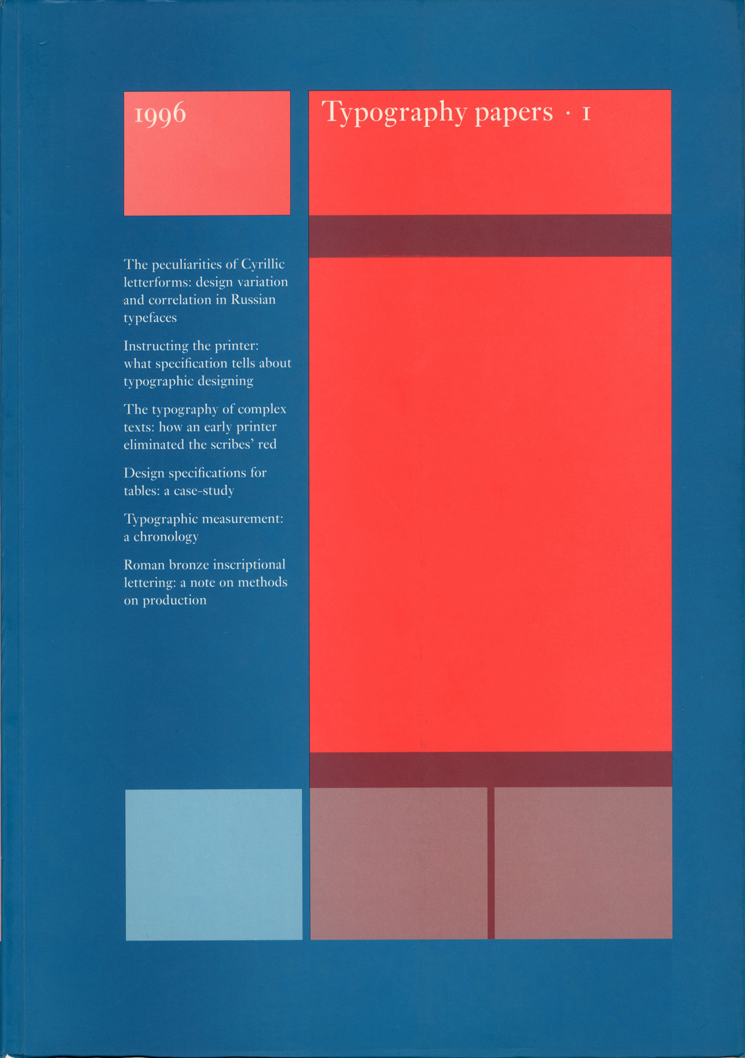
robin / 2011.01.09
We get quite frequent enquiries about Typography papers: which issues are still available? how best to try to get hold of out-of-print numbers? contents of the back numbers? And, from subscription agencies: please send us the issue for 2010!
‘From hieroglyphics to Isotype’: book launch
robin / 2011.01.06
On Thursday 20 January, thanks to the kind hospitality of the Austrian Cultural Forum in London, we are launching From hieroglyphics to Isotype.
Recent production
robin / 2010.12.01
Three books and a music CD have been published in the last couple of months. There will be a pause for breath now.
‘Printed matter’ 3 (update 2)
robin / 2010.11.30
We do now have copies of the new edition of Printed matter / Drukwerk in the office.
Teus de Jong (1946–2010)
robin / 2010.11.10
Teus de Jong died last week in hospital in Groningen, after a succession of serious illnesses. He was the typesetter of a number of our books, especially the paperbacks designed by Françoise Berserik.
‘Modern typography’ reprinted
robin / 2010.11.09
The book Modern typography has just been reprinted and copies are on sale now.
‘Printed matter’ 3 (update 1)
robin / 2010.10.29
We have had many enquiries about this book. So, further to the last post here: the first batch of books has been bound and is now waiting to be put into boxes.
‘Nun komm!’ Outstanding!
robin / 2010.10.20
Nun komm!, our recently released music CD, has been given an ‘outstanding’ award by International Record Review in its November issue.
Isotype exhibition in London
robin / 2010.10.18
In December an exhibition presenting the history of Isotype opens at the Victoria & Albert Museum.
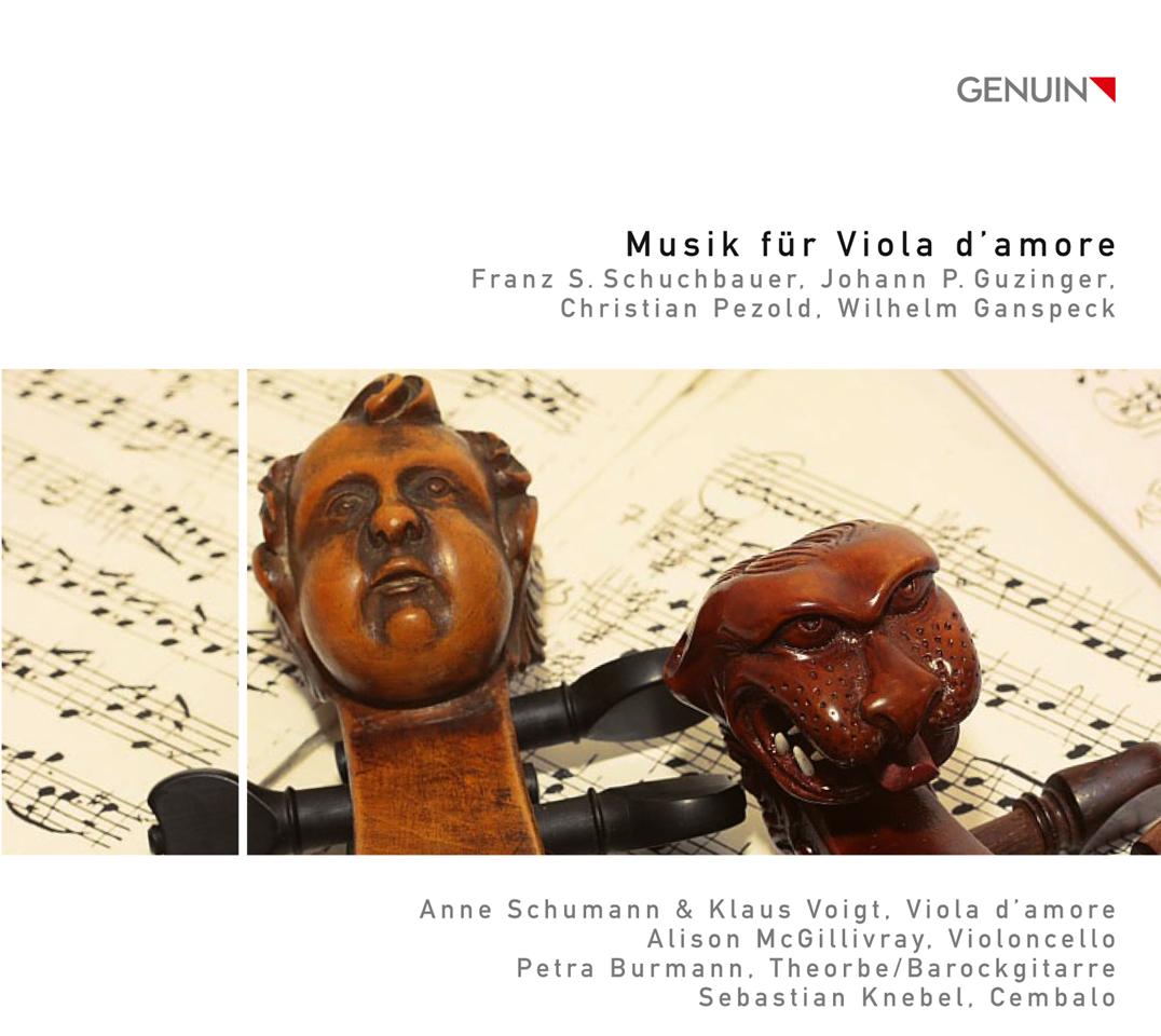
Music for viola d’amore
robin / 2010.10.11
We are selling copies of a CD of music for viola d’amore, issued this month on the German label Genuin.
Antwerp talk
robin / 2010.09.28
On the occasion of an exhibition about Jan I Moretus – the Moretus in ‘Plantin-Moretus’ – Fred Smeijers is giving a public lecture on ‘present-day typography’ at the Plantin-Moretus Museum in Antwerp on 28 October.
Local talk
robin / 2010.09.27
On Thursday 28 October (7.30 pm) at the Highgate Library in Chester Road, London N19, Robin Kinross will be speaking about his work with Hyphen Press.
‘Printed matter’ 3
robin / 2010.09.10
The third edition of Karel Martens’s Printed matter / Drukwerk is being printed by Thoben in Nijmegen now; sheets will then be sent to the binders, Hendricks–Lützenkirchen in Kleve, across the border in Germany.
‘From hieroglyphics to Isotype’ arrived
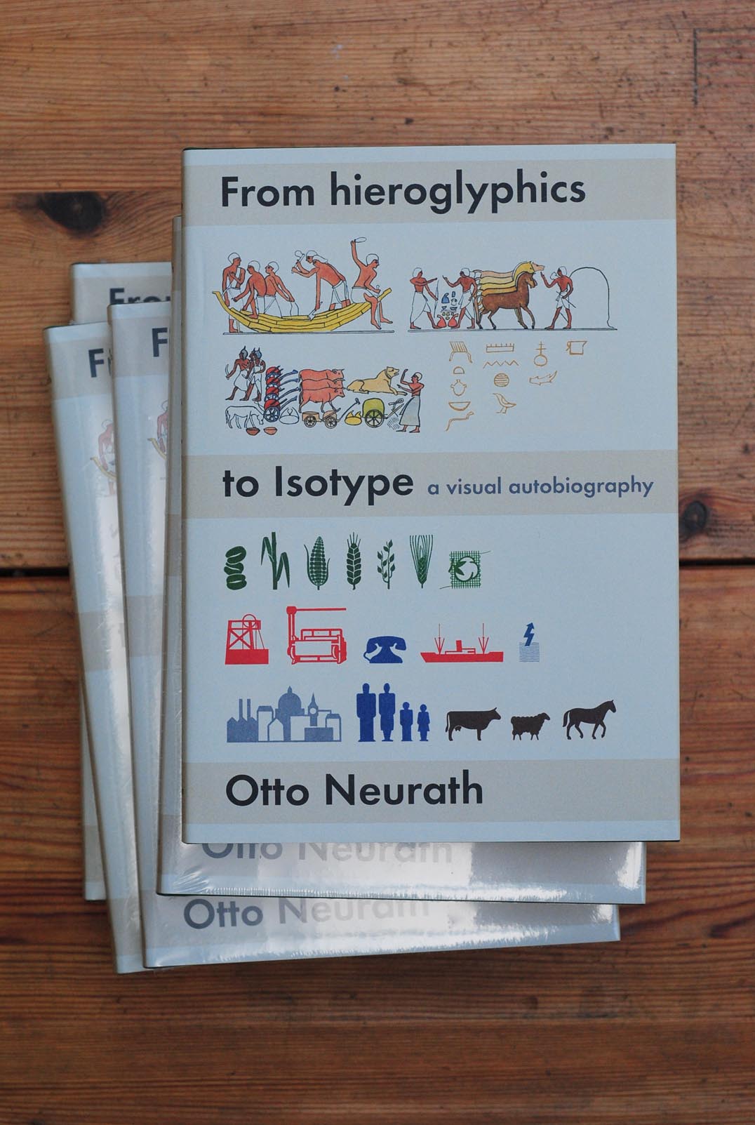
robin / 2010.09.09
Copies of Otto Neurath’s ‘visual autobiography’ arrived in London a few days ago.
Amazon once more
robin / 2010.08.23
Some previous posts here have offered indirect criticisms of the shop Amazon.1 Now here is a direct assault on the behemoth, made by a publisher with much mainstream experience, just starting out on a new venture that will work outside the existing book trade and sell direct to customers. (It’s interesting to compare Colin Robinson’s […]
A book of conversation
robin / 2010.08.09
It’s been suggested elsewhere in these web-pages that we can judge the quality of a book by looking at its production as an object for carrying meaning. The space between the lines will tell us something about the quality of thought in the editorial-design processes, and so – because editor and writer might work hand-in-hand – in the writing too; and the glue on the spine will tell us something about the thinking in the publishing house
Our third CD
robin / 2010.07.28
The Bach Players’ Nun komm! arrived from the printers and CD-multipliers some days ago, just in time for a launch-party for its subscribers. The CD is now waiting for its official UK release, after the summer holidays, on 20 September. This new Bach Players recording uses the kind of thinking evident in the last one […]
Designer as publisher
robin / 2010.07.07
Some years ago – I recall events and publications in the early 1990s – there was some noise about the ‘designer as author’: graphic designers would have a hand in writing (or maybe ‘authoring’) the texts that they also designed, and designers could even be considered as authors.
Interview about Hyphen Press
robin / 2010.07.05
Last December, Michel Aphesbero and Thomas Boutoux came to London to interview Robin Kinross, for the rosab.net web-magazine, made at the École des beaux-arts de Bordeaux.
‘Subterranean modernism’
robin / 2010.07.01
Idea magazine is pleasantly print-fixed: none of the words it publishes are put online, so anyone wanting a taste of it simply has to go out and find a copy. The current issue, no. 341, has an article that refers to Hyphen Press and its efforts. This essay, ‘Subterranean modernism’ by Randy Nakamura and Ian Lynam, is perhaps the first published piece by unconnected observers to address ideas that we’ve been busy with for now 30 years.
Lifestyle and Letraset
robin / 2010.06.24
Simon Esterson’s lecture on ‘British magazine design, 1960–2000’, at the St Bride Library, London, January 2008: an insider’s view.
Tweet!

robin / 2010.05.26
We have opened a twitter account, with the promise to restrict it to hard news.
A must-read critic
robin / 2010.05.25
Along with (among others) Pauline Kael, James Wood, and Susan Sontag, Peter Campbell is recommended by the The Guardian‘s Andrew Dickson as a must-read critic.
Exhibition pamphlet posted
robin / 2010.05.06
The pamphlet can be seen here at the Werkplaats Typografie, Arnhem, posted in a way that makes sense.
To be fired with enthusiasm
robin / 2010.04.16
An obituary of Bernard Coutaz, founder of Harmonia Mundi, an exemplary publishing company.
London Book Fair 2010
robin / 2010.04.15
We are at the London Book Fair next week, with a metre-width of space at stand E200.
CD distribution
robin / 2010.04.01
As from today, our CDs are being distributed to the trade by Harmonia Mundi UK.
International Project Space exhibition
robin / 2010.03.25
Our exhibition at International Project Space opened last Saturday and will be there until 8 May. The show could be an occasion for a visit to the model village of Bourneville. In some respects the exhibition tries to be a model too.
St Gallen comes to London (2)
robin / 2010.03.11
The exhibition was opened last Thursday with Jost Hochuli’s presentation of the topic – a wide-ranging history of book-making in St Gallen.
St Gallen comes to London
robin / 2010.03.03
The exhibition ‘Book design in St Gallen’ opens this week at the St Bride Library and runs for two short weeks.
More on binding
robin / 2010.02.26
A short notice about our article on the binding of books, with a vivid photo of a hotmelt binding and a diagram of how Otabind works.
Peter Campbell in conversation
robin / 2010.02.19
On 24 March Peter Campbell will be in conversation with Julian Bell, another painter and writer about art, at the London Review Bookshop.
Hyphen Press in Birmingham
robin / 2010.02.16
International Project Space, at Bourneville (Birmingham, UK), is the host for a Hyphen Press exhibition opening on 20 March and running through to 8 May.
Write your own academic sentence
robin / 2010.02.04
From the University of Chicago’s Writing Program (the whole site is worth exploring).
Design for music / Music and design
robin / 2010.01.26
This Friday the lively events programme at the St Bride Library offers a conference on Design for music / Music and design.
Judging books
robin / 2010.01.25
The National Mental Coach of the Netherlands – Wim de Bie – recently visited Zutphen (‘book-city Zutphen’) to ask and answer the question ‘how do you choose a book?’.
Our CDs
robin / 2010.01.05
Last Saturday morning, the two Bach Players CDs were included in a roundup of recent Bach recordings on BBC Radio 3’s ‘CD Review’ programme (one can listen back to this on the BBC website for the rest of this week).
Price changes: less good news
robin / 2010.01.04
Books are zero-rated for Value Aded Tax in the UK, but CDs are not. From this week, the rate of VAT on CDs goes up from 15 to 17.5 per cent.
Price changes: good news
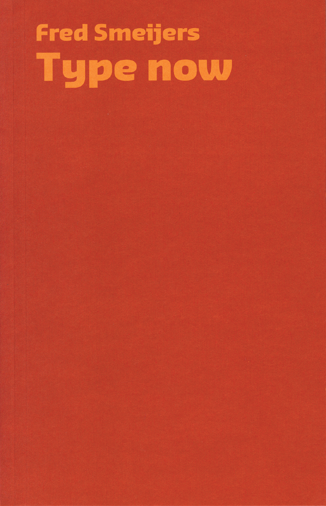
robin / 2010.01.03
As from today we are reducing the price of Fred Smeijers’s Type now, from £17.50 to £10. The book was made on the occasion of the award of the Gerrit Noordzij prize to Smeijers and surveys his work up to then (November 2003).
The new year, 2010
robin / 2010.01.02
Thanks to everyone who sent greetings and good wishes for the new year.
A great venture
robin / 2009.12.18
Every one a chaconne, the new release from Hyphen Press Music, is Editor’s Choice of new vocal CDs – with five stars (= ‘exceptional’) – in the January 2010 issue of Classic FM magazine.
Hyphen in Paris
robin / 2009.11.16
It has always been difficult to see our books in France. But copies of most of them are now on sale at Section 7 Books in Paris.
Hyphen Press catalogue & almanack 2009–2010
robin / 2009.10.30
The Hyphen Press catalogue for 2009–2010 was ready (as is traditional) just in time for the Frankfurt Book Fair. New books are announced here, and every in-print title is shown too.
UK postal workers on strike
robin / 2009.10.29
During the present postal strike in the UK supply of books and CDs ordered from the website may be slow.
E.C. Large in Zurich
robin / 2009.10.28
On Thursday 5 November (while the English are busy letting off fireworks), if you are in Zurich there is a chance to learn more about E.C. Large.
Desmond Jeffery the printer
robin / 2009.10.27
An exhibition of the work of the English printer Desmond Jeffery opens at the St Bride Library in London tonight. This is the first chance for the public to see something of his production.
Best Swiss books in London
robin / 2009.10.20
The Helvetic Centre in London is again organizing a show of the ‘most beautiful Swiss books’.
On typography
robin / 2009.10.19
Anthony Froshaug’s article ‘Typography is a grid’, which we posted here in August 2000, has proved to be the most popular page on this website, with numbers boosted recently by a link from a website about grids in typography.
The new CD launched
robin / 2009.10.14
A report of the launch of HPM 002 for subscribers and friends.
Hyphen in Amsterdam
robin / 2009.10.05
Through this month and next, some of our core books are on display and for sale at the Kunstverein in Amsterdam.
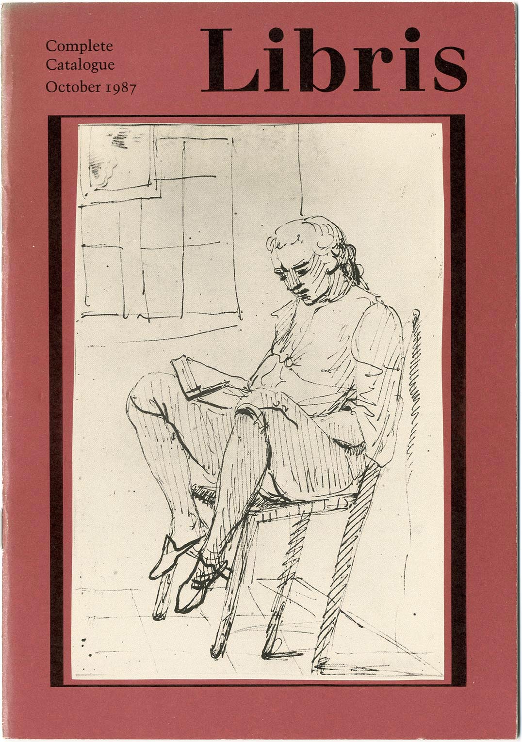
Brecht and Benjamin in English
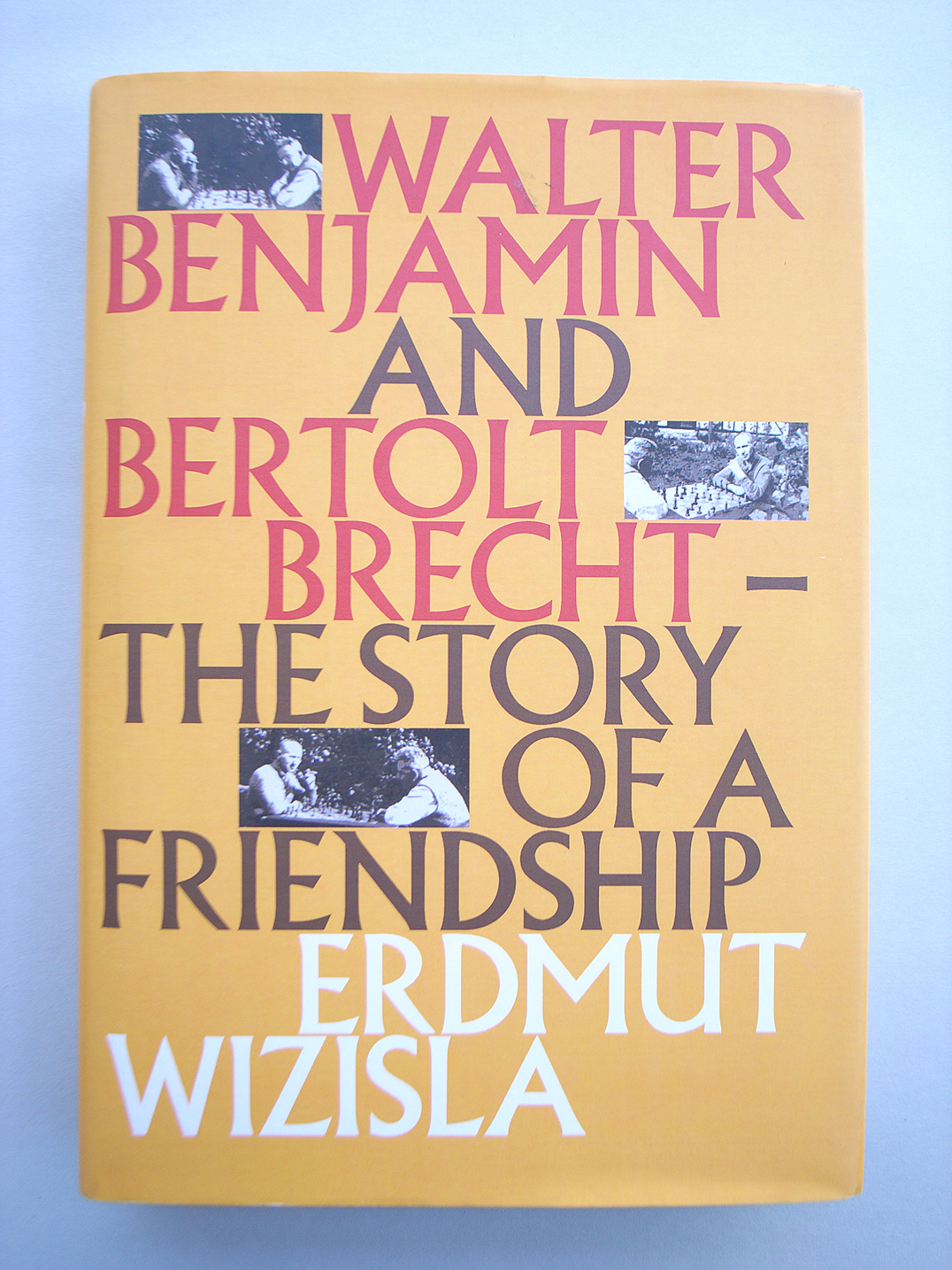
robin / 2009.09.29
Last Thursday the London publisher Libris brought out Erdmut Wizisla’s Walter Benjamin and Bertolt Brecht: the story of a friendship. This is an English-language edition of the book published originally by Suhrkamp. Behind that edition was a first embodiment, as its author’s doctoral thesis.
Isotype revisited
robin / 2009.09.22
The ‘Isotype revisited’ research project at the Department of Typography & Graphic Communication, University of Reading, has now launched its website.
London after the war
robin / 2009.09.21
Following his ‘Mitteleuropa and Bethnal Green, 1946’, Paul Stiff expands on another theme of Modern typography in Britain.
Alexander Verberne
robin / 2009.09.15
The typographer Alexander Verberne died on 27 May 2009. After a stroke in 1997, which was followed by further strokes, he had been seriously impaired and was living in a care-home in The Hague. He was born on 18 August 1924 in Den Helder.
Our second CD
robin / 2009.09.12
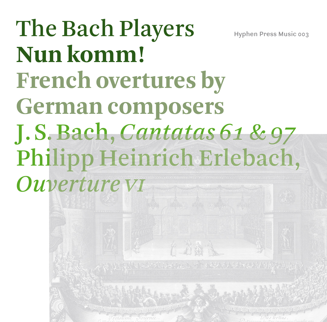
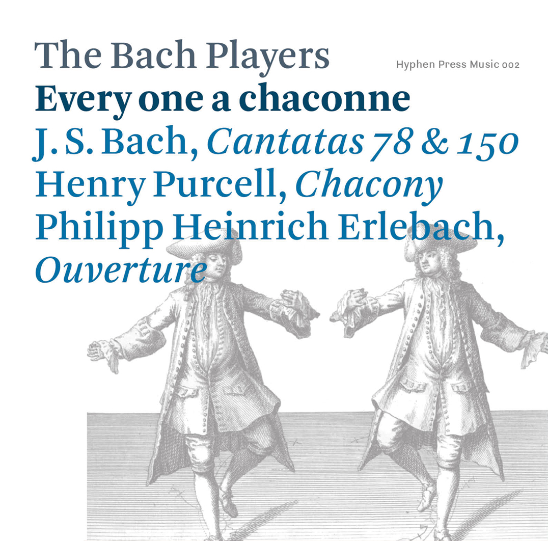
Every one a chaconne, the second recording by The Bach Players has just arrived in physical form and will be launched publicly at the group’s concerts in Cork, Norwich, and London in the coming week. This new recording brings together pieces by J.S. Bach, Henry Purcell, and Philipp Heinrich Erlebach, linked by the common thread […]
‘Type spaces’ discovery
robin / 2009.09.11
In another of those warehouse discoveries, a few copies of the late Peter Burnhill’s Type spaces have come to light, after we had declared it out of print here (our North American distributor still has some left). There are several reasons to get hold of this book, which we are unlikely now to reprint. The […]
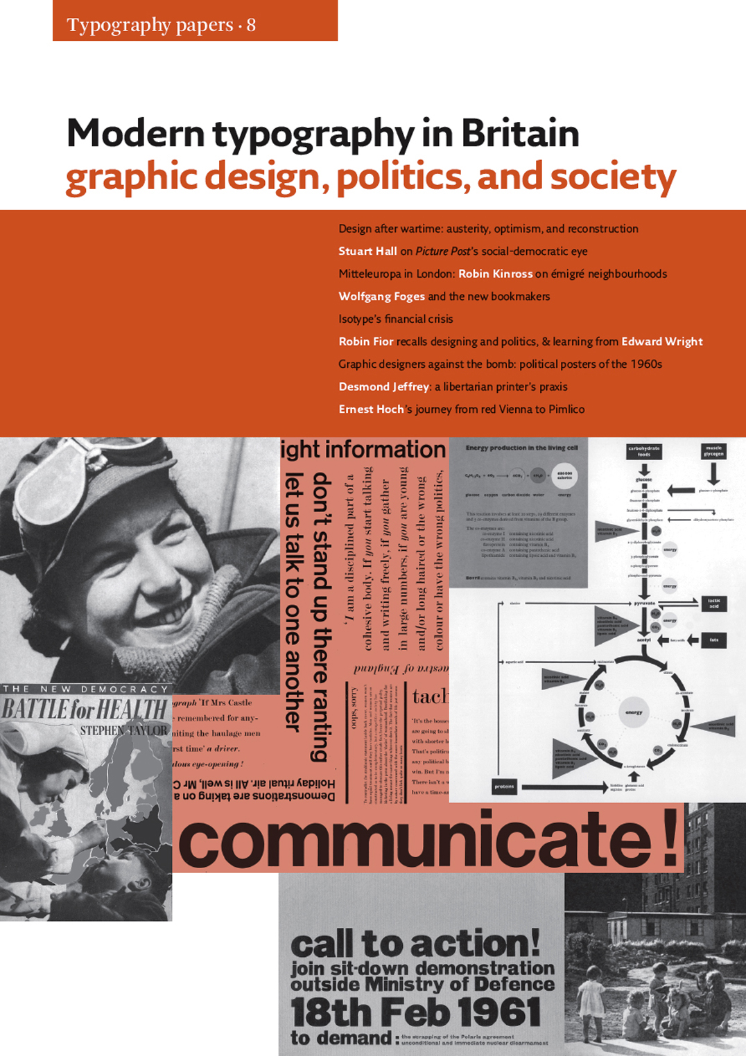
‘Modern typography in Britain’ arrived
robin / 2009.09.10
This week we received copies of Modern typography in Britain: a very packed and rich set of discussions, which will surely come to define its still too little comprehended subject. The book is at the same time Typography papers 8, and continues Typography papers’s work of publishing fully serious, lively and comprehensible articles.
‘Modern typography’ in translation
robin / 2009.07.26
One of the most pleasing aspects of publishing is to see translated editions of your books appearing. Italian, Spanish, and now Korean editions of Modern typography have been made in recent years. Meanwhile our own second edition of the work is out of print and awaiting a reprint, with corrections and small updatings. We hope […]
‘Typography papers 8’ (update)
robin / 2009.07.21
The next Hyphen book, Modern typography in Britain: graphic design, politics, and society – a special issue of Typography papers (no. 8) – is now at the printers. It will be published in September.
A4 and before
robin / 2009.06.02
On 11 June at the Koninklijke Bibliotheek in The Hague, Robin Kinross is giving a lecture on standard paper sizes. This is the culmination of his period this year as a joint Fellow at the KB and NIAS. The talk will have the character of preliminary survey, towards a long history of paper sizes.
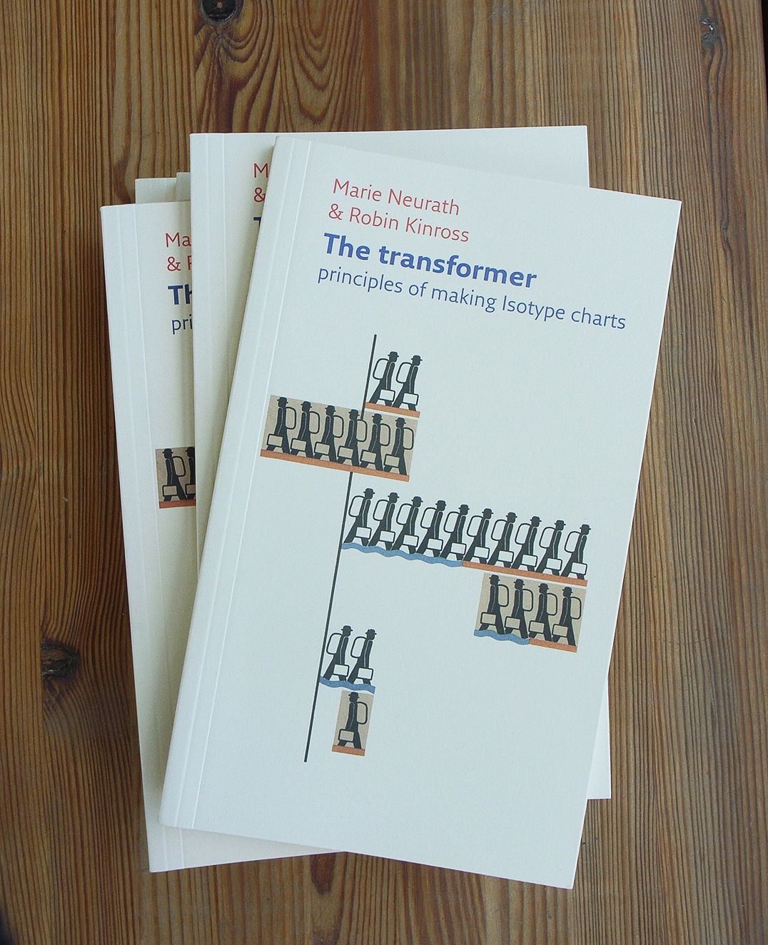
‘Transformer’ arrived
robin / 2009.05.21
We now have copies of this book, which this month goes on sale generally in the UK, the Netherlands, and elsewhere in Europe. It is of course also for sale from our website. Those in North America – to whom we can’t sell from the website – will need to wait at least a couple […]
Our first CD (4)
robin / 2009.04.21
‘Einzelgängers’ – it takes one to know one. Hyphen Press Music is joint winner of the best record label of 2009 in the Prelude Classical Music Awards 2009.
Amazon again
robin / 2009.04.14
More on ‘one of the most powerful forces in the publishing industry – with the power to make or break a book’: another in an occasional series.
‘Typography papers 8’
robin / 2009.04.13
For a foretaste of Typography papers 8, have a look at Paul Stiff’s ‘Mitteleuropa and Bethnal Green’ (‘Mitteleuropa’ = Central Europe).
Ludwig
robin / 2009.03.25
This new typeface designed by Fred Smeijers has just been released by OurType. As its name promises, it is an echt-German production: recalling the early-nineteenth-century Grotesk letter.
Information Design Conference 2009
robin / 2009.03.22
From 2 to 3 April the Information Design Association in the UK is holding a two-day conference at the University of Greenwich, London – admirers of Christopher Wren’s work will have good reasons to go and then get distracted.
Edit!
robin / 2009.03.21
Under this splendid title, a conference on the ‘norms, formats, supports’ of publishing (in a wide sense) was held a couple of weeks ago in Bordeaux.
Back online
robin /
This website has been offline for the last three days, for inexplicable technical reasons, but is now restored.
Anthony Froshaug: material words / making the book
robin / 2009.02.21
A recent tidying of the office turned up an offprint from the journal Matrix (no. 21, 2001), which published two pieces written on the occasion of the publication of our book ‘Anthony Froshaug’. Looking at them again, they seem worth reviving – to explain something of the process by which that book was made.
Kinross at the KB
robin / 2009.02.04
From this week to the end of June, Robin Kinross is living and working in the Netherlands: taking up this year’s Fellowship at the Konkinklijke Bibliotheek [Royal Library].
Our first CD (2)
robin / 2008.12.23
Early public reactions to our first CD – given the hopeful catalogue number HMP 001 – have been encouraging.
Benjamin and New Left Books (now Verso) – and Libris
robin / 2008.12.13
Further to this discussion of the Benjamin archive book, published in English by Verso, some invaluable notes on the history of the publication of Walter Benjamin’s writings can be found [here], as a prelude to the publication next year of Erdmut Wizisla’s Walter Benjamin and Bertolt Brecht: the story of a friendship, 1924–1940
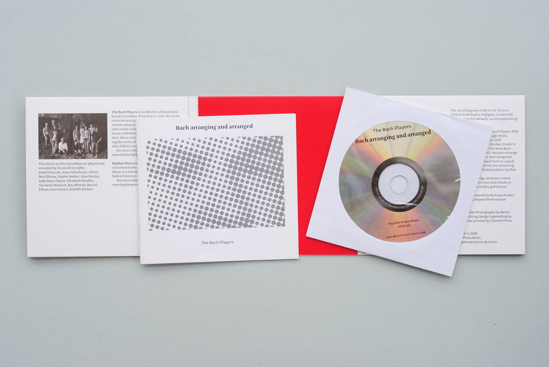
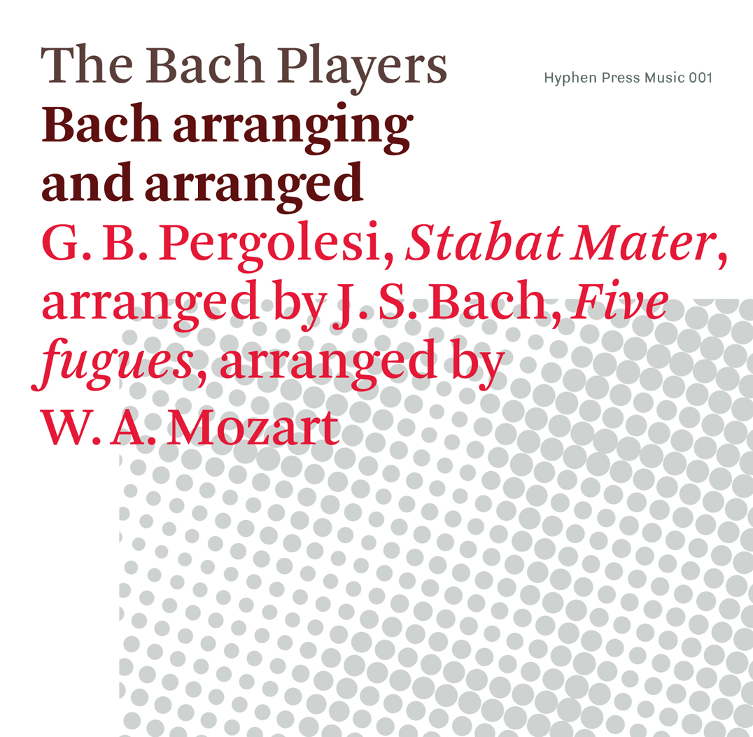
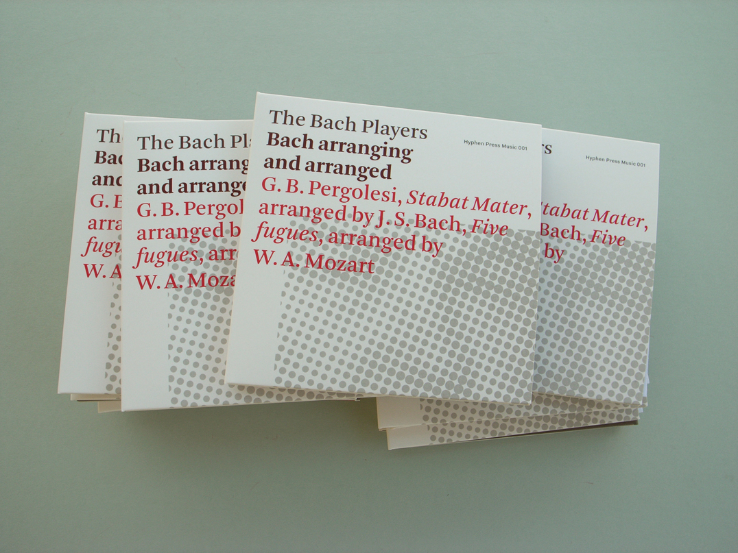
Our first CD
robin / 2008.11.19
Bach arranging and arranged, the first recording by The Bach Players, and the first issue from Hyphen Press Music, is now finished and awaiting formal release next month.
‘The most beautiful Swiss books’
robin / 2008.11.13
Further to the last post, we can mention an exhibition of this year’s ‘most beautiful [what most of the rest of the world knows as ’best-designed’] Swiss books’.
Jost Hochuli in London
robin / 2008.11.05
On Thursday 27 November at 7 pm Jost Hochuli will give a lecture on ‘Systematic book design?’ – the question mark is important here – at the St Bride Foundation.
Design in the real world
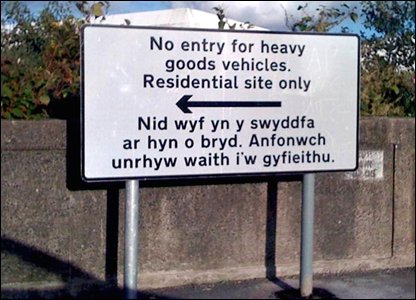
robin / 2008.11.02
Road signs are indeed mostly written & designed by harassed public servants.
An interview with Nicolette Moonen
robin / 2008.10.26
en Press Music is publishing its first CD: Bach arranging and arranged by The Bach Players.
E.C. Large novels have arrived
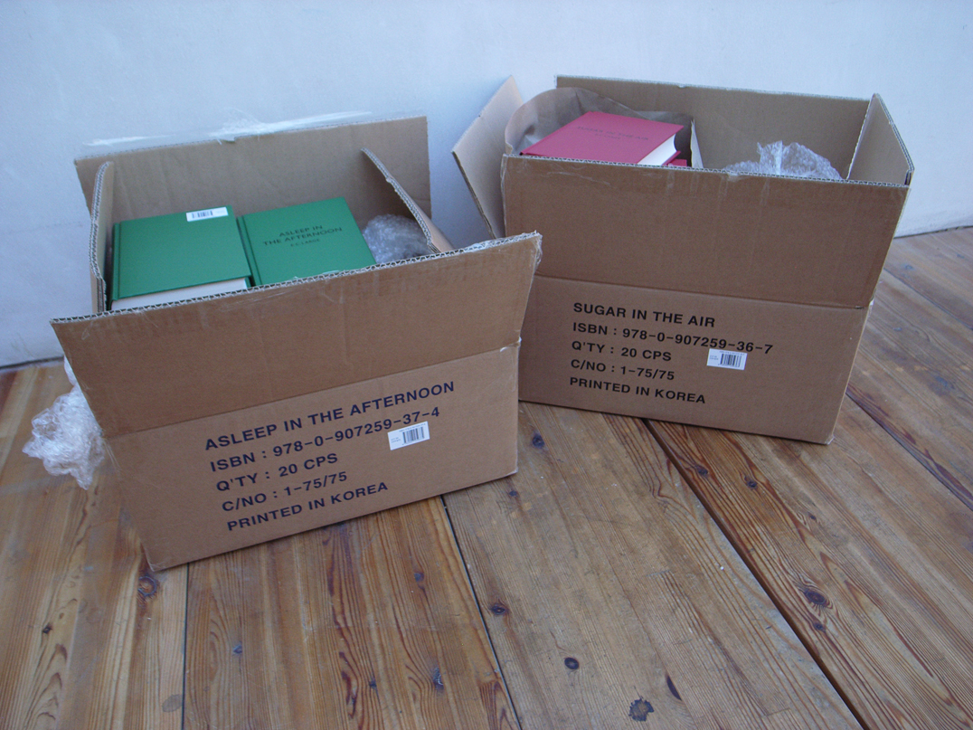
robin / 2008.10.22
We have received our first copies of Sugar in the air and Asleep in the afternoon.
Events at Somerset House
robin / 2008.10.21
Next week Stuart Bailey and David Reinfurt – Dexter Sinister – present three nights of talks at Somerset House in London, which will create the content for the next issue of Dot Dot Dot (no. 17).
Otto and Marie Neurath in exile
robin / 2008.09.24
On 24 October, Christopher Burke is speaking, in a Research Centre for German and Austrian Exile Studies Seminar, on ‘Otto and Marie Neurath in Exile’.
‘Designing books’ discussed
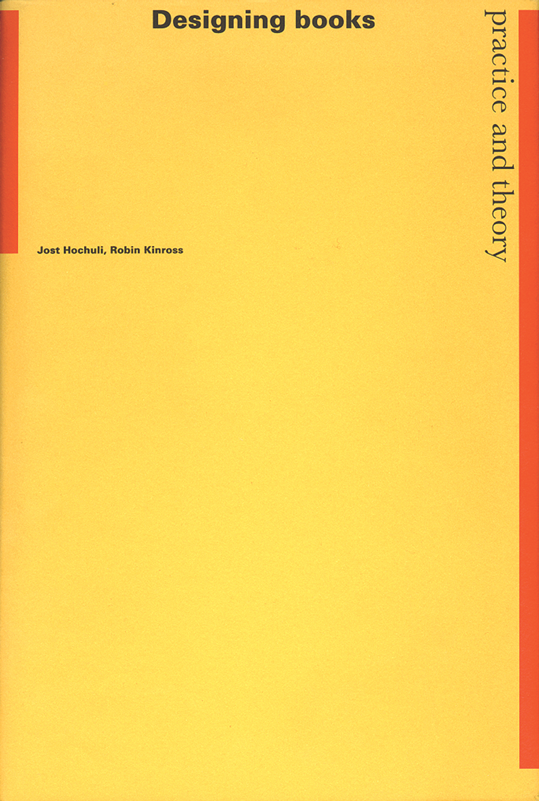
robin / 2008.09.17
Twelve years after publication, a new generation of readers is finding ‘the best single volume on the subject’.
Trying to explain
robin / 2008.09.04
On 15 October, in a talk at this year’s Cheltenham Literature Festival, Robin Kinross will attempt to explain what typography is.
Benjamins
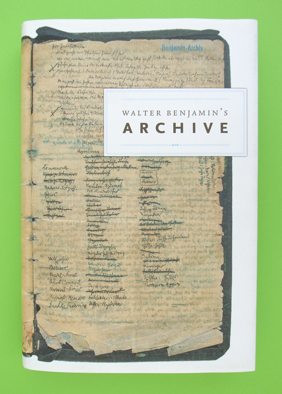
robin / 2008.08.22
Now that every word that Walter Benjamin published in his lifetime has been collected and republished, and now that his many unfinished words have been similarly collected and printed, and now that to this set of ‘collected writings’ we can add letters and diaries that he cannot have thought of publishing, there only remains to be transcribed and multiplied the scraps, cards, sheets, that fill up the rest of his archive.
Merchandise
robin / 2008.06.25
Now that we are preparing to publish CDs, a reader has suggested that we consider selling Swiss chocolate (‘in various point sizes’) and sweaters (‘Norman-Potter-style pullover with cross-patterns’).
‘Counterpunch’ discovery
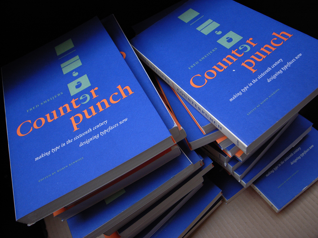
robin / 2008.06.12
Not for the first time in the history of publishing, a book that had been declared ‘out of print’ makes a return to availability.
‘Detail in typography’ arrived
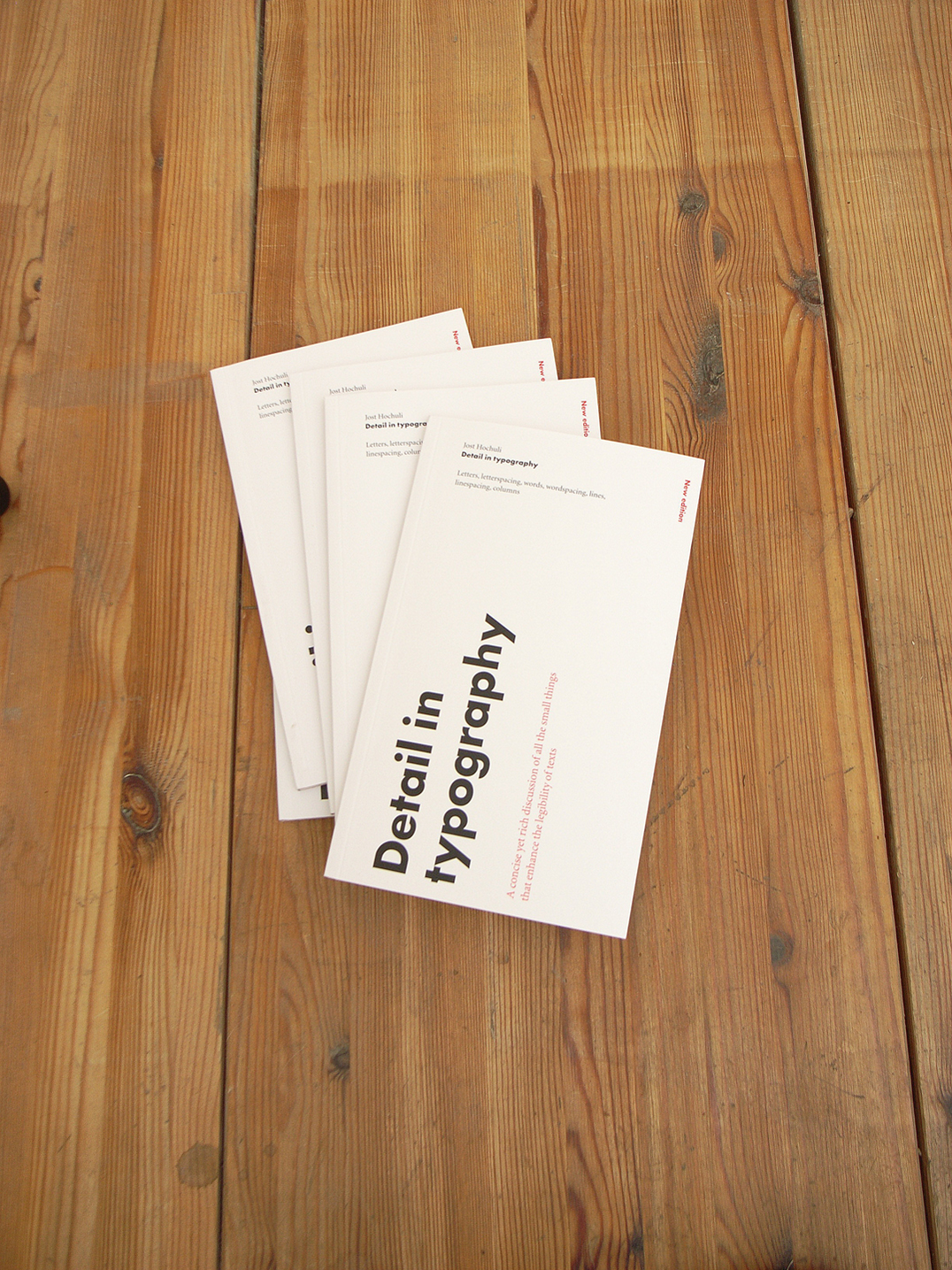
robin / 2008.06.11
Copies of Hochuli’s Detail in typography have arrived in London. The book is officially published later this month.
Edward Wright
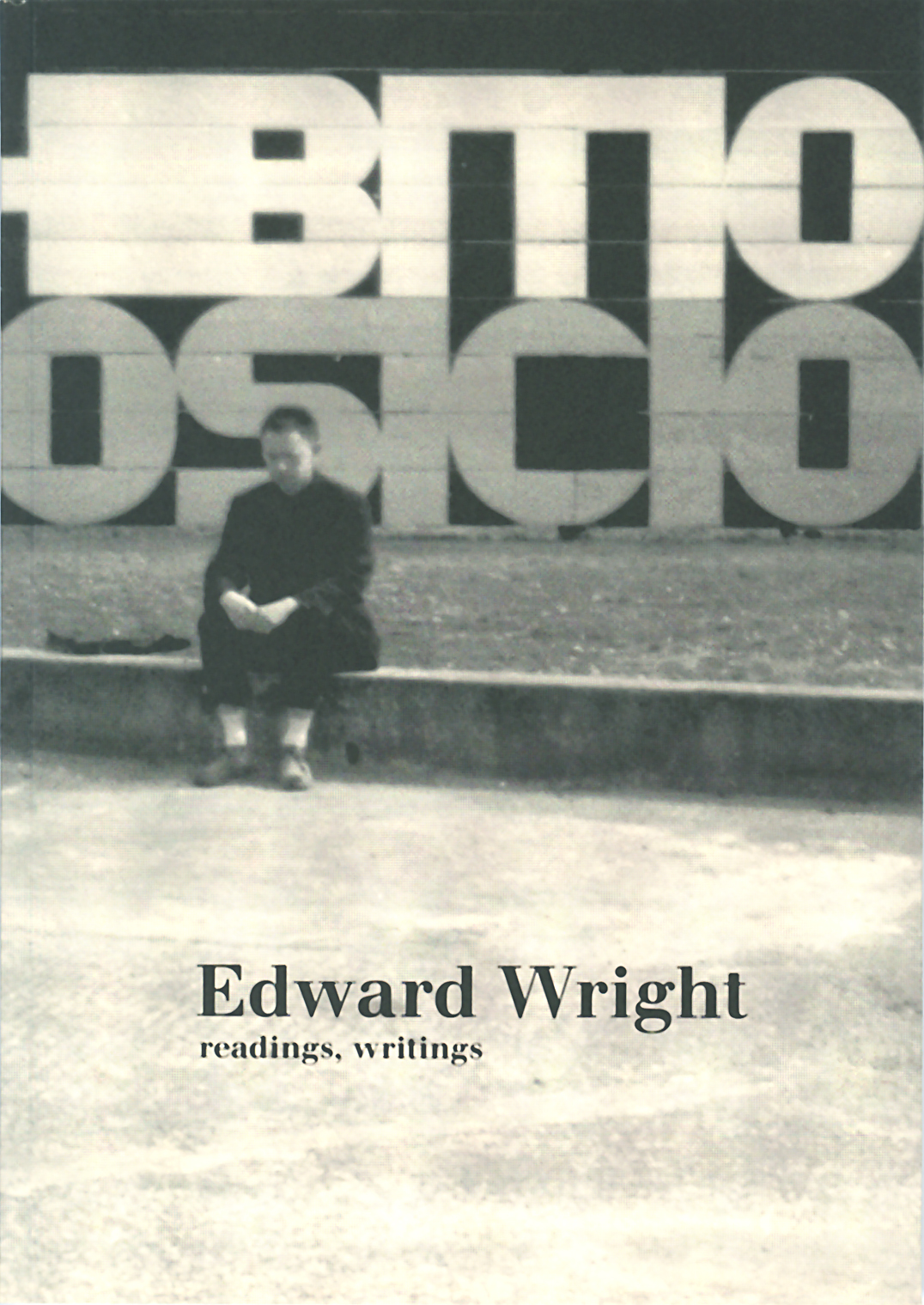
robin / 2008.05.23
We are now selling copies of the book Edward Wright: readings, writings, published last year by the Department of Typography & Graphic Communication, University of Reading.
Hochuli and tools for reading
robin / 2008.05.13
Jost Hochuli, author of Designing books and Detail in typography, is responsible for an exhibition of the remarkable book production of his home town of St Gallen.
Isotype: recent publications
robin / 2008.05.12
The recent flourish of interest in the visual work of Otto Neurath – let’s call it Isotype – may be seen as a second wave, coming after a first period of discovery, which included exhibitions of the work in Reading (1975) and Vienna (1982), and an exhibition of the work of the Neurath group’s main artist, Gerd Arntz, in The Hague (1976).
Hyphen Press catalogue & almanack 2008
robin / 2008.04.16
We have just received finished copies of our new catalogue of books.
Martens in London
robin / 2008.04.15
Among the speakers at the Friends of St Bride Library Conference on 15 and 16 May is Karel Martens.
London Book Fair 2008
robin / 2008.04.14
We are present at the London Book Fair (14–16 April) c/o our new UK distributor, Publishers Group UK.
UK distribution
robin / 2008.03.25
From the beginning of April our books will be distributed in the UK by Publishers Group UK.
New titles (2)
robin / 2008.02.28
We are announcing some new titles for publication in the course of 2008, which will add more than just numbers to the list.
Johnston’s ellipsis
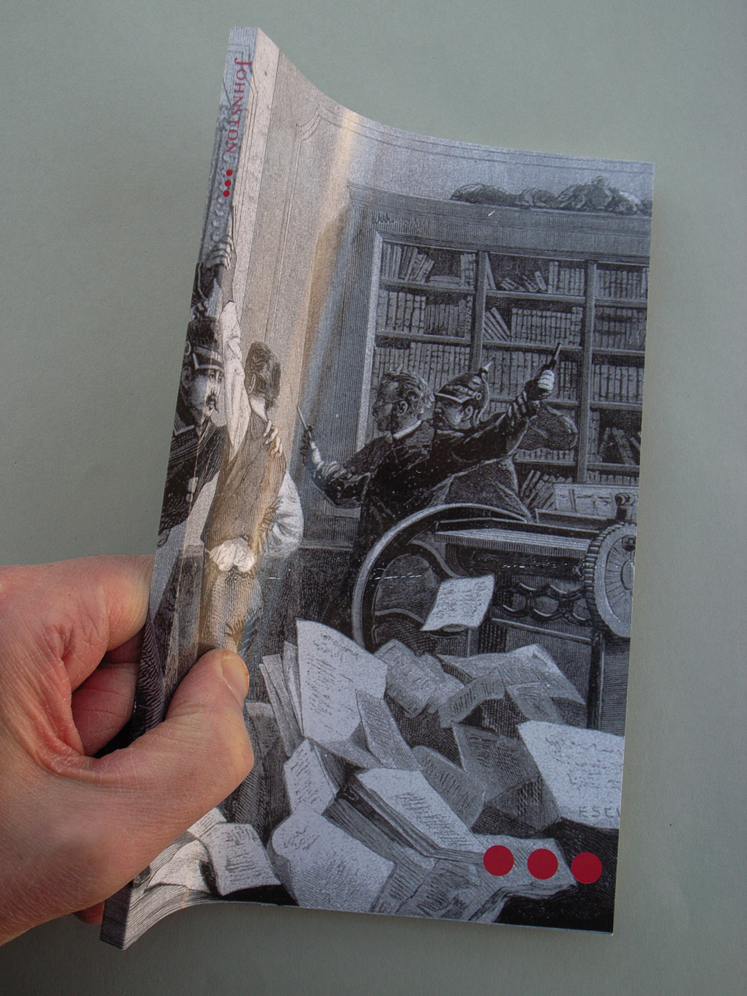
robin / 2008.02.27
Alastair Johnston, printer & publisher in Berkeley CA, but of UK origins, has collected more than twenty years’ worth of his occasional writings. The central theme of the pieces is the small press poetry scene on the West Coast and in the UK since the 1960s, with a sprinkling of articles on typography and publishing […]
The political economy of book production
robin / 2008.02.18
Compare and contrast these two good books published by Verso in London and New York.
Nice book, well glued
robin / 2008.02.17
Good evening, Mrs Craven, the collection of Mollie Panter-Downes’s stories written during the Second World War and published originally in The New Yorker, then collected in 1999 by Persephone Books (London), has just been reissued in their ‘Classics’ series.
Branding nonsense
robin / 2008.02.12
Andrew Martin on the ingratiation-strategies and the deceits of corporate identity.
Cypher House, London N7
robin / 2008.01.24
This building, designed by David Wild, is now very near to completion: it provides an artist’s studio and connecting top-lit rooms arranged in an interlocking L-shaped configuration.
‘Counterpunch’: the second edition
robin / 2008.01.03
Prompted by this nice review, we can confirm that a second edition of the book is in preparation.
Signs at the Royal Festival Hall
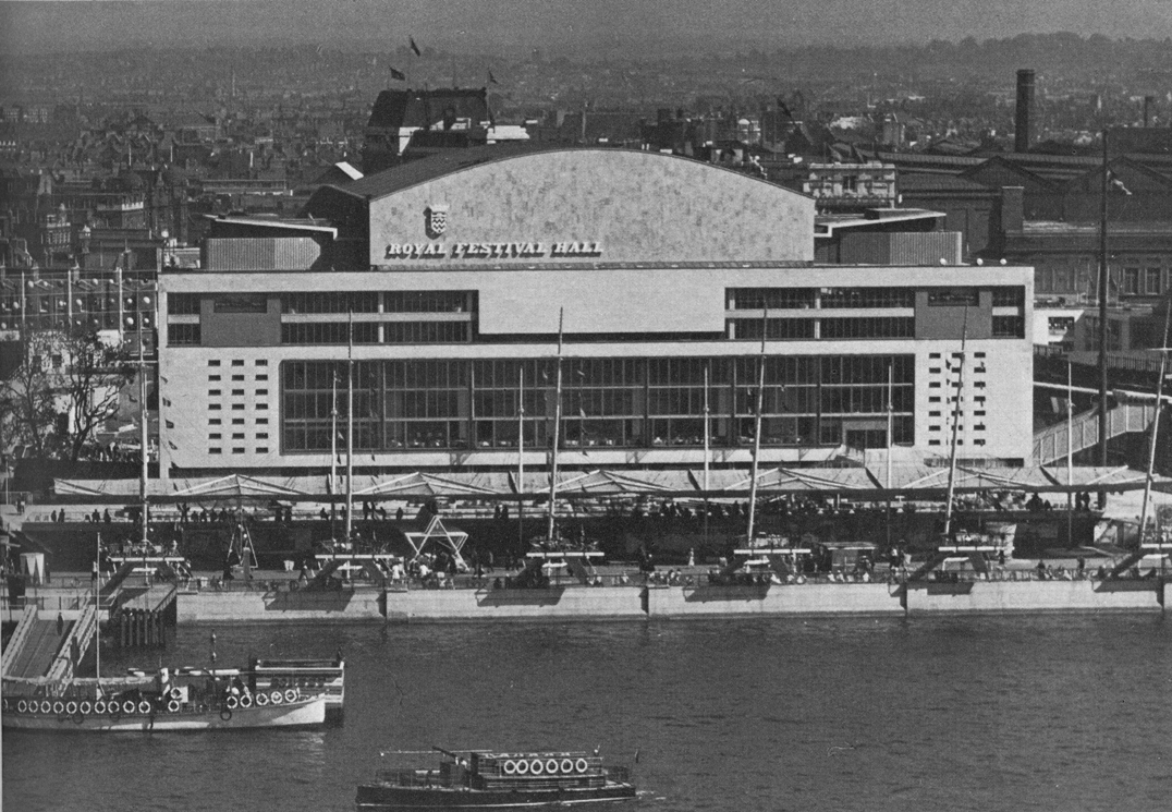
robin / 2007.12.10
In summer of this year the Royal Festival Hall, on the South Bank of London’s river, was reopened after a major, two-year refurbishment. The auditorium itself was remade and restored, and the rest of the building was significantly remade/restored too. The spirit and the materials of the original building were respected, at the same time changes needed for the place’s new uses were made.
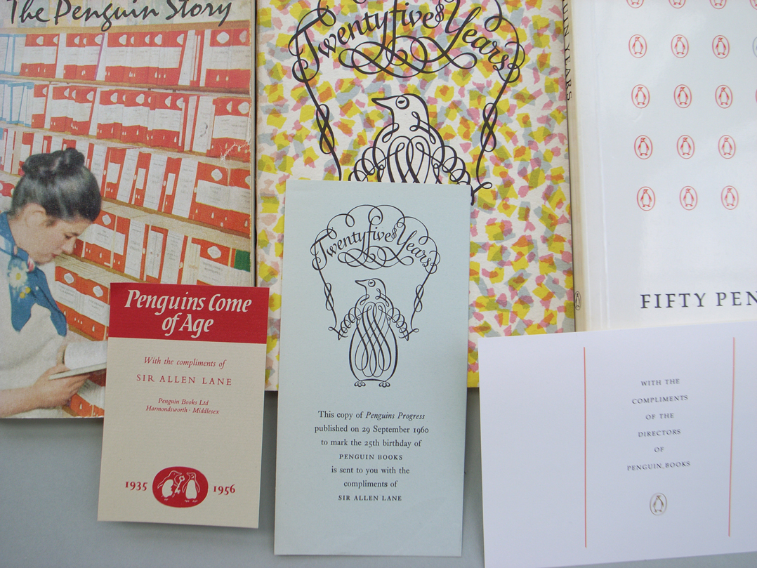
Penguins lose the plot
robin / 2007.11.01
As any long-term reader and watcher of Penguin Books knows, the company has always cultivated its own history, seizing the chance of an anniversary to make an exhibition or put out a book celebrating its own story.
Kafka in Oxford
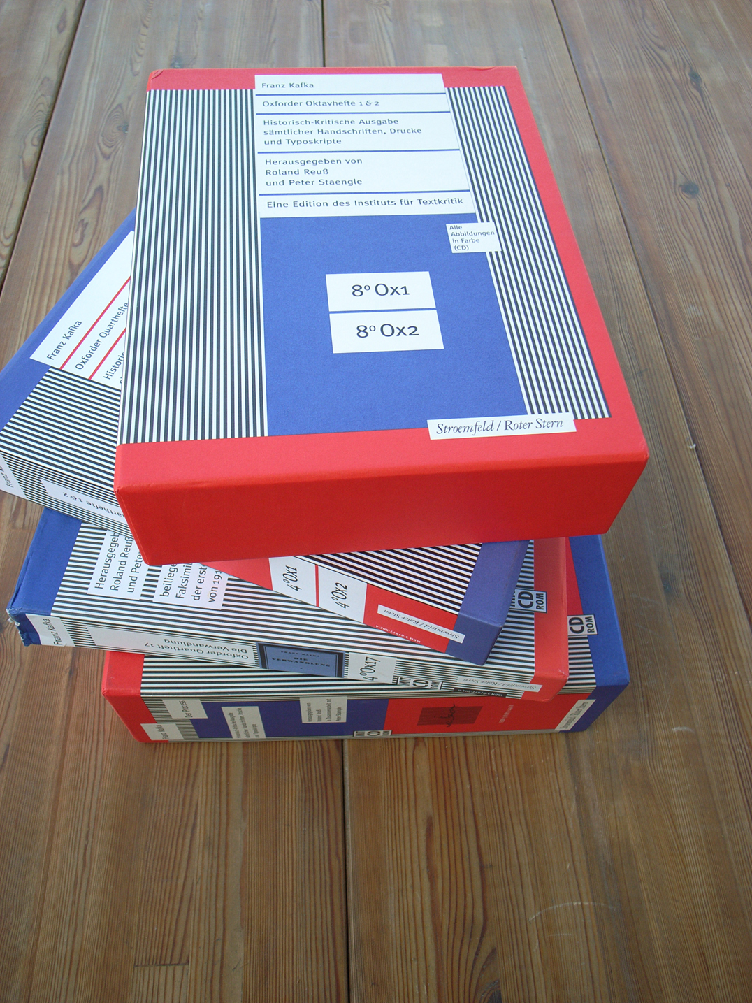
robin / 2007.10.31
On 15 November a presentation of the new ‘Historical-Critical Edition’ of Franz Kafka’s writings will take place at the Sheldonian Theatre in Oxford, followed by a panel (and open) discussion.
A new Zurich Bible
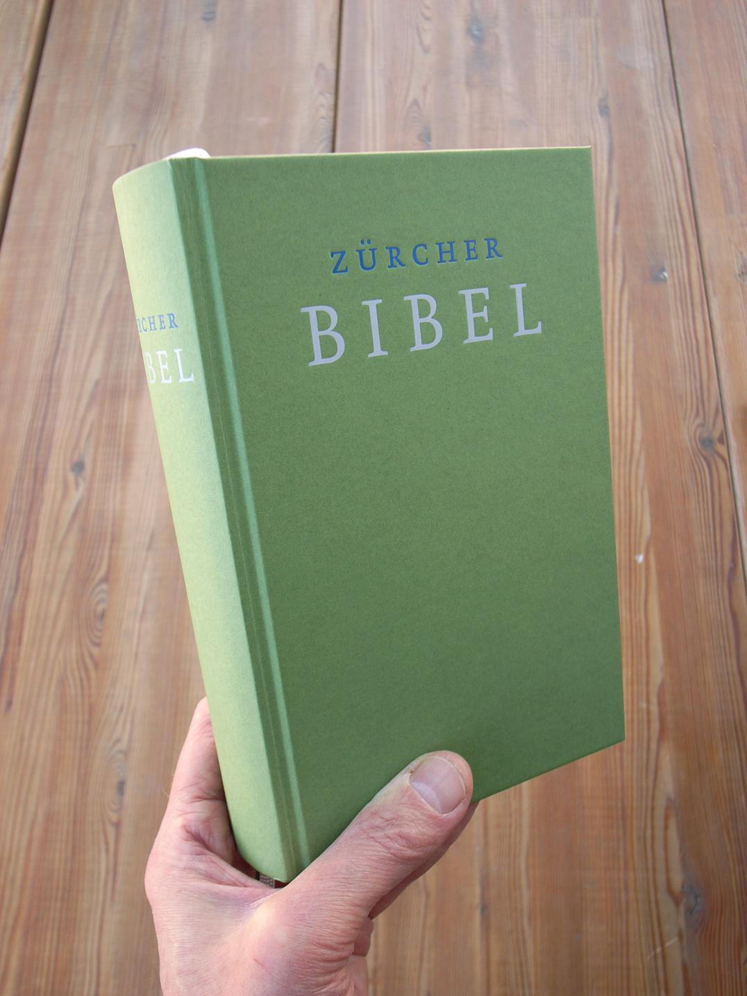
robin / 2007.10.30
The Zurich Bible was published in a new translation this year. This is the Bible in its Swiss-Protestant text, first published in 1531. Not only is it a bestseller (26,000 copies sold since June), but it must be one of the best-looking and best-made books published anywhere for some time.
Rule or law
robin / 2007.09.15
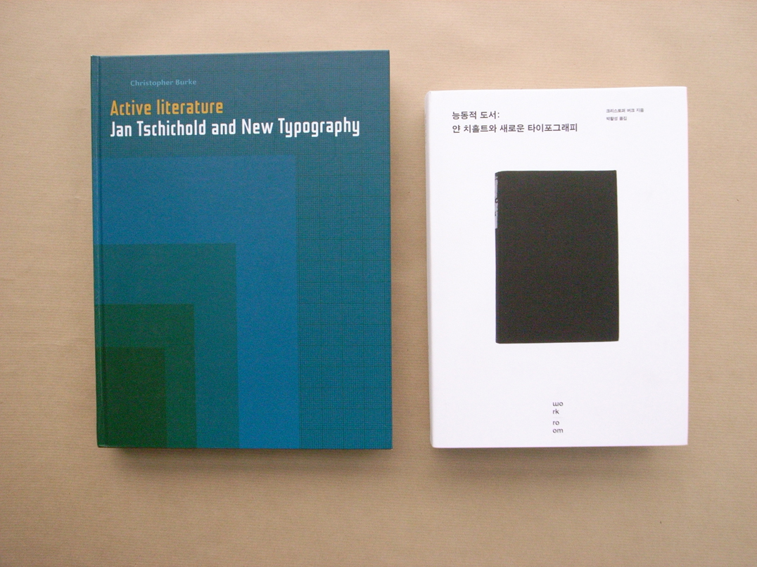
The re-publication here of this essay by Gerrit Noordzij is prompted by the issue of Christopher Burke’s Active literature. Our book was made in the belief that the best service to Tschichold is a critical placing of his works and his ideas in their real historical context: the fact that we want to do this in such detail must be evidence of the importance that we think his work has. Gerrit Noordzij’s short and sharply critical essay points to what may be the central issue in Tschichold’s writings, and it does more than that.
‘The new standard work’
robin / 2007.08.24
‘… meticulously researched, splendidly illustrated, and very nicely designed – without doubt the new standard work on Tschichold … even experts will find new and surprising things in it.’
Socialism and print
robin / 2007.08.20
The latest New Left Review leads with a dazzling article by Régis Debray, lamenting the end of print, and of socialism: the one death implies and necessitates the other.
Renner re-clothed
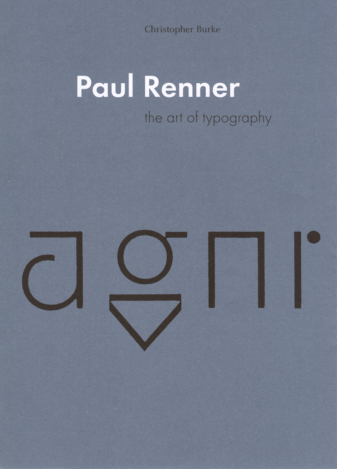
robin / 2007.08.14
To coincide with the launch of Christopher Burke’s new book, we have put a new jacket on the remaining copies of his first book, Paul Renner.
Vertigo: Collecting W.G. Sebald
robin / 2007.08.13
Terry Pitts’s blog about these books: interesting, and not just for the Sebald content.
Biospeak
robin / 2007.08.09
Two demon constituents of capsule English-language biographies (for book-flaps, catalogues, CVs, and so on) are ‘currently’ and ‘based in’. ‘Cormac Wrathbone is a freelance writer and critic, currently based in London.’ What’s wrong here? It’s not just the tiredness of the phrasing.
Buy this book by Nicolette giovanni M Gray today!
robin / 2007.07.30
Why it is safer to look at the website of the publisher of a book, rather than at one of the websites of the internet shop Amazon.
More on cold glue
robin / 2007.07.26
A letter published in the London Review of Books, 2 August 2007.
‘Typography papers 7’ finished
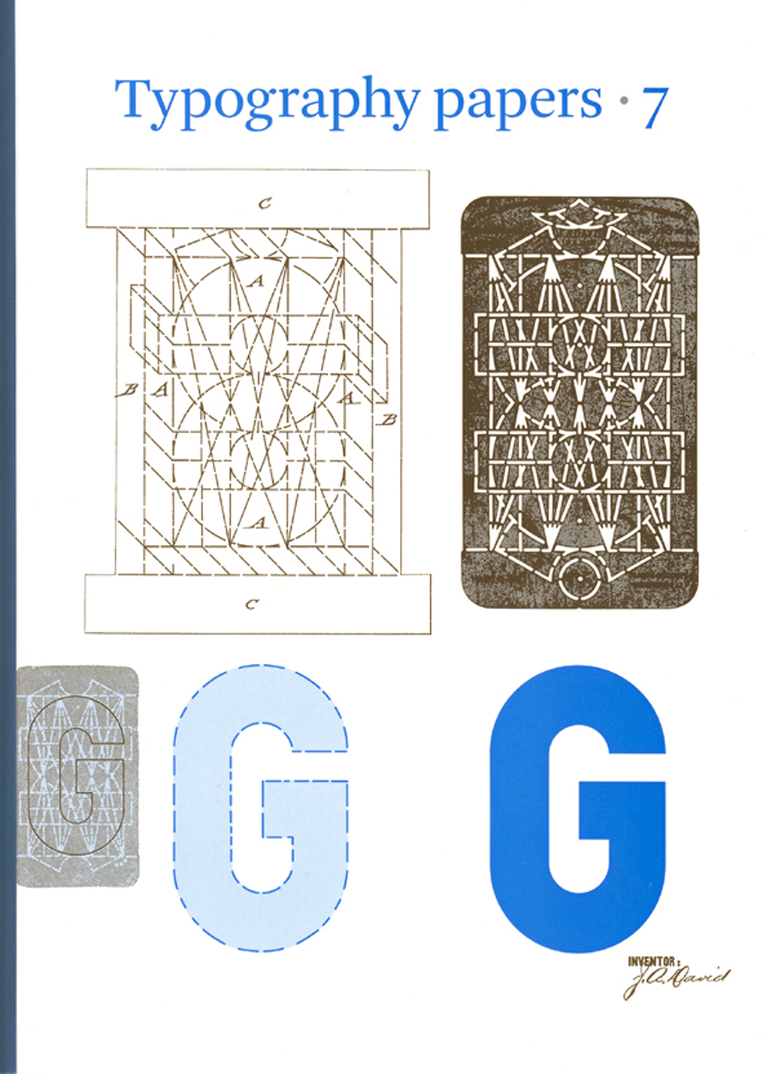
robin / 2007.07.24
We have received the first copies of Typography papers 7 in the office.
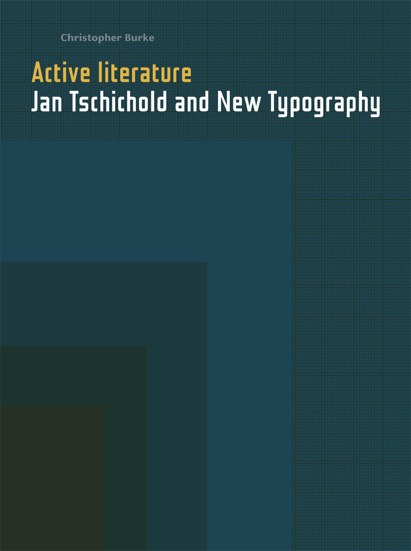
‘Active literature’ arrived
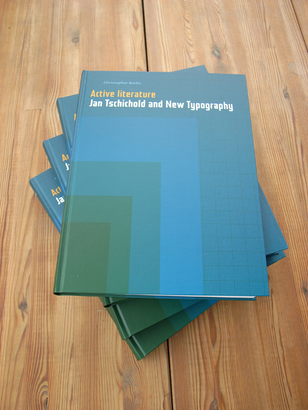
robin / 2007.07.12
This week we received copies of Christopher Burke’s new book.
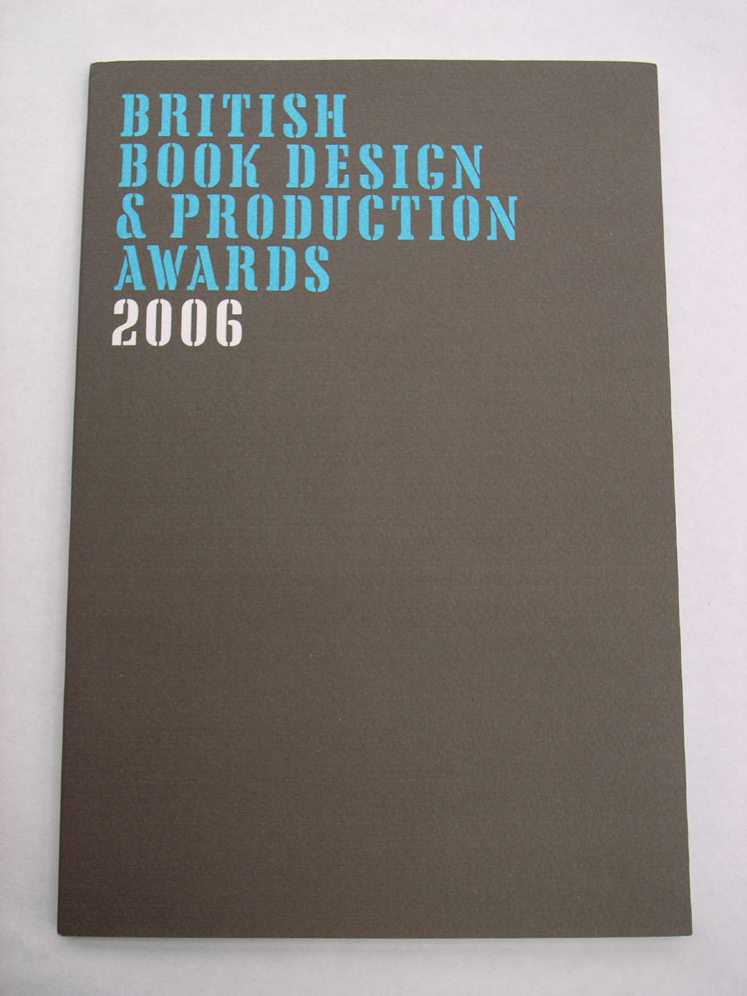
Best books 2006
robin / 2007.06.27
This year’s catalogues for the best-designed/-produced books have been appearing. The Swiss catalogue for books issued in 2006 is just published. The German catalogue for the same period came out some weeks ago. The British publication, also carrying the designation ‘2006’, was produced towards the end of last year. The Dutch best-books catalogue is on its way, and will cover books published in 2006. With the exception of the British publication, these catalogues describe and discuss books that are put on exhibition in their own countries, and which are also, in the autumn, added to a showing at the Frankfurt Book Fair of all the world’s best-books of that preceding year. A proper survey of the best-books exhibitions would take in all the countries represented at Frankfurt, including (as I recall) Finland, Denmark, the Czech Republic, the United States, Spain. These remarks are addressed to the countries with which I am most familiar.
‘Active literature’ advance
robin / 2007.06.22
On Tuesday of this week, Christopher Burke talked in London on ‘Jan Tschichold: the missing typefaces’ to the Friends of St Bride Library. Speaking without notes, and in full command of his subject, he described and analysed the previously almost unconsidered typeface designs that Tschichold made in the 1930s.
Burnhill obituary
robin /
Paul Stiff’s obituary of Peter Burnhill is published in The Guardian today.
Typefaces of their times
robin / 2007.05.15
There has been much discussion in recent years about the typeface Helvetica, prompted by the book made by Lars Mueller and now a film by Gary Hustwit. In this connection, Erik Spiekermann has been active. Much of Erik’s work has been a wonderful effort in surpassing the unthinking, formulaic and bureaucratic approach that often entails the use of Helvetica. In 1991 Erik brought out his typeface Meta. With the great success of Meta, it came to be some sort of alternative to Helvetica: more subtle and humane than the essentially regularized-industrial forms of Helvetica. The tag ‘the Helvetica of the 1990s’ has become attached to Meta, and has sometimes been attributed to Robin Kinross.
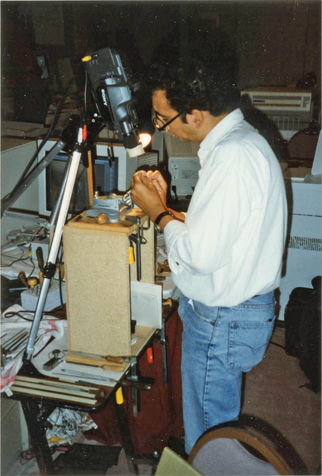
The x-height ribbon
robin / 2007.05.08
Sergei Egorov (it must be him) has made an analysis of a column of Aldine text that seems to correlate with Peter Burnhill’s findings in Type spaces.
Books that lie open
robin / 2007.05.02
This is an introductory survey of a vexed issue of book-production: binding techniques. The intention of the piece is general enlightenment, and to support a process that is threatened with extinction. A version of this article was published here in May 2007. The text and images here are a new version of this article – thoroughly revised and reshaped in April 2018.
Tschichold at St Bride’s
robin / 2007.04.29
In connection with his forthcoming book Active literature, Christopher Burke will be talking on 19 June at the St Bride Printing Library in London on ‘Jan Tschichold: the missing typefaces’. An exhibition at the Library of work by Tschichold, curated by Christopher Burke and Robin Kinross, will open then and be on display through to 23 August.
Two books on book typography
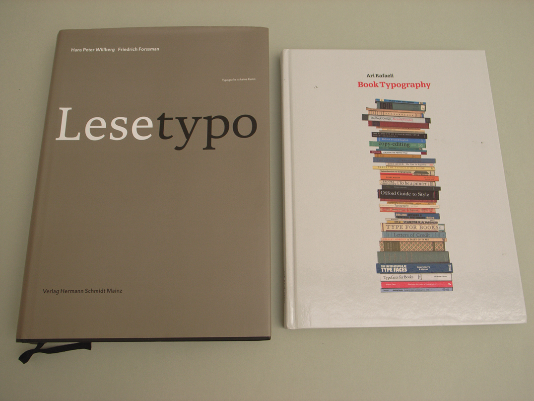
robin / 2007.04.26
This review has just appeared in the new number (no. 11) of Text, within an issue on the theme of ‘Edition & Typographie’.
Architectural positions
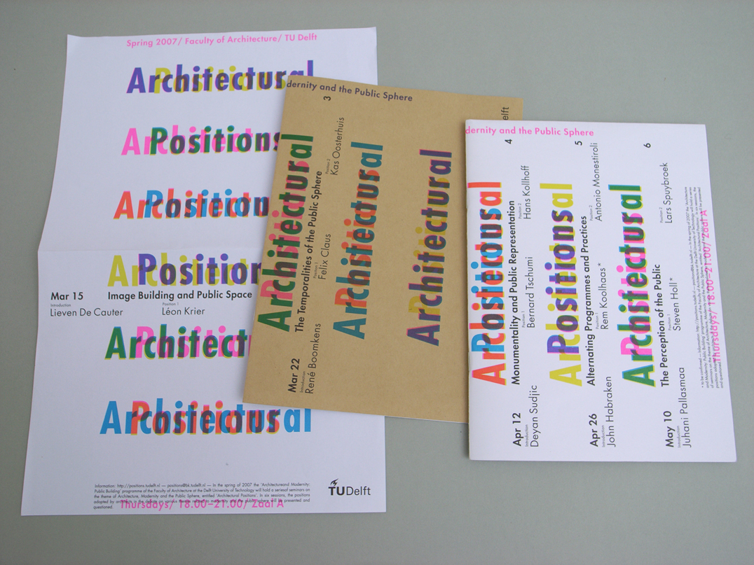
robin / 2007.04.25
The faculty of architecture at the TU Delft commissioned Karel Martens to design booklets, flyers, stationery, and a poster for their series of six seminars this spring on ‘Architecture, Modernity and the Public Sphere’.
Remembering Peter Burnhill
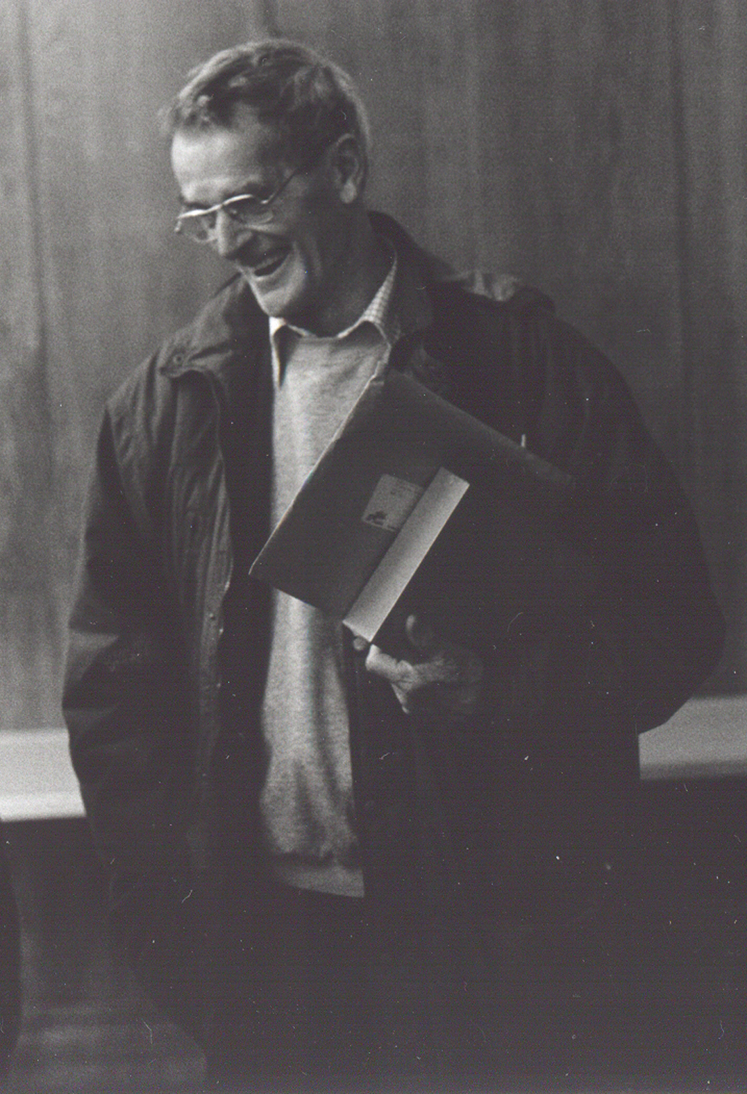
robin / 2007.04.17
Peter was there in Stafford as a constant point of reference for me for about thirty years. I remember making what seemed like a pilgrimage from Reading to Stafford, in 1977, to meet him for the first time, and the others around him in the group that made and ran the typography course at the College of Art and Design.
London Book Fair 2007
robin / 2007.04.15
We are taking part in the London Book Fair, at Earls Court, from 16 to 18 April.
Peter Burnhill
robin / 2007.03.13
Peter Burnhill died in hospital at Stafford on Sunday 11 March, aged 84. We will publish something here soon about him and his work.
Wright in Reading (further)
robin / 2007.03.09
The Optimod website has further material on the Edward Wright show.