Typography papers 6
Hyphen Press /
This occasional, book-length work is edited and produced at the Department of Typography, University of Reading, and is now published by Hyphen Press. It publishes extended articles on its subject, exploring topics to the length to which they want to go. Its scope is broad and international, its treatment – serious and lively.
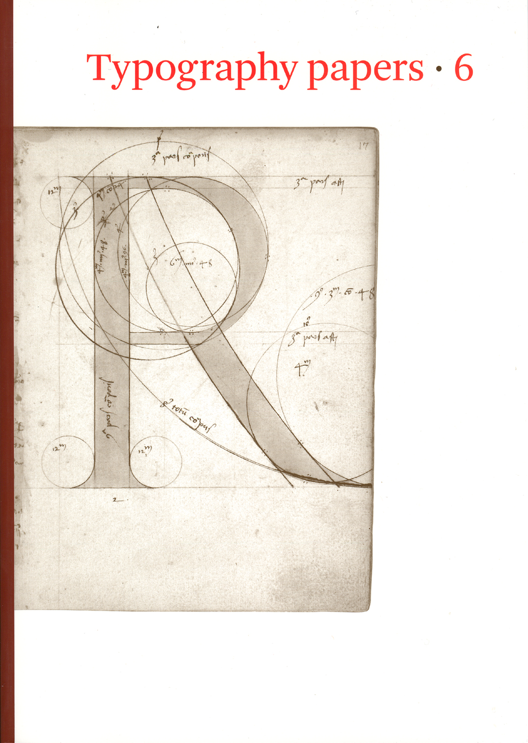
A view of early typography: up to about 1600
Hyphen Press / 2022.08.16
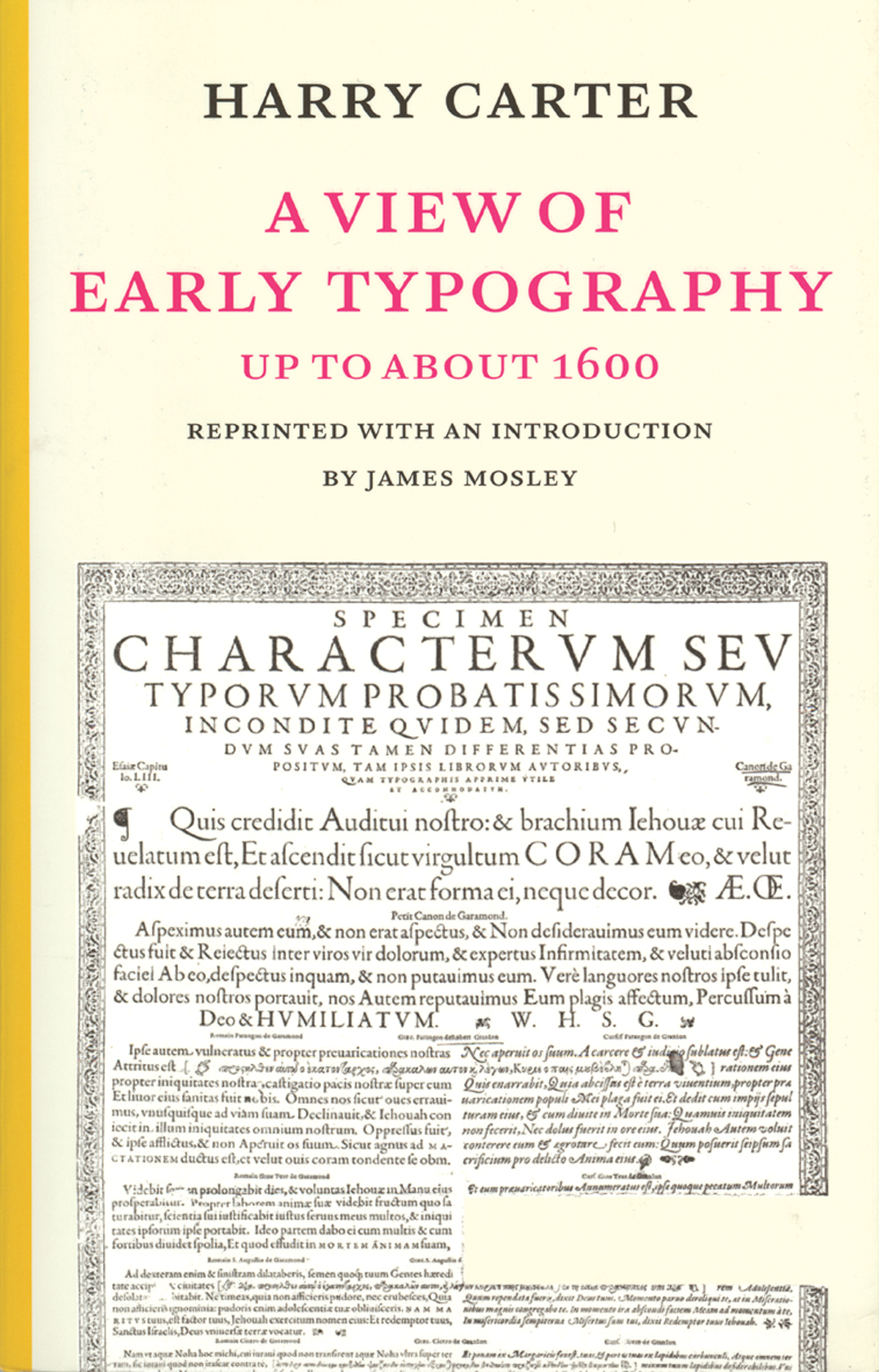
A reprint of this long-out-of-print and now classic work, which summarizes what can be known about the production and use of type in the first 150 years of printing. Originally a set of lectures, the book is an informal discourse by a master of his topic. The argument is illustrated with a large gathering of pictures. A new introduction by James Mosley explains the significance of the book and gives a short account of Carter’s life and work.
Risen spaces
Hyphen Press / 2016.07.04
Comments on the picture-sharing service Instagram have pointed to an interesting detail in Harry Carter’s book A view of early typography. Our edition of this work was a facsimile reprint of the book published by Oxford University Press in 1969, with added editorial matter.
A very English blunder
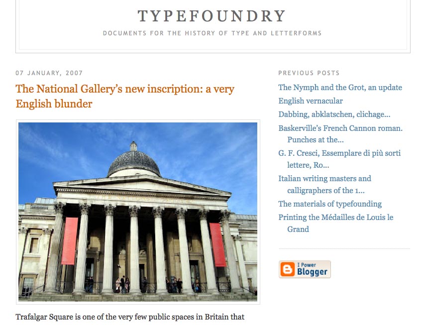
Hyphen Press / 2007.01.09
James Mosley has welcomed the new year by adding two substantial posts to his blog Typefoundry: an update on his thesis about the appearance of sanserif letters in eighteenth-century Britain; and an explanation of why the inscription recently added to the National Gallery in London is all wrong.