This is the first English-language edition of a major piece of thinking about writing (in its visual manifestation). Noordzij’s short and powerful text, illustrated with his own diagrams and examples, is the best exposition of a theory that is making a still growing impact on designers, and on those thinking about writing and letters.
Our English-language edition of this book has now been taken over by De Buitenkant in Amsterdam. Go here.
[April 2019]
Contents
Foreword 1985
Foreword 2005
- The white of the word
- The stroke
- The orientation of the front
- The word
- The invention of the word
- The consolidation of the word
- The great break
- Changes in contrast
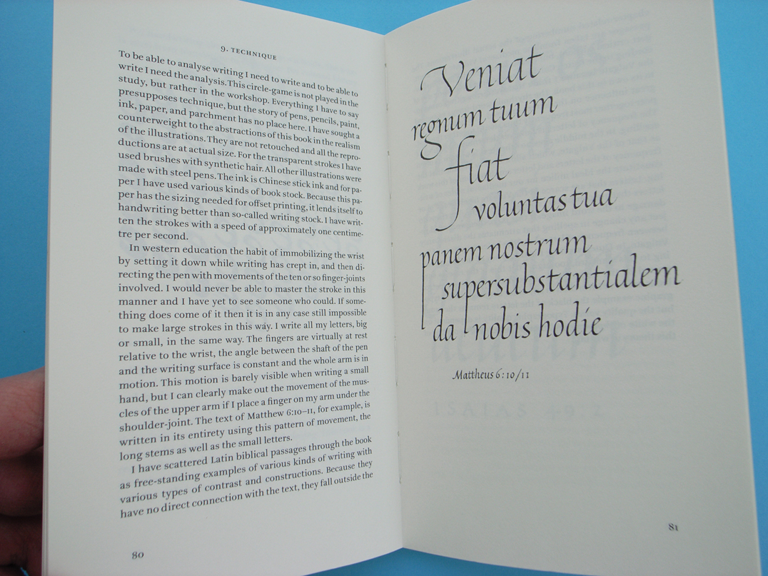
- Technique
A note on the translation
Index of texts
Synopsis
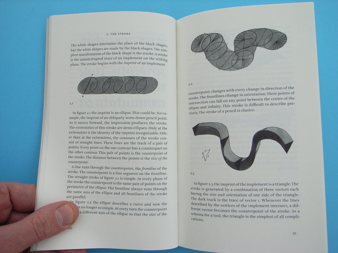
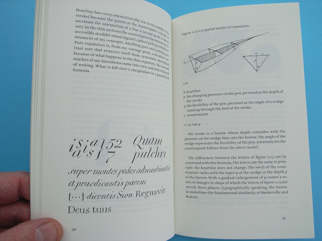
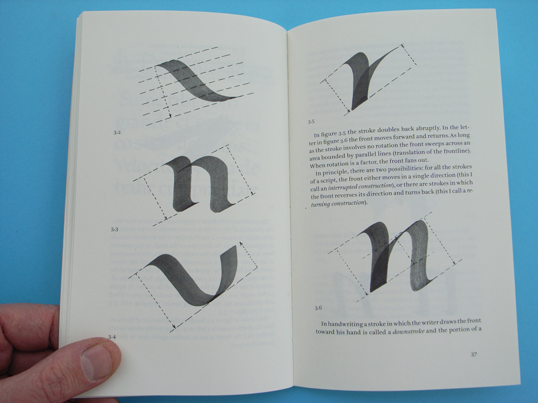
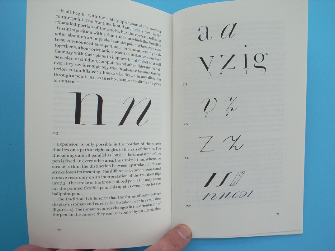
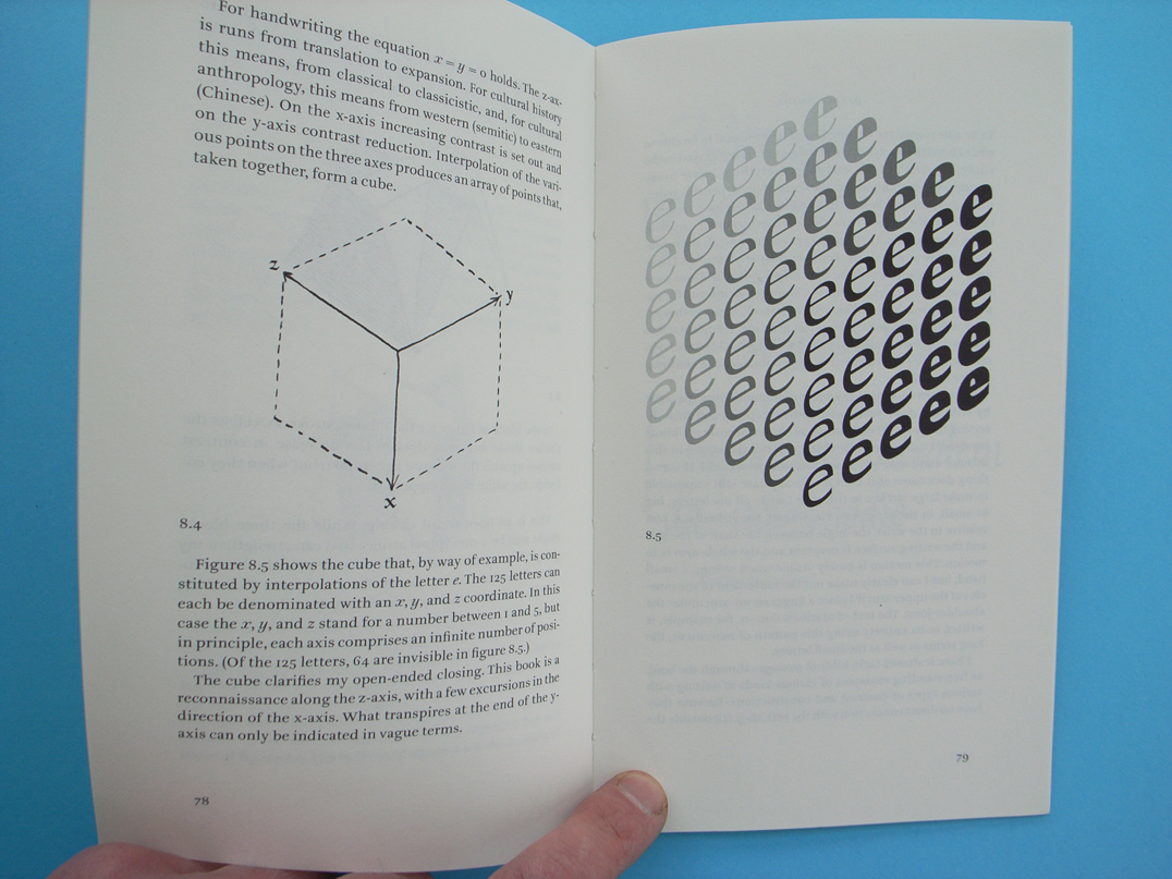
Published in Dutch in 1985, The stroke now appears for the first time in an English-language edition. The book puts forward a genuine theory of all writing, with any kind of implement: thus it covers both western and what we call ‘non-western’ writing. Noordzij starts from basic principles, and gives his attention first to the space around the letters: the white space that serves to define and distinguish what any letter is. He describes in minute detail how the strokes of writing can be formed. Here he uses simple geometrical concepts to underpin his descriptions. So the book is far from a work about art calligraphy and beautiful forms. Rather it is a sustained description of the phenomenon of letters and how they are made in writing.
Noordzij’s theory serves to repair the split that grew up, with the invention of printing, between written and typographic letters. He shows us the underlying ‘written’ quality of all letters, with whatever technology they have been formed. With these ideas Noordzij can be seen as a prophet of digital typography, in which typefaces have been freed from the constraints of their embodiment in metal.
Our edition is introduced by a new author’s foreword; we also retain the foreword of the original Dutch edition. Also included is a note by the translator, Peter Enneson, who has worked in close collaboration with Gerrit Noordzij in making the English text.
Reviews
Anyone interested in visible language and in why our letters and our types look as they do should study these 86 pages. A single reading is not enough, because ‘The stroke’ has consequences that extend far beyond what one finds in most handbooks.
Erik Spiekermann, Text [Heidelberg].
‘Letterletter’, originally a one-man journal distributed mainly to ATypI members, is witty and rich in ideas, but too fragmented, polemical and tongue-in-cheek to function as an introduction to Noordzij’s thinking. ‘The stroke’, Peter Enneson’s long-awaited translation of ‘De streek’, is much better placed to take that role. Published in Dutch in 1985, ‘The stroke’ stands out as the most concise and complete summary of Noordzij’s theories on type. … This theory is the subject of the 70-odd pages of ‘The stroke’: an analysis of the construction of letterforms informed by historical study but firmly rooted in hands-on experience. In Noordzij’s words: ‘To be able to analyse writing I need to write, and to be able to write I need the analysis. This circle-game is not played in the study, but rather in the workshop.’
Jan Middendorp, Eye, no. 59, 2006